4

I'm working on an app that requires someone to rate the how they did at recalling an item (to which they are shown the correct answer before they rate the item). The three options are: wrong, right, and easy. With easy meaning that it was right they didn't have to think about it to get the answer.

I'm open to suggestions of name changes that improve the clarity, but this question is more about how to make it easier for users to scan them without having to read the text each time - with particular interest on the "easy" option.

Two example mockups we have so far are:

enter image description here

and

enter image description here

How would you represent these 3 buttons, and what improvements can you suggest over the current ones, with emphasis on the easy option?

4
  • 1
    Will the user know whether they have done a task wrong? Could be an idea to simplify it to just 'difficult' or 'easy'.
    – benb
    Commented Sep 16, 2011 at 10:03
  • Yes, I should probably reword the question. They are trying to recall something and when they see the answer they rate how they did at recalling the item.
    – JohnGB
    Commented Sep 16, 2011 at 10:38
  • 2
    It would be slightly painful for the people who now have to answer both "Wrong" and "Easy" ;)
    – MSalters
    Commented Sep 16, 2011 at 12:22
  • I agree - decide first on what you are trying to measure, and that may drive the UI. Right vs. Wrong is just common sense, but "easy" just doesn't fit that pattern. Commented Sep 16, 2011 at 14:42

4 Answers 4

16

PhilipW is right in that you don't need to say right, because that implies that easy might not also be right. I'm assuming a task has to be completed to get to this stage and that users have some indication of right and wrong, and that they have some element of measurement by which they can consider the task to be easy or hard?

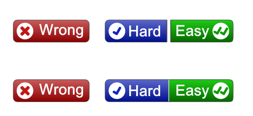
Based on the information given, here's a visual that might be easier to scan:

enter image description here

[edit1] added comparison following Gilbert's comment

enter image description here

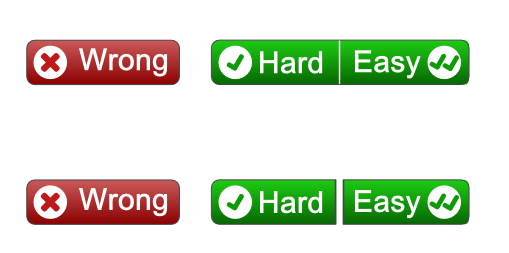
[edit2] and here's a couple of options that group the hard and easy as both not being wrong (ie right!)

enter image description here

enter image description here

10
  • 4
    Love the double tick for easy.
    – JohnGB
    Commented Sep 16, 2011 at 10:33
  • 1
    Nice visual buttons. I'm concerned that making the Easy button green sends a subliminal message to the user that the tasks are supposed to be easy. Maybe yellow would be better? Commented Sep 16, 2011 at 12:46
  • good point (and assuming they aren't all supposed to be easy.) @JohnGB - what is the outcome (and for whom) when the user clicks more on hard than easy. Commented Sep 16, 2011 at 12:52
  • 1
    It's answers like this that make me love coming here...
    – John N
    Commented Sep 16, 2011 at 14:11
  • 1
    @RogerAttrill: Me likes :)
    – JohnGB
    Commented Sep 16, 2011 at 14:25
4

I'd go for a 3 button scale - arranged in order:

Wrong / Difficult / Easy.

You don't need to say right - as this is implied by the first option 'wrong'.

1
  • Good point. That does indeed help clarify the issue.
    – JohnGB
    Commented Sep 16, 2011 at 10:27
3

Wrong, Right, Too easy

The too easy should maybe have the same visual clues as the Right option. Too easy is still Right, right?

1
  • +1 I disagree with the "difficult" or "hard" button labels as even if something wasn't easy/obvious - I think someone judging their own effort won't tick "difficult" or "hard" even if they had to think for a while... Commented Sep 16, 2011 at 14:28
2

I'd make the three options refer specifically to difficulty - "Couldn't do it!", "Difficult!", "Easy!". This makes more sense to the user (there's three comparable options), but because your options now easily fit a 'sliding scale', you can use imagery based on traffic-light schemes or numbers.

For instance, you could now use a set of coloured faces (red / angry - impossible, yellow / neutral - tricky, green / happy - simple) or sets of one, two and three domain-relevant icons, with the number signifying difficulty (eg, for recipes, one chef's hat for easy, two for tricky, and three for impossible).

4
  • How do you fit "couldn't do it!" on a button?
    – JohnGB
    Commented Sep 16, 2011 at 10:52
  • Impossible? ••• Commented Sep 16, 2011 at 11:01
  • <sub>couldn't do it</sub> - damn - that doesn't work in comments :-) Commented Sep 16, 2011 at 11:49
  • Larger buttons, shorter synonymns. There's a couple of things you could do. What's important is that the three options are directly comparable (e.g on a sliding scale), both for user perception (makes more sense to the reader) and because it provides more opportunities for iconography. Commented Sep 16, 2011 at 12:09

Your Answer

By clicking “Post Your Answer”, you agree to our terms of service and acknowledge you have read our privacy policy.

Not the answer you're looking for? Browse other questions tagged or ask your own question.