0

I'm working on a table redesign and when it was first created they didn't have the design and experience in mind. Right now, the table is a listing of products and there's a button inside the table that allows the user to activate and deactivate the item. When clicked, there's a modal that asks for confirmation. The "Active" product's button is green and the "Inactive" is red. As of now, we don't have the resources to use tooltips or dropdowns and the action must be down directly from the table. Are there any suggestions on how to make this cleaner?

enter image description here

enter image description here

Are there any suggestions on how to make this cleaner?

3 Answers 3

1

if there are two statuses

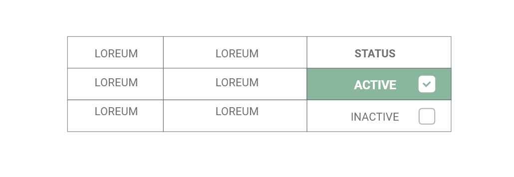
  • remove the red colour, one colour is enough to highlight the status, second brighter colour is disruptive.
  • replace the icon with checkbox
  • highlight the cell instead of having a button
  • use muted colours
  • follow recommended contrast ratios

table preview

0

The cleaner version would mute the cell borders more (or maybe even hide them altogether) and make the buttons scream less - ie use more muted colors and also not have them full caps. Gmail probably is a pretty good inspiration here.

Also, more generally: Since you're presenting your data as a table (as opposed to a card grid), it lends itself to bulk editing. If you keep the confirmation dialog, bulk edit capabilities are going to be faster for >2 items and also more scaleable. You currently can (de)activate, but it's likely you'll have actions like: Edit, Delete, Add to collection, Export (CSV, Excel, ...), Print, Assign to user, and so on and so forth going forward, which will blow up your table with buttons.

0

Maybe a toggle switch would solve your issue?

enter image description here

Your Answer

By clicking “Post Your Answer”, you agree to our terms of service and acknowledge you have read our privacy policy.

Not the answer you're looking for? Browse other questions tagged or ask your own question.