0

A few years ago I built a web application for my wife that allows her to keep track of recipes, add them to a calendar, and create a grocery list from a specific range of dates. I'm doing a facelift on the site and need some help with the placement of some buttons.

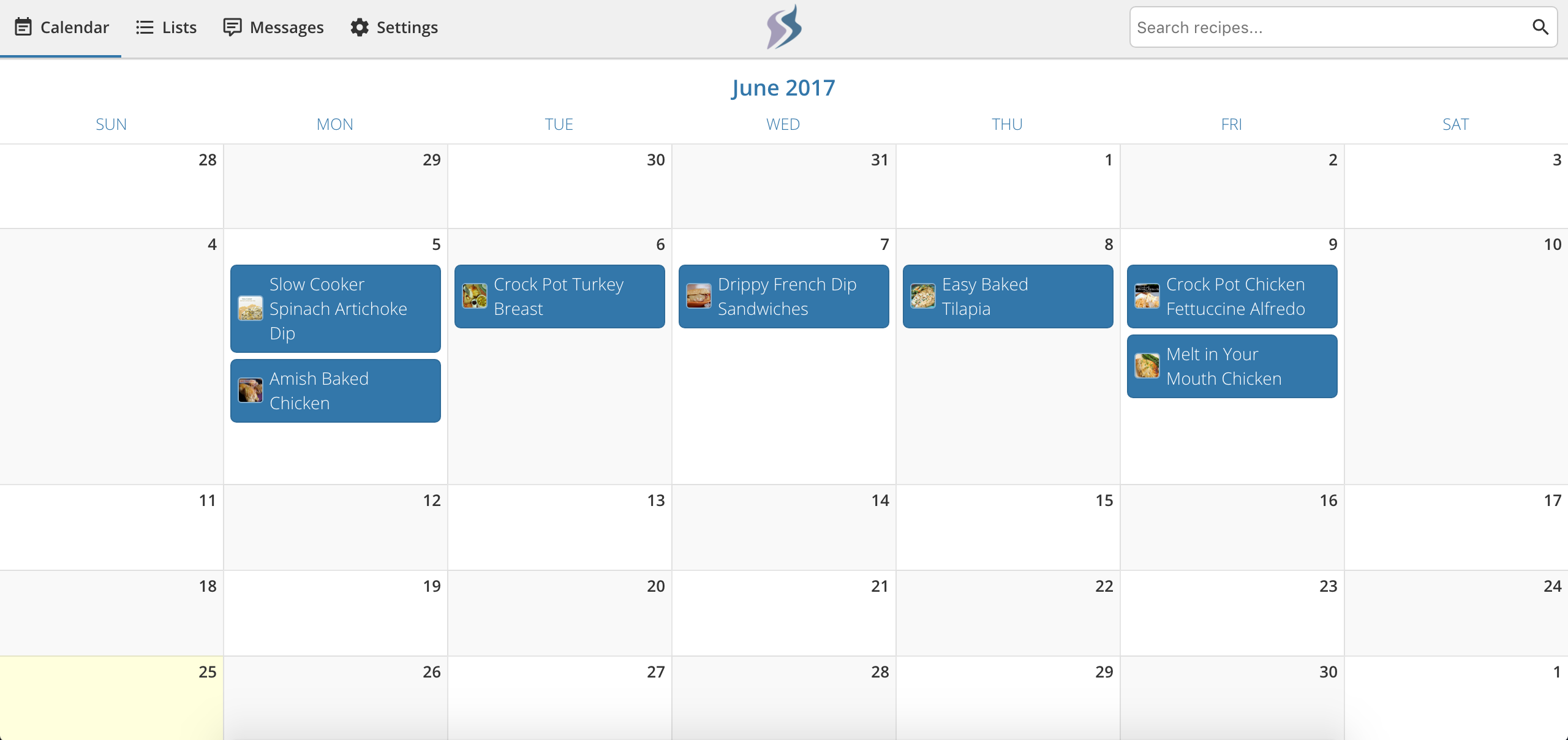
Here is a screenshot of the app's calendar view:

App screenshot

My problem is that I need to add three buttons:

  1. Create new recipe (brings up a form where you can manually enter the recipe name, ingredients, directions, etc.)
  2. Add item (this is used to add an item like "Cereal" or "Strawberries" directly to the calendar)
  3. Create grocery list (allows you to click on a start and end date and brings up a view of the grocery list that was generated from the recipes and items selected for those dates)

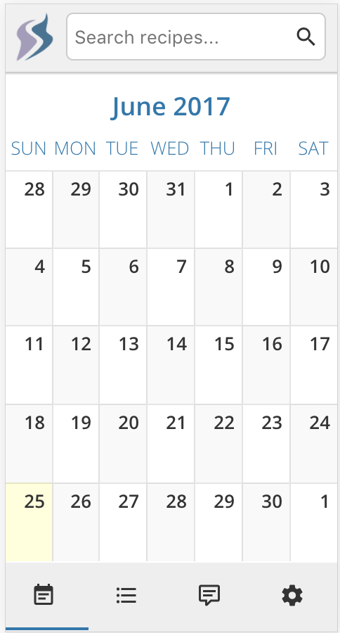
One major limitation I have is that this web application is responsive. I don't have the time to support both a mobile and a desktop version, so it uses media queries to re-arrange the view a little when it's a mobile view.

Mobile view

Any thoughts on where to put those three buttons?

2
  • What does the lists view do? It seems like the calendar and the lists seem like two views of the same item: recipes organized by time, vs. recipes in a list that can be sorted by other dimensions (time created, due, A-Z). One possibility is to roll up those into one menu item, in which you toggle the views.
    – Mike M
    Commented Jun 25, 2017 at 19:25
  • @Mike The lists view actually shows you grocery lists that you have created in the past. It defaults to your most recent list and allows you to select or delete older ones. So it's not really related to recipes. Commented Jun 25, 2017 at 19:31

2 Answers 2

1

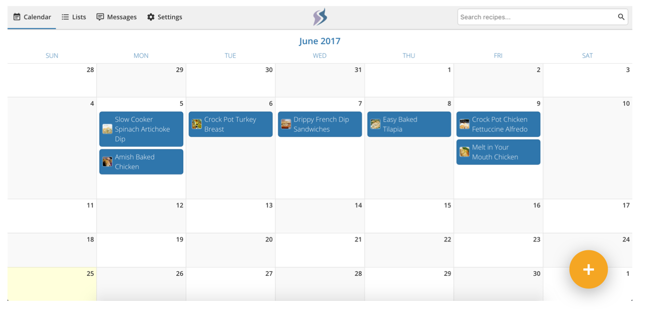
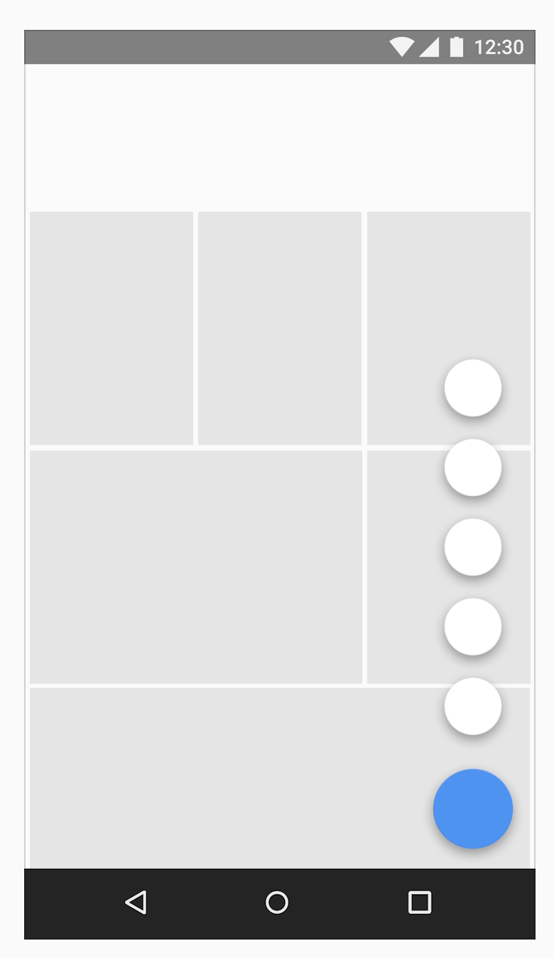
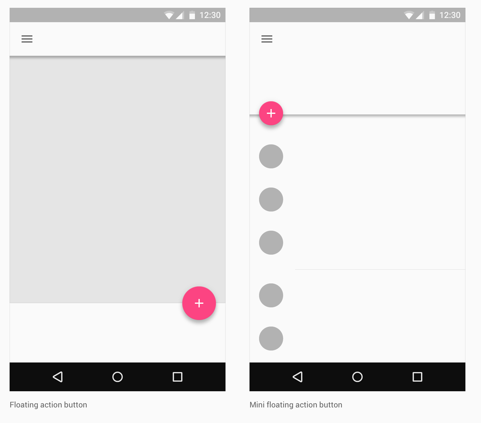
You could go with a floating action button (material design). It would look like in the screenshot below.

It is responsive and will be in the lower right hand corner (or left, if your wife is left handed) and pops up a menu with your different options.

enter image description here

enter image description here

enter image description here

3
  • I really like this. What about in the mobile view--it would be right in front of some of the days on the calendar, wouldn't it? Commented Jun 25, 2017 at 19:50
  • 1
    Yes. You can put it at the top like the final picture in my answer. It floats so the user can see there's something under it. Commented Jun 25, 2017 at 20:06
  • I think this will work nicely. Thanks for your time! Commented Jun 25, 2017 at 20:11
1

Make room for primary actions at top

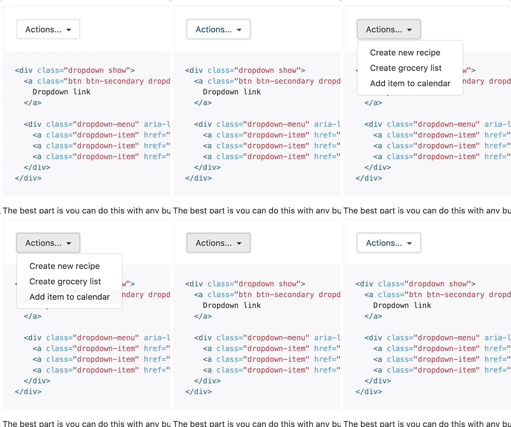
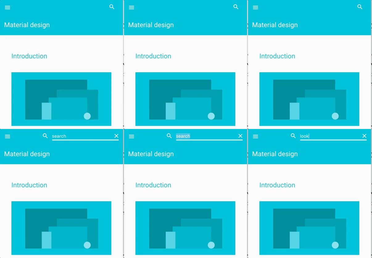
Without a lot of redesign, you can take advantage of the trends toward expanding search fields, in combination with a dropdown button using bootstrap.

See enclosed examples:

bootstrap

dropdown button

material design search

search field

You can also make the search field appear below, like this news site does:

enter image description here

Pro

  • Makes room for both search and primary actions
  • Dropdown button allows one word label (Actions)
  • Dropdown list allows more explanation for each action
  • Can work on mobile

Con

  • More clicks (each a click to get to the action, although you're a cool husband to build an app for your wife so hopefully she'll forgive you :))
3
  • So in this case you'd recommend hiding the search field and adding an action dropdown where the search field is currently located? Commented Jun 25, 2017 at 20:02
  • Yeah, that's my thought. You'd have the search icon, and the button top right. NGAFD's solution is also good.
    – Mike M
    Commented Jun 25, 2017 at 21:01
  • I will try both of these solutions and see which one feels better after repeated use. Thanks very much! Commented Jun 25, 2017 at 21:17

Your Answer

By clicking “Post Your Answer”, you agree to our terms of service and acknowledge you have read our privacy policy.

Not the answer you're looking for? Browse other questions tagged or ask your own question.