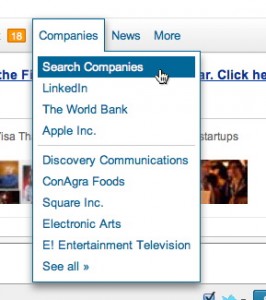
Do users find it easy to use headers/menus like the one displayed below?

Do users find it easy to use headers/menus like the one displayed below?

You get better performance if users click the menu bar to open a menu rather than simply hold the mouse pointer over it. Hover-menus were demonstrated to be a bad idea long before they appeared on the web:
Chaparro BS, Minnaert G, & Phipps C (2000). Limitations of using mouse-over with menu item selection. Proceedings of the Human Factors and Ergonomics Society Annual Meeting, July 44(2), p361. (nearly full text at Mouse-Over vs. Point-and-Click: It Depends! )
They're also inconsistent with the tried and true DOD Design Criteria Standard - Human Engineering (aka MIL-STD 1472):
5.14.2.1.8.4 Explicit actuation. A separate, explicit action, distinct from cursor position, shall be required for the actual entry (e.g., enabling, actuation) of a designated position
However, once a menu is opened, it is preferred that additional menus open on hover. For more details, see Make web menu bars more usable.
Part of the issue is that to get accuracy as good as click-to-open, you have to put in a delay that’s so long that any speed advantage of opening on hovering is negated.
Hover-menus are a textbook case of an intuitively appealing idea that fails in practice. They're also a textbook case that just because something is common on the web doesn't mean it's a best practice.
Drop down on click is easier to use. In addition, touch screen devices don't have hover.
I would recommend going for click, not hover. Do not forget to add a visual clue (triangle pointing down) to help with discoverability.
Here's some helpful information about possible usability issues with dropdowns.
ontouchstart attribute to the relevant elements. Then clicking on the menus will trigger the hover effects.
Commented
Apr 30, 2013 at 21:00
I highly suggest you read the following article from smashing magazine.
We found that our users hated traditional skinny drop down menus like the one in your screen shot. However, when we went to wider drop downs with multiple columns, larger margins, better styling, and no sub menus, then they seemed pleased.
With the prevalence of tablets and mobile devices I feel that we should move away from hover-centric designs. Touchscreens don't have a "hover" state.
My approach is simple:
Last of all, the site needs to be very fast so that this multi-page design doesn't slow down or annoy the user while browsing your site. So use tools like YSlow and http://www.webpagetest.org to optimize your site. A fast website is always welcome of course, but this is especially important for mobile users.
Almost all users will be familiar with the concept as they are omnipresent in Windows and Apple applications (and even though it was redesigned in The Ribbon, it's still a similar concept.)
Wether they like it or not is something you need to find out - it depends on the user, also on how well the menu works. For example, you need a delay to prevent menus hiding when a user moves in a straight line from the top to the menu item. Menus that are difficult to navigate will confuse or irritate the user, even if they are familiar with the concept.
(A difference to note is that the menus on Windows only dropdown on click, not on hover. Dropping down on hover will make it more discoverable - but also more invasive. Dropping down only on hover (and not on click) can come with problems when visiting the page with a tablet because those have no way of hovering.)
Hover menus are extremely hard to use with touch devices
(try browsing through LinkedIn without using a smart phones built in browser)
... and often get closed if the user moves the mouse inaccurately over the menu
(e.g. the start menu in older versions of Windows - the "All Programs" in Windows 7's start menu does not use hover menus).
My experience is that hover menus and megamenus are hard to use. This comes from personal experience and watching other users. This is especially significant if the user has limited dexterity or poor motor skills.
I also agree that they don't seem to work well with touch interfaces.