Two level menus: should they be used? Why are they important?
I never found any resource explaining this. Should I avoid them and only use them when you really have too much stuff to present?
Two level menus: should they be used? Why are they important?
I never found any resource explaining this. Should I avoid them and only use them when you really have too much stuff to present?

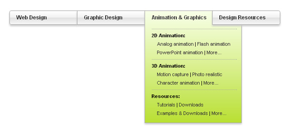
Two level menus are better for usability than traditional drop-down menus, because the user doesn't have to navigate carefully in multiple directions.
As AskTog explains, with traditional, multi-level drop-down menus:
The bottleneck is the passage between the first-level menu and the second-level menu. Users first slide the mouse pointer down to the category menu item. Then, they must carefully slide the mouse directly across (horizontally) in order to move the pointer into the secondary menu.

download bmml source – Wireframes created with Balsamiq Mockups
Trying to move sideways without straying outside the menu can be difficult, especially for users with impaired mobility.
On the other hand, placing two levels of hierarchy within a single menu saves the user time because she doesn't have to navigate carefully through a maze to get where she's going. With two-level menus, you can navigate straight downward, instead of having to navigate down, then sideways, then downward again.
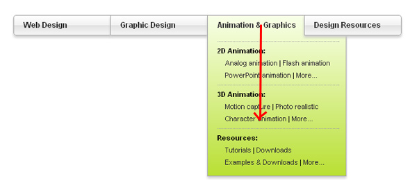
Two-level menus only work well with relatively simple hierarchies. On larger hierarchies it becomes inefficient. For example, if you have a 10 menus at each level of your hierarchy, such a menu would be ill-fitted because the user would be presented with 100 options inside the dropdown instead of just picking one of 10 and then one of another 10 (20 options total). For hierarchies of five or fewer items per level, the two-level menus work great.
EDIT: Jacob Nielsen has an article on why mega menus work better than normal menus and how to implement them.
Considering you are really asking about hover menus.
They can be a really good mean in creating a rich content website. It is also a trap in which you do not want to fall.
They are hard to use because they are often badly designed. @Marvin is pointing at some issues you can deal with while using them in your graphic interface.
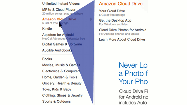
Amazon has been kind enough to overcame this hindrances for us :
Ben Kamens from Khan Academy explains you how. A must read article : those guys where quite cunning and incredibly smart.
Below, the image that rocked my world a few weeks ago :
I should add, of course all those tricks are useless if the content is not well organized and the layout is not neat: content beeing the most important thing to consider.
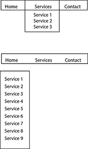
If you have just a few buttons and only one button with a submenu, then it's not bad user interface. However, if many of them have submenus you might want to consider a side page menu. Otherwise it will be hard to read and not very clear what you are trying to communicate.
In 2009 a Nielsen Norman Group finding Big, 2-dimensional drop-down panels group navigation options to eliminate scrolling and use typography, icons, and tooltips to explain users' choices.
This sounds great... but (and this is all very old by internet standards).
In 2010 they revised their statement after researching and finding more and more bad examples of the mega menus.
Mega Drop-Downs Are a Design Canvas
In the bigger scheme of things, the usability problems mentioned here aren't too serious. They'll reduce site use a few percent, but they won't destroy anyone's business metrics. But still: why degrade the user experience at all, when the correct design is as easy to implement as the flawed one?
As I stated last year, mega drop-downs can enhance the usability of website navigation. But, as these new examples show, megas can have usability problems of their own.
Of course they can.
Trying to stay on the bleeding edge can lead to bad design if you throw planning out the window. Remember to follow-up your design with statistical analysis and user feedback to see how much of a menu is wasted space or what can be reorganized to make it easier on the user. Test on the various devices and in the browsers your users use based on your analytic feedback. Bleeding edge functionality is not always backward compatible and may result in a bad user experience.
That being said, here's a 2013 exploration of Amazon's new mega menu.
The example you have given here is a hover menu. Hover menus can help in defining a large navigation and allow users to clearly see the child and sub child nodes of a main navigation and they also save on vertical space.However they are not excellent for usability as this article shows
One of the worse things about hover menus is that they force users to skillfully move their mouse through hover tunnels. Hover tunnels are passages that users have to tunnel their mouse through to click a menu item. Older users who are less tech-savvy will often have trouble doing this. Even tech-savvy users can find it annoying that their mouse has to move through a confined path to click a menu item.
This not only makes the menu harder to use, but it makes it less efficient for users to complete their navigation task fast. This is because when the menu opens, users can’t move their mouse directly to the menu item they want. If they do, they’ll accidentally close the menu. Instead, they have to carefully move their mouse through the hover tunnel each time they want to click a menu item. There’s no reason users should have to work this hard to navigate a website.
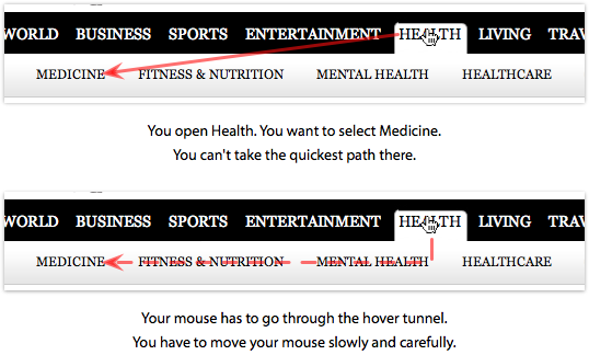
Another point stated by the article which calls out why Hover menus are hard to use is
Hover menus make peripheral items slow and hard to click.
Hover menus will close right when the mouse moves outside the menu. This makes peripheral menu items harder to click because they’re closest to the edge of the menu. Users can’t move their mouse fast to click a menu item. They’ll have to slow it down as they get closer to peripheral menu items that are farther away. And since most menu items are text links in small fonts, it makes the target smaller, which further adds to the slowness.