4

Let's say we have a grid displaying a bunch of devices, where each row is a device. The devices have performance data and configuration data. Some users are going to be interested in the performance metrics, say 6-8 columns, and others are going to be interested in the configuration data, another 5-6 columns. A clear minority of the users will be interested in both. I'm thinking about how to best display this data.

Displaying the two sets of data in two different tabs/pages feels wrong, because the row titles are the same and some of the data will overlap (names, IDs, status, maybe more).

Describing the data structure in this way suggests taking the overlapping fields out of the grid somehow, and then having two alternative views of just the different fields. That is problematic, because a) the sorting and filtering of the grid must affect the overlapping fields as well, and b) it must not affect the rows in the alternative view - I wouldn't want to filter according to performance and then see incomplete and randomly ordered data when I switch over to configuration view. In addition, there are controls outside the grid which are relevant to either one view or the other.

Any ideas besides the tabs or thought on how the tabs solution could be improved so that the overlapping data doesn't feel as strange?

P.S. Couldn't think of a decent title to this... Feel free to change it.

5
  • The title is fine imho, it caught my eye and the question was about what I was expecting.
    – Jeroen
    Commented Aug 8, 2012 at 21:21
  • What if you turn the whole thing 90 degrees, each device is a column, each property is a row? It'd make collapsing more natural perhaps, you could even create separate tables for each property groups collapsible with a [+] sign next to a header. Albeit filtering and sorting would be manual / visual then..
    – Aadaam
    Commented Aug 9, 2012 at 0:13
  • Just a thought: would the "Freeze columns" approach from MS Excel be appropriate for you? You could "freeze" the "overlapping" columns on the left of the grid and only scroll the remaining columns. In a desktop app that would be easy to attain, not sure whether there are grid controls for the web that support this kind of feature. Commented Aug 9, 2012 at 6:26
  • @Aadaam I admit I hadn't thought of that, and it's an interesting approach, but I don't think it will work here. Devices can go into the hundreds, while there won't be over 15-20 properties even if I pile them all together. Commented Aug 12, 2012 at 6:13
  • @MarjanVenema That's a great idea, thanks! It might help us handle the large number of columns. You should make it an answer. Commented Aug 12, 2012 at 6:16

3 Answers 3

2

One suggestion would be to make all three groups (basics, performance, configuration) be collapse/expand column groups. When expanding one group, the others will collapse. Only if you "lock" a group it will stay in its collapsed/expanded position even if others are expanded.

My suggestion probably works best if you can have one "main" column per group, preferably a small one (e.g. "rating" would be great). Visually this would mean:

mockup

download bmml source – Wireframes created with Balsamiq Mockups

The collapse/expand would probably work best if it's accompanied by a visually appealing animation, for example some accordeon-like effect. Depending on your case it might make sense to have the basic info "locked" by default.

One requirement you mention in the question may still be troublesome though:

I wouldn't want to filter according to performance and then see incomplete and randomly ordered data when I switch over to configuration view

You could perhaps visually "wipe" any filters on a group before a group is collapsed because another group is expanded. If a group is "locked" you might even consider keeping the filter.

0
1

Here is another option (reading vertical labels is not ideal :), maybe they can be color coded/have symbol instead and have a legend).

enter image description here

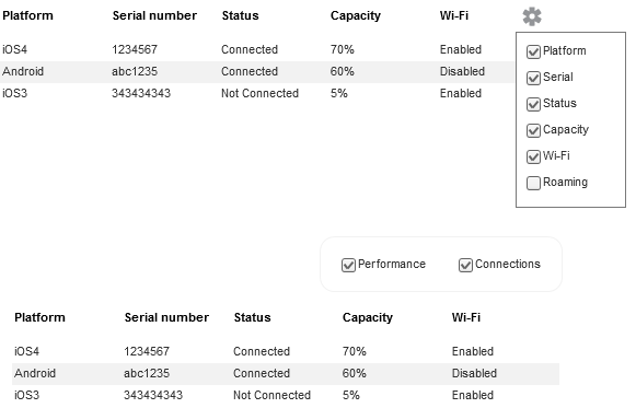
Since different users might be interested in different information, perhaps the table should be configurable to meet their goals. Visually processing a table with 10+ columns seems very challenging.

enter image description here

1

Just a thought: would the "Freeze columns" approach from MS Excel be appropriate for you?

You could "freeze" the "overlapping" columns on the left of the grid and only scroll the remaining columns. In a desktop app that would be easy to attain, not sure whether there are grid controls for the web that support this kind of feature.

Side note:

I have always tought of the frozen columns as providing "row captions". Just like the header provides column captions. You don't scroll the header out of view (when you scroll the grid, not the page), so you really shouldn't scroll identifying columns (row captions) out of view either.

Your Answer

By clicking “Post Your Answer”, you agree to our terms of service and acknowledge you have read our privacy policy.

Not the answer you're looking for? Browse other questions tagged or ask your own question.