34

I'm working on a service with limited credits and designing a counter displaying how much is left. I came across two approaches (below) and even if the first one looks simpler I feel like the second push me to fill it (and so to buy credits, which is a good thing).

enter image description here

Is there a reason why I'm more tempted by the second than the first ? Is it personal or you feel the same thing ? Is it something about progress, checking boxes, ... ?

It seems like there is a reason behind it... Probably something about user's psychology.

NOTE : if you have something else in mind which could push even more I'd be glad to learn from it.

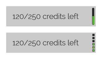
EDIT : below is a clearer mockup
enter image description here

6
  • But the left image does not reflect a 120/250 status, but a lesser status, does it?
    – 32746
    Commented Jan 14, 2014 at 9:57
  • Actually I filled it quickly but I edited my post and now it's 120/250 for real :)
    – Gabin
    Commented Jan 14, 2014 at 10:01
  • 1
    The black color of an empty fill bar is almost undistinguishable from the dark blue background. Both variants do not look like they represent the gauge. A contrast outline for the bar (or for the dots) would fix it. As for the counters, I'd prefer the second one, but with finer dots' granularity.
    – mbaitoff
    Commented Jan 14, 2014 at 10:07
  • 1
    Due to the influence of video games and health bars, I have a strong suspicion you're going to get different answers based on age groups.
    – Izkata
    Commented Jan 14, 2014 at 19:03
  • 2
    @Zhouzi I believe the reason you feel compelled to fill the bar on the right (or bottom) is because it's segmented into more discrete units. I'm no psychology expert, but I believe the way you persuade someone to commit to something is by convincing them the effort committed will be worth some resulting value thus warranting the effort. Neither variant changes the resulting value (a filled bar), however, the variant on the right (or bottom) is easier to fill comparatively and so the perceived effort required to fill is less. Commented Jan 16, 2014 at 2:06

11 Answers 11

21

I tend to agree with you - the one on the right tempt me more. But I think it depends a bit on the increments in which you get credits. I wouldn't feel very motivated if the credits build up slowly. But that is the same with both of the options. I guess with the option on the right, it feel like 6 big steps to get to 250 and on the left it is just 250 very very small steps. I feel like I'm progressing more, when taking big steps. Not sure if it makes sense, but I can't find a better way to put it.

At the moment one increment on the right is about 42 credits. If the increments are often smaller, it might be better to place the illustration horizontally along the bottom of the box and then have more but smaller increments.

2
  • 1
    I think this is the point : the second solution is dividing the progress in several steps so it's easier to see your evolution while the first is abstract. You're also pointing to an important problem of the second proposition. Since it is divided into 6 squares, depending on the total amount it'll be encouraging or discouraging. Thank you René !
    – Gabin
    Commented Jan 14, 2014 at 13:09
  • 1
    @Zhouzi see my comment on your question, but I tend to agree with your hypothesis proposed in your comment. Interestingly, this is at odds with the notion that people will spend more if they think they have more (the utility function for currency). Imagine if you reduced credits to a range from 1 to 6 and made each one more valuable. People are less likely to spend one credit because it's 1 of 6 rather than, say, 60 of 240. Commented Jan 16, 2014 at 2:12
68

Well, after thinking for about 10 min, I have to agree with you that the second one does prompt the user to fill it up. Although the difference is minimal.

For a stronger feeling of "emptiness", you can change the color of the meter according to the amount filled in.

  • 1-2 bars: Red
  • 3-4 bars: Yellow
  • 5-6 bars: Green

enter image description here

6
  • 1
    I'm not sure about this. Using colours implies that it is emptying rather than filling up (like a fuel gauge). Whereas in reality the actual meter here can only go up.
    – JonW
    Commented Jan 14, 2014 at 11:10
  • 2
    Who said the meter can only go up? Users do use up their credit scores (which is money I guess).
    – kBisla
    Commented Jan 14, 2014 at 11:14
  • Ah you're right, my mistake. I took it originally as a counter for showing how close user was to the total (like a donations / kickstarter counter) but I misread it.
    – JonW
    Commented Jan 14, 2014 at 11:21
  • Thank you, it'd definetly help to push the user to action :)
    – Gabin
    Commented Jan 14, 2014 at 12:58
  • 2
    To manipulate the consumer a step further maybe OP could also use a slightly exponential representation ?
    – franssu
    Commented Jan 14, 2014 at 17:10
17

enter image description here

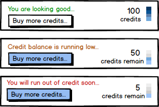
On a closer read of the design problem, the aim is to show the user the receding credit limit and persuade to purchase more.. I will reverse the design [aim is not to complete but fill] and add a clear call to action.


enter image description here

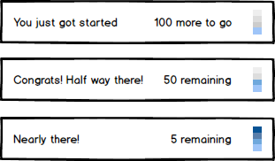
Persuasion to complete can be achieved in letting the user now how much more is remaining. We are used to such examples in our daily life and can relate to the need to "complete" it. E.g.

  1. 50 miles from destination
  2. Half way there on a Treadmill
8

Personally, the first one makes me want to fill it. The second one already looks like it is made of some blocks, it is not a single object.

I'd also recommend you to alter color depending on how low balance is. E.g. green is when it is 50% full, yellow when it is less than 50% full and red when it is really low (10% or so).

If it really critical for your service to have balance you can even make it slightly (really slightly) pulse with red if it below 5%. If made subtle it will drag attention and won't look too annoying. But add animation only if human lives depend on this.

1
  • 2
    I have to agree with this one - my gut reaction upon seeing them is to want to see the single bar fill up more. It's more fluid, and implies you can do more with it.
    – Izkata
    Commented Jan 14, 2014 at 19:02
5

The reason the design on the right (what I'll call the "chunked" display) grabs your attention more is because that type of discrete-boxes design is often used to represent battery levels on electronic devices such as cell phones, computers (battery button on a macbook, for instance), etc.

The reason that it is more common is because it is easier to implement a chunked display using cheap electronics (a row of LEDs) than it is to implement a continuous display (which requires some sort of high-res display).

Because of the relative commonness of the "chunked" display, most humans have a more deeply-ingrained classically conditioned association that makes them want to see all of those lights lit up.

It's that simple, IMO.

4

I'm more inclined to fill the left progress bar, which is akin to a glass of liquid. The right one seems to require 3 undefined units. If the squares represented ammo, then i'd be more inclined to fill that, as it looks more volatile.

4

I would say none of them as they do not induce me to fill them. If intention is to persuade me this is not working yet.

Another question could be which option is seen filled? The version on the RIGHT seems more like half-filled than the one on the left. Left version can be easily confused with a scroll-bar.

If you can increase the contrast between the unfilled background of progress-bar and blue background of the container then progress-bar would be noticeable then it is now.

1
  • Thank you, that was a pretty bad out-of-context design. I edited my post and added a mock up regarding your useful tips.
    – Gabin
    Commented Jan 14, 2014 at 13:00
2

I would say none of them, if you want to use some sort of psychological aspects of the design, look at your audience, if they are young use a glass of wine as a measure and fill it up based on current credit (or even a few small Shot Glasses), if they are young female looking for slimming products use a scale with red and green zones, if they are middle aged women use a nice set of moon glasses filled and empty! And if it's real money another approach could be using dollar bills for each block!

If you have no specific group in mind, you always can use games strategy for showing how many more rounds you can play, they show it with hearts or circles or just like the way you did it by green blocks, my opinion regarding your current design is that if you have to go with either one of them make them more visible, for example you can use horizontal design which will be larger and you can expand it above or under your text.

PS: forgive my stupid examples I just made them up!

1
  • As @René Rasmussen said its good to consider the increment measures for motivating users to fill smaller steps as soon as their credit drops.
    – Marzy
    Commented Jan 14, 2014 at 11:43
2

I think this might have something to do with humans being better at qualitative data than they are at quantitative data. The second example seems more obvious or intuitive because it's easier for us to split things up into 3-7 groups than it is to gauge a continuous scale.

That's why we have things like the pain scale (the chart of different types of smiley faces used in hospitals to determine the amount of pain a patient is in) and the Likert scale (pick a number from 1-7, 1 being strongly agree and 7 being strongly disagree). It is much easier for us to pick a category ("my pain is at a 4") than it is to come up with a continuous number ("my pain is at 40%").

Although, I agree with other people about color being helpful- again, it's easy for us to split things up into red, yellow, and green as opposed to "well this bar looks about 25% full, better fill up".

2

A reason the one on the right grabs your attention is due to how the human mind groups objects. http://en.wikipedia.org/wiki/Gestalt_psychology#Gestalt_laws_of_grouping

In short, on the left, there is ambiguity in the grouping. Is it one box, or two boxes of different colors. So your subconscious may be switching between one box and two boxes, not leading to a clear impulsive understanding of the shape. You consciously understand the meaning, but not subconsciously.

The one on the right, more clearly defines the empty parts and provides a separation between full and empty. Your subconscious can figure it out, so then your subconscious can make you want to complete the set (buy more credits).

1

This has to do with how your brain perceives images and interprets them. The first, solid bar seems bigger/fuller because there is no break in the continuity of the fill meter image. The one on the right is broken up into smaller "chunks", so the brain interprets it as smaller, even if it represents the same amount.

So if you are going for a psychological boost to wanting them to fill credits, the one on the right is probably preferable. However, if you want them to feel the progress and satisfaction of having filled more, then the one on the left would be preferable.

1
  • Do you have any links to back up your assertions about how the brain perceives images?
    – Fractional
    Commented Jan 15, 2014 at 17:00

Your Answer

By clicking “Post Your Answer”, you agree to our terms of service and acknowledge you have read our privacy policy.

Not the answer you're looking for? Browse other questions tagged or ask your own question.