48

I'm trying to design a control where the user can enter a figure that has no maximum value. For example, how many miles that person wants to travel that year.

There's a text field there for direct entry, but I want to make this tweakable. The control updates another field in real-time, so as they make changes to this 'miles' field it updates a map elsewhere showing how many times around the world that works out as, or how far towards certain countries it would take you. That sort of thing.

Text fields aren't very 'tweakable'. But because the total in the box could be anything (it could be 10, it could be `10,000) going with standard +/- options would be pretty painful. so I added in a slider to adjust the value that way.
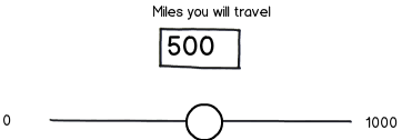
mockup

download bmml source – Wireframes created with Balsamiq Mockups

However, the drawback with a slider is that by the very nature of the control there is a maximum value. So I tried to come up with an alternative.

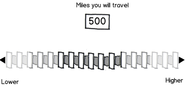
My idea was to mimic a horizontal 'thumbwheel' - the sort of scrollable cog you get on volume controls (or the mouse scrollwheel too) but one with no end - it just keeps rotating as you scroll:
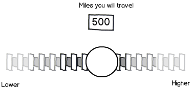
mockup

download bmml source

I designed it so that when the user gets to the end the thumb drops back to the middle, or when they let go of it the thumb returns to the middle again, so that they could then scroll to the end again, then repeat ad infinitum.

Unfortunately, this is suffering from the same issues as the slider. Usability testing finds that people still treat this control like a slider - pulling it to one end of the bar and not letting go, or not understanding that it can be used in the manner I had hoped.

I think my metaphor of a thumbwheel may not have been ideal here. Unfortunately I only have horizontal space to work with. So what am I doing wrong? Is there a better control I could go with to allow the user to adjust the text figure up/down?

Because the total in the box could be anything (it could be 10, it could be `10,000) going with standard +/- options would be pretty painful.

7
  • 1
    Does your users milage have a distribution (normal distribution is what comes to my mind) of how far they travel, or is it random (e.g. it's just as likely that the user will chose 35 miles as 346,352 miles)? Commented Oct 3, 2014 at 12:17
  • It's probably more likely people will pick something within a range of a few thousand. But as it's just an interactive 'toy' thing they'll be encouraged to play around with wildly different figures. It's more the method of inputting these figures I'm concerned with rather than the specific accuracy (it's a textbox too so can be typed in directly).
    – JonW
    Commented Oct 3, 2014 at 12:28
  • But there is a maximum.
    – paparazzo
    Commented Oct 3, 2014 at 15:34
  • 2
    yes, so if you imply a max value at the end the user will most likely wonder why: that is a max value and why they can't reach it quickly with this control.
    – colmcq
    Commented Oct 3, 2014 at 16:22
  • 2
    Have you thought about making the slider adjust the speed of increment instead of the increment itself? Further to the right is faster ascending, further to the left faster descending, etc.
    – Mast
    Commented Oct 5, 2014 at 20:00

15 Answers 15

33

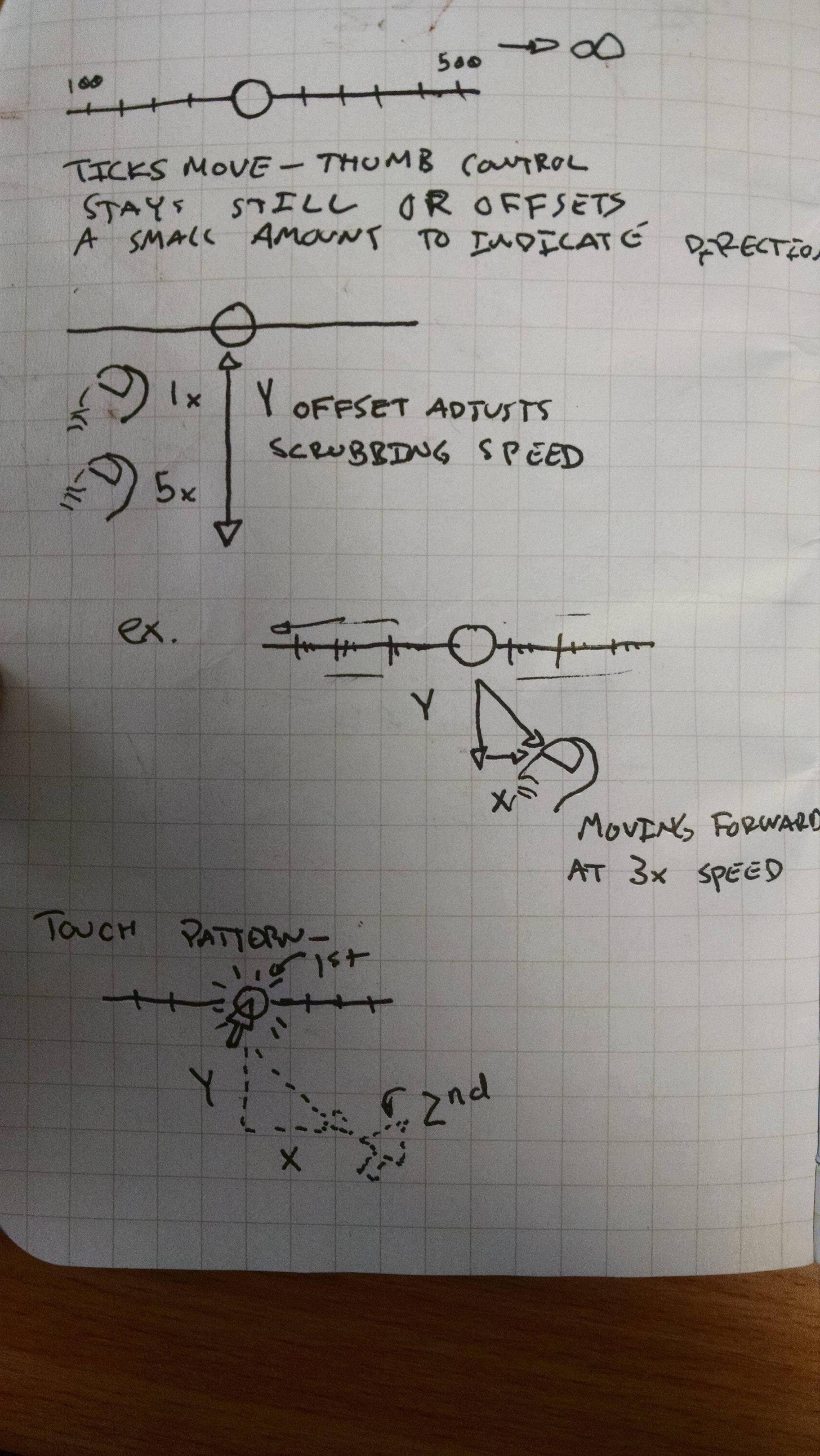
I've always been enamored at the way the iOS quicktime application works when viewing MP3s in Safari, and I think this method can be adapted for your use. We can stay with a normal slider bar - perhaps the handle could be changed from the normal circle to show a difference. We can add tick marks to the bar and numbers that change on either end. Then, instead of having the user drag a moving marker along the fixed slider bar, we can flip the equation - fix the marker and illustrate a movement on the slider bar by animating the ticks. We allow the user to slider their finger / mouse off of the marker and use the y axis of this input to adjust the scrubbing speed - the further offset the mouse / finger is from the marker, the higher the scrubbing speed in the given direction (we can use the x axis to determine forward / backward). We can even offset the marker visually a bit to illustrate the current direction of movement. The ticks animate, and the numbers on either side change to illustrate the current range.

Reasons I feel like this might work:

  • The variable range you mentioned is present
  • It allows for fine tuning - simply move your finger closer to the bar when you want the multiplier to be lower

Reasons why it might be confusing:

  • It might not be immediately apparent that you can move your finger from the slider bar to adjust values, and there may be a confusion because the user is used to dealing with slider bars and this one behaves differently.
  • It may be a more difficult analogy with a mouse pointer instead of a finger

I don't have an iOS device, so I've included a small sketch as well to (hopefully) better illustrate this. Sketch of a slider bar!

3
  • 1
    Ah, this seems like a suitably obvious option that I can't believe I didn't think of! Always the way isn't it, instead of a massively overengineered solution there is always a simpler one. I'll see if I can knock this up and see how it works out.
    – JonW
    Commented Oct 3, 2014 at 16:50
  • I'm glad this was helpful! I am excited to see what you come up with.
    – Jake Liff
    Commented Oct 3, 2014 at 16:52
  • great concept and very well illustrated! how about adding + and - buttons at the extremes of the scrollbar? it would be an additional guidance to novice users. Also how about increasing the scroll rate with time (to a certain extent) so that the operation is faster even for those who don't realize that they can move away from the bar?
    – BatlaDanny
    Commented Oct 3, 2014 at 18:00
32

Well, I guess there is a maximum number of miles someone can travel in a year, since there are a finite number of seconds in year, and one cannot exceed the speed of light.

A more practical limit may be 1000 miles every three days, which would be about 100,000 miles in a year.

I suggest using a normal slider but with a logarithmic scale.

i.e. equal spaced notches for the following values:

0, 10, 100, 1000, 10000, 100000

Or if you need more resolution, then:

0, 10, 20, 50, 100, 200, 500, 1000, 2000, 5000, 10000, etc.

ALTERNATIVELY:

You could have plus and minus buttons and a number.

[-] 5000 [+]

Plus increases the most significant figure by one (minus reduces).

You will only get a subset of numbers though:

1,2,3,4,5,6,7,8,9,10,20,30,40,50,60,70,80,90,100,200, etc.

then 300-900, 1000, 9000, 10,000-90,000 and so on.

6
  • 1
    Obviously this might make it difficult to select very precise values (e.g. 17,491 miles), however it would be difficult to predict future travel with that kind of accuracy and a logarithmic scale will make it easier for the user to choose an appropriate order of magnitude.
    – Paul S
    Commented Oct 3, 2014 at 11:16
  • That is kind of how I tried to put my control together. I split the control into segments, moving the thumb to either extreme end increase/decrease the total by 1,000, whereas moving the thumb slightly off centre to left/right change the value by 1/-1. Plus some notches inbetween. It's still too confusing for users though. Especially because at one end the counter goes up in thousands, so moving the thumb back a bit still increases the total, only in 100s instead. It's not behaving as users expect, but it's hard for them to describe how they do think it should work.
    – JonW
    Commented Oct 3, 2014 at 11:43
  • I think I get what you mean. What I had in mind was something like this (very rough example): jsfiddle.net/cpwmdekm (it does limit what numbers they are able to select, but I'm assuming if your example is miles per year, they won't know an exact value)
    – Paul S
    Commented Oct 3, 2014 at 12:34
  • Your jsfiddle still has a max value though. You can reach the end of that slider. Whereas I want something where there is no end. That's why I went for a 3Dish looking cog that can rotate all the way around and keep going. It's a tricky one I guess.
    – JonW
    Commented Oct 3, 2014 at 12:39
  • 3
    Okay, I was going with the 'miles per year' and assuming that there was a max, albeit a very big one. a logarithmic slider should be usable up into trillions or more. Slight tidying up of output: jsfiddle.net/mwobdh7z
    – Paul S
    Commented Oct 3, 2014 at 12:40
22

One interesting solution that hasn't been proposed yet is a sort of "odometer" that the users could set to the desired number. This would have the benefits of preventing users from having to scroll through smaller numbers to get to larger ones, allowing users to be as precise as they wish, and being as simple as plain text entry without messing with a keyboard.

Odometer to set to "miles"

You can make it so if the user click on the top or bottom of a number, it would swivel to the next number in the direction desired. In addition, the user could drag a dial up or down to match the number they want. I admit this solution isn't "infinite" like was originally requested, but you could add enough dials to be reasonably sufficient, or you could add a + button on the left if the user wants a greater order of magnitude.

3
  • 3
    I think this solution fits with the "mileage" theme perfectly. To me this is the best solution, as it clearly gives the user a way to input their information quickly. A plus button at the left-hand side could be used to add an infinite number of Most Significant digits, one at a time. So start with 7 digits for up to 9,999,999 miles and I bet nobody will ever even use the + button! Allow clicks at top and bottom of each digit to change, or drag each digit up/down to set. Commented Oct 4, 2014 at 16:10
  • 2
    Here's an example, without the dragging up/down added yet: jsfiddle.net/hn8a61mx Commented Oct 4, 2014 at 16:31
  • Completely agree that that this is perfect for keeping the theme of mileage. Plus as @esamek points out, 7 dials will be more than sufficient. You can probably even get away with 5, but 6 dials looks better to me, and obviously has a higher maximum.
    – dberm22
    Commented Oct 6, 2014 at 13:32
9

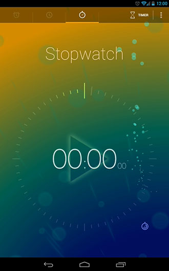
Reading @Henrik Ekblom's comment about circular controls reminded me of how the Timer app works on Android phones (image below is from the Timely app). You can add as many minutes/hours to the timer as needed by continuing to drag the cursor in a circle around the clock. Obviously the circular format works a lot better for clock-like functions, and it could be more difficult to use with a mouse-based interface rather than a touch-based interface.

Timely Stopwatch

However it remains the best example of a control for specifying a specific amount with no maximum. Depending on what numbers you use for labels and where you place them, you could give users the control to be as specific as they'd like.

The biggest downsides to a circular control is it takes up considerably more space than a horizontal slider, and it is strongly associated with clocks and time.

2
  • Volume controls are circular and new stereos often has endless rotation ability on them (even though the software reaches a maximum value for the volume after some turning) Commented Oct 3, 2014 at 15:44
  • 5
    I did consider a circular option as that would translate well on a mobile. However this is a desktop only interface so I don't have the space for a circular one. Plus, I imagine that this control is very intuitive with a finger but incredibly fiddly and annoying with a mouse cursor.
    – JonW
    Commented Oct 3, 2014 at 16:25
8

I suggest you replace the slider with a dial by removing the thumb indicator and adding arrowheads on either side so it looks something like this:

enter image description here

I use a program at work that uses a similar dial to control frequency during an online simulation, and I've never seen anyone get confused with it. Here's the interface:

enter image description here

3
  • 1
    Yeah, this was an alternative version I tried out having already posted this question. Early tests seemed OK and better than my initial version, but I was only able to test with a few people so will try it out again to see how intuitive and easy to use this version is.
    – JonW
    Commented Oct 3, 2014 at 19:25
  • Do you know the name of the software where you grabbed this screenshot?
    – JonW
    Commented Feb 12, 2015 at 9:38
  • 1
    @JonW it's from SIMPACK 9.7
    – Tymric
    Commented Feb 12, 2015 at 13:00
6

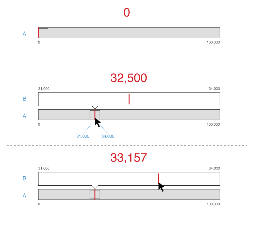
It seems like your users need something that first selects a less detailed milage area, with big steps. When that area is selected it's time to fine tune. One way of doing that could be something like my image below shows.

As soon as the user clicks and drags in the span control (A), the red marker follows and a more fine tuned area (B) shows up. The user can move the mouse up to area B to fine tune the milage.

(Blue text is comments)

enter image description here

2
  • 2
    Darn, reading your comment I noticed that one important thing was the endless part. Darn... Maybe pieces of this can be used... Back to the drawing board :) Endless controls exists, they tend to use circular movements since circles has no start nor end... Commented Oct 3, 2014 at 12:42
  • Hmm, an interesting idea. Albeit one that still has a maximum amount on the slider, but would allow to have a ludicrously high maximum that it'd be unlikely the user would ever need that much. However this option does require two inputs, and would mean most of the tweaking would have to happen on the second (B) bar. If someone enters 100 but wants to see what the results would be like on the 15,000s range that is going to be tricky (but still possible here, I agree).
    – JonW
    Commented Oct 3, 2014 at 12:47
5

I like your general idea, but it seems that your users are not getting the metaphor. Which leaves you with two options:

  1. Make it very skueoumorphic, hoping that they will get the hint. Instead of using a slider, use something which looks like a physical lever that can be pushed more or less to the left (or right), and beside it a spinning number display like the one from Chase Sandman's answer, which turns quicker or slower depending on how far the lever is pushed. It will probably take the point across, but it's very showy, and will probably not fit with most designs out there.

  2. Forget about the metaphor altogether, and use a simple, straightforward digital control which has nothing to do with a thumbwheel. This would be my preferred option. My first attempt would be just a few incrementing and decrementing buttons:

mockup

download bmml source – Wireframes created with Balsamiq Mockups

With the steps I am showing here, it is semantically equivalent to the spinner proposed by Chase, with the downside of taking up more space. But it is more flexible, because it can choose the steps as you want and not only in powers of 10 - for example, you can have +1, +10, +50, +250 or whatever makes sense. As for the infinite number, I'd say only start with numbers which make sense for the usual range, but show additional buttons once the user reaches an unexpectedly high number.

It is probably a nice touch to make these not just normal buttons, but have them increment steadily when long pressed, like the controls of some physical watches. While this feature will have low discoverability, the ones who discover it will probably appreciate the playfulness (you said that you want to introduce some, so I assume it's OK with you), and the ones who don't discover it are not prevented from efficiently entering the information by multiple clicks.

You will have to test this suggestion against some of the others proposed here before finding out which works. I haven't seen it in practice and so cannot guarantee it has no gotchas.

7
  • I like this idea (number 2) for the clear usability aspect of it. But as a result it does reduce the UX I think (It's always a balance between usability and experience!) but perhaps there is a happy medium somewhere. Some custom buttons perhaps, something that can be tried out in design rather than wireframe. I'll look into it I think.
    – JonW
    Commented Oct 6, 2014 at 11:06
  • Anyone who ever bought a BART ticket (Bay Area transportation) will tell you how much they hate it! The problem with this solution is that it forces users to do the math themselves. The few times I bought a BART ticket I found this quite frustrating and I am not the only one apparently: bit.ly/1z13m8U
    – Ucodia
    Commented Oct 23, 2014 at 14:11
  • I am not fond of this solution but at least a nice touch to make it a little better would be to group the add and substract for the same numbers. For example make a first row with add buttons and a second row with substract buttons. This way if the user presses a add button one time too much he does not have to search for the substract button to cancel the last click. In the proposed layout he will have to seek and think to activate the opposite button.
    – Ucodia
    Commented Oct 23, 2014 at 14:27
  • @Ucodia I don't think the BART example applies here, as this is a very different use case. If people really want an exact number, and know it at the beginning, entering it will be better. If this is the case, none of the possible answers to this question will be good, because the OP specifically asked for a UI for incrementing a counter. But I believe it is a different situation, where people want to play around until a number looks roughly OK, not where they want an exact value.
    – Rumi P.
    Commented Oct 27, 2014 at 8:42
  • @RumiP. I agree precision is probably less important in the case described by OP but the scenario is really similar, in both case they already know the number. But anyway it still forces the user to think how to do the math to be at least a 10/50 miles close and thus which combination of different buttons he should press. Might yield a frustrating experience.
    – Ucodia
    Commented Oct 27, 2014 at 16:48
4

I might be missing something (you might have been referring to this when you said "standard +/- values"), but this seems like the perfect use case for a spinner:

enter image description here

The design of the spinner is such that "the appearance of the spinner at a given time does not represent the quantity of the associated value" (Wikipedia). Thus, you wouldn't run into the problem you currently face with the slider, which has distinct endpoints.

Furthermore, spinners make it easy for users to select any value (large, small, precise) because they have several ways to input the value: directly entering it into the text box, clicking the up/down buttons, and pressing the up/down arrows on their keyboards. If they want to scroll quickly through the options, they can hold down a button/key. Finally, spinners are a well-known UI object, so users already know how to interact with them.

2
  • 1
    Can you illustrate what you mean by a spinner in this sense? That is an often overused term in UI so it's better to show an example of what it is you're referring to and how it would be used in this situation than just describing the control alone. I'm also not sure what your attached image signifies in this context. (Unless that is the 'spinner' you refer to. In which case I really don't understand this).
    – JonW
    Commented Oct 4, 2014 at 22:00
  • I know many UIs where you can also press the center betweeen both buttons and then move the mouse up and down to select the value - when moving up if the mouse reaches the top of the screen it reappears in the bottom so you can move up endlessly...
    – Falco
    Commented Oct 6, 2014 at 9:06
3

EDIT

Whatever number the user enters into the text box, that is the middle value of the slider. They can tweak that number by sliding left (for less miles) or right (more miles). How much distance to place between the middle number and the upper and lower ranges is up to you.


In your case, there is a maximum number.

1 Year is 365 Days or 8,760 Hours available as travel time.

The average speed of an airplane is 550 mph.

A Boeing 777-200LR is a long range passenger jet, and its maximum distance with load is about 10,800 miles, or about 19.6 hours assuming its traveling at the above speed.

So even if literally landing and then immediately taking off (and somehow refueling instantaneously), a 777 can go its maximum distance ~447 times.

Thus, ridiculous yet defensible, the maximum distance a person could travel in a year is 4,827,600 miles.

How about this:

Let the user (or your default) set the maximum number for the slider. So the right side value of the slider is always equal to the text field. That way, people can either enter in the number, or increase it and see what happens when they lower it. You could also try the variations of this approach.

4
  • 2
    Hmm, letting the user set (and change) the maximum is an interesting idea. Although I'd wager people never actually change the default (people don't tend to with defaults) but it's an interesting idea.
    – JonW
    Commented Oct 3, 2014 at 13:02
  • If you're asking the user as a required field how many miles they want to travel, then the max value would be set. The question is, do they want to see the real time tweaking affects of more miles or less miles...which brings me to another solution...
    – esamek
    Commented Oct 3, 2014 at 13:06
  • Yeah, having the user set the maximum basically means you're having them manually type in the actual mileage they want, ergo reducing the need for the 'slider'. Well, it'd mean the 'slider' only gets used for tweaking rather than initial entry.
    – JonW
    Commented Oct 3, 2014 at 13:08
  • However, "I have a spacecraft that can travel at 0.99999999c". The limit is the speed of light limit, meaning the max somebody could travel is just shy of 5.87849981e12.
    – Kaz Wolfe
    Commented Oct 6, 2014 at 17:37
3

Put a logarithmic scale on the slider. Larger values rarely need to be precise, so you can put a quite large upper limit on it. Take the largest conceivable value for this input, add 50%.

In response to the system wanting volume rather than substance, I will restate what I said in the above paragraph.

The question wants a scrubber/slider-style control, but with a very high upper end. If you put a logarithmic scale on the scrubber you get both detail at the lower end and a very wide range at the upper end. This is what "logarithmic" means. Significant-figures rules say we rarely need "104,253" - 100,000 is usually good enough, but 20 vs 25 is important.

2
  • 1
    Please illustrate what it is you're recommending here. A one-line answer isn't really ideal here as it could be interpreted in any number of ways.
    – JonW
    Commented Oct 4, 2014 at 22:01
  • 3
    What explanation would you like? Use a standard scrubber control, but instead of 1-1000 linear use 1-10,000 logarithmic. I don't see how this could be interpreted any other way.
    – paul
    Commented Oct 5, 2014 at 3:38
1

Hopefully I understand how you've implemented your "thumbwheel" concept so that I'm not simply rehashing the same idea, but the following concept comes based largely on what you've already laid out.

At the moment, the way that you've designed the thumbwheel means that to get through large values (such as when adding 10,000 miles), you would need to repeat the same action a number of times (dragging to the end and letting go), which could be an issue for users due to the fact that repeating this task numerous times could become fatiguing. A better solution to this might be to use the same concept, but instead of increasing the value only after the user has dragged to a certain point and let go, you continually increase the value while the user is holding the circle away from it's central resting point.

To elaborate, this would mean that while the circle stays in the centre, the value doesn't change at all. If you drag the circle slightly to the right, it increases the value based on how far you have moved the circle away from the middle, and it does this every x milliseconds. This means that the user can move the circle a certain distance and then wait while the text field increases in increments of only a small value, or they could move the circle to the very right hand side and wait while the value increases very quickly.

A real life example of this idea can be found when scrolling using middle mouse click on web pages. If you go onto a sufficiently long page, click the scroll wheel down and then move the mouse either up or down, you'll see that if you only move a small distance, the page behind will move in the same direction at a speed that represents the distance between the start point and current point of your cursor. In this case, the cursor represents the proposed control, while the page behind represents the counter that is being incremented or decremented (the comparison is a bit of a stretch, but it's relatively hard to explain otherwise).

The benefit of this kind of approach is that users can move large amounts by moving the slider to the very right hand side and holding it there, stopping (or slowing down) when they are close to the value that they want. It also bypasses the issue of having no maximum value, as the value can continue to increase as long as they manipulate the control.

This idea isn't a new one, but I am unsure of what name the control has traditionally been given. I'm also relatively sure that I've seen it applied physically in the past, although I'm not entirely sure where.

2
  • 1
    Your description is sort of what I was trying to go with. The idea sounds great in principle, but because visual control is a static form control I don't think the users are understanding the intracies of how it operates. They just use it like a scrollbar - shove it to one side and the result ends up at 120,000, then shove it the other way to correct it and the result shoots down to 100 or so. Getting them to understand that it can be used in small increments is the trouble here. If it requires instructions for use then it's no good.
    – JonW
    Commented Oct 3, 2014 at 12:49
  • 1
    @JonW After looking at my solution again, I'm tending to side with what you've said. Unfortunately this kind of control is pretty rare, so for the average user it would be somewhat foreign and hard to understand, especially if you just drop it in front of them without explanation. I think that the effort I had to go to try to explain it in the first place should probably have tipped me off that it wasn't a very simple solution. Thanks for the feedback. Commented Oct 3, 2014 at 13:09
1

I propose that you display (1) a position indicator (displaying a number of miles, for instance) and (2) a "speed knob" (a thumb on a slider).

Let's suppose that the speed knob position goes from -1 to 1. Then when it's in position x, you increase, once per tick of some clock (e.g., once every 60th of a second) the position indicator by an amount Ctan(pix/2) for some value C that you choose by experiment, and which depends on how fast you want people to be able to move. As x approaches 1 and -1, this rate of increase will go to plus-or-minus-infinity, so you can move very fast...but in mid-control, it'll be pretty rational and controllable.

Igarashi once proposed something clever for map-scrolling -- can't recall the reference -- but the idea was that the map scrolled in proportion to how far you moved your mouse...except that when you moved your mouse more, the map "zoomed out", so that your effective speed across the map was very fast.

In your case, imagine having those "tick marks" so that every tenth one was red. You move the mouse to the right, and they begin spinning past...but the distance between them also shrinks a bit...and if you move further right, it shrinks more, with the grey tick-marks fading out, until now you just see the red tick-marks moving...and it turns out that every tenth one is blue...and so on, through multiple levels of scroll. Basically, if you're between positions -1/2 and 1/2, you see grey ticks with occasional red ones; by the time you reach +/- 1/2, you really see only red ticks, with occasional blue ones; that pattern remains as you go from 1/2 to 3/4, at which point you're seeing blue, with occasional green ones; from 3/4 to 7/8, ... well, you get the idea.

Of course, you COULD make the grey ones fade out at first, and the red ones, as they get closer and closer together, get more and more grey, with new BRIGHT red ones every ten steps, and so on, so that you don't have to keep inventing new colors.

In short: use a mapping from your available cursor space, which is an interval, to a larger part of the reals -- something like 1 / (1-x^2), or the tangent function I suggested earlier.

0

How about having two controls--a pull-down or "zoom" control which selects a range or scale, and a slider which selects a number within the indicated range, or of a suitable scale?

Another approach, depending upon the precision with which values must be entered, is to use a logarithmic scale, so that the values 1, 3, 10, 30, 100, 300, 1,000, 3,000, 10,000 are roughly equally spaced. That will allow some reasonable precision at smaller values while still allowing the selection of larger ones.

0

Any kind of control which presents a visual start and stop is going to be problematic for your criteria. Why not just use scroll to modify the input field? The ratio of pixels to distance units can be customized, and scrolling affords a much more natural interaction than repeated clicking/tapping, or trying to carefully navigate a number line. I've prepared an example to show how it'd work:

http://codepen.io/jessejackson/pen/taAbB

The only things you'd have to modify are:

  1. Make it a scrollable element within the flow of your form/page
  2. Add an EventListener which would modify the scroll position if the user manually entered a value (so that if/when the user scrolls again afterward, it would begin to modify the value starting at the point the user entered). In this step, you would also add functionality to increase the height of the scrollable element in case the user enters a [ridiculous] value beyond the element's maximum (I started it at 20 000 000).
0

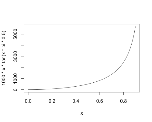
You could map from a scale [0,1] to [0, Infinity), with the condition that the derivative at x=0 is 0, the derivative at x=1 is Infinity and that y=500 at x=0.5, say. For example, f(x) = 1000*x*tan(0.5*pi*x), which looks something like this:

Non-linear transformation

On this scale, you have the following values:

  • 0 <-> 0 miles
  • 0.1 <-> 16 miles
  • 0.25 <-> 103 miles
  • 0.5 <-> 500 miles
  • 0.75 <-> 1810 miles
  • 0.9 <-> 5682 miles

Of course, there are plenty of other transformations you could use, and you might want to play around with some others. One of the problems is, the further to the right of the scale you go, the more difficult it is to fine tune. A 1% increase at the x=0.1 corresponds to 3 mile increase. A 1% increase at x=0.9 corresponds to a 700 mile increase.

1

Your Answer

By clicking “Post Your Answer”, you agree to our terms of service and acknowledge you have read our privacy policy.

Not the answer you're looking for? Browse other questions tagged or ask your own question.