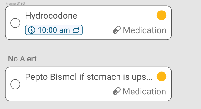
I am creating somewhat of a reminders feature for my app and one of the features (time) is optional. When all options are selected, I have an ideal layout with one item in each corner of the card. When the time is missing, however, I feel that it is best to move the category to the bottom left for readability, even though the cards with time have the category in the bottom right. I want to keep the layout of the first card because the title and time are most important, so by keeping them left aligned users can scan and get the important information first. My issue is, with the second card (no time), will the inconsistency in card design throw users off, even if the readability is improved this way? An image is provided below:
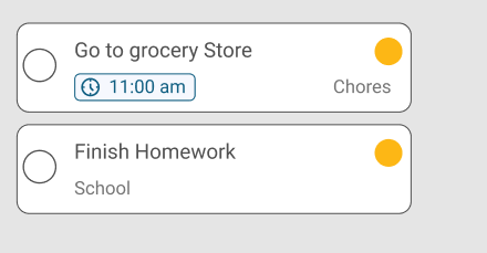
Solution: I decided to keep the layout of the first card while removing the time entireley from the design when it is not there. Here is the layout of the current solution, with fixed margins:


