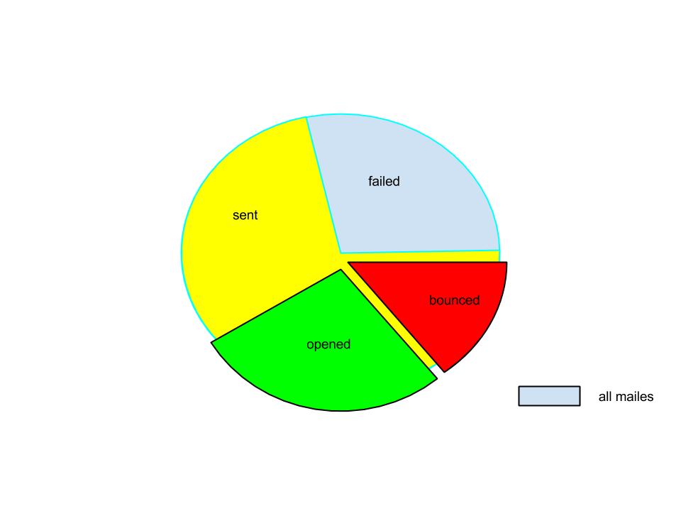
For example, take the following data, with:
- Recipients
- Sent Mails
- Opens
- Bounced
I want to show the data like this:
- First whole pie for the reciepents. (100%)
- Sent mail (80%)
- Opens (30%)
- bounced (20%)
Note: opens and bounced are the part of the sent slice.
How would it be best to display it graphically. I've thought of using a pie chart, which you can see below.

