2

So at my job I have been tasked with the designing, development and implementation of our customer based application. We already have one however it is out-dated in terms of style and functionality. Long story short: Our customers wanted the ability to see time-series data that was associated to their account and have it represented in the application. The simplest solution was to generate a graph that took that information from the server and displayed it visually, as you can see below.
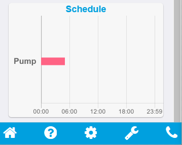
Please ignore the scroll-bar - Cordova adds it into the emulator however it doesn't appear on a device.

That's just an example of one device that is associated to that users account. Most customers have 2-3 devices so they are simply stacked on top of each other. The user is quickly able to see that their 'Pump' device runs from midnight-5am.

However: I have never been too sold on this design and although all of the internal stakeholders agree that it is 'good', I am not satisfied. I always ask my SO (significant other) for her opinion as well and she shares the same views with me that being: "Is there another way to display that graph or information? It's okay but could probably be better".

So TL:DR - Any advice or ideas on how to better represent a time-series based data?

4
  • What conclusions do the users want to draw from the data? What task are they trying to accomplish? There are many visualizations, but without answers to these questions, it'll be hard to choose between them. Commented Aug 25, 2016 at 16:25
  • "Our customers wanted the ability to see time-series data that was associated to their account and have it represented in the application" - this is a solution, but what is the problem that it's supposed to solve? Assuming that this is a valid solution, it's difficult to suggest alternatives without more context. Why are you not sold on this option? What specifically are its shortcomings?
    – LynnseyS
    Commented Aug 25, 2016 at 20:37
  • @AlexFeinman The users are basically wanting to be able to gather a quick snapshot of when devices are scheduled to run over a 24hour period. The potential to show users the set value (power output) of each device is also another bit of information they would like to dissect, however I plan to tackle this by simply adding a tooltip when they click on the selected device on the chart.
    – Nomm
    Commented Aug 30, 2016 at 0:41
  • @LynnseyS One of the main shortcomings is the fact that the graph only gives a 24hour view which isn't that accurate. By lack of accuracy I mean a device might only run on a Monday from 1-3pm but will constantly be shown to the user on the graph as it only represents a 24hour time-frame. I was potentially thinking making the graph update with the latest 24hour time-frame to avoid this potential issue.
    – Nomm
    Commented Aug 30, 2016 at 0:43

2 Answers 2

1

If you use a customizable tool like the one used to render this Inverse Bar Graph, you could easily put the different devices in separate charts, combine all and use different coloring, show/hide devices by clicks on a chart legend, adjust the height of the chart, etc.

0

Have the list of devices that users have on Y axis so that it does not over lap. Also give each device a different color so that the user can differentiate easily.

1
  • 1
    Definitely a good idea - especially on the different colour aspect. There isn't a lot of devices a user can have so the colour pool to pick from will be quite small so that way the same colour palette can be applied. :D
    – Nomm
    Commented Aug 30, 2016 at 0:41

Your Answer

By clicking “Post Your Answer”, you agree to our terms of service and acknowledge you have read our privacy policy.

Not the answer you're looking for? Browse other questions tagged or ask your own question.