87

Problem:

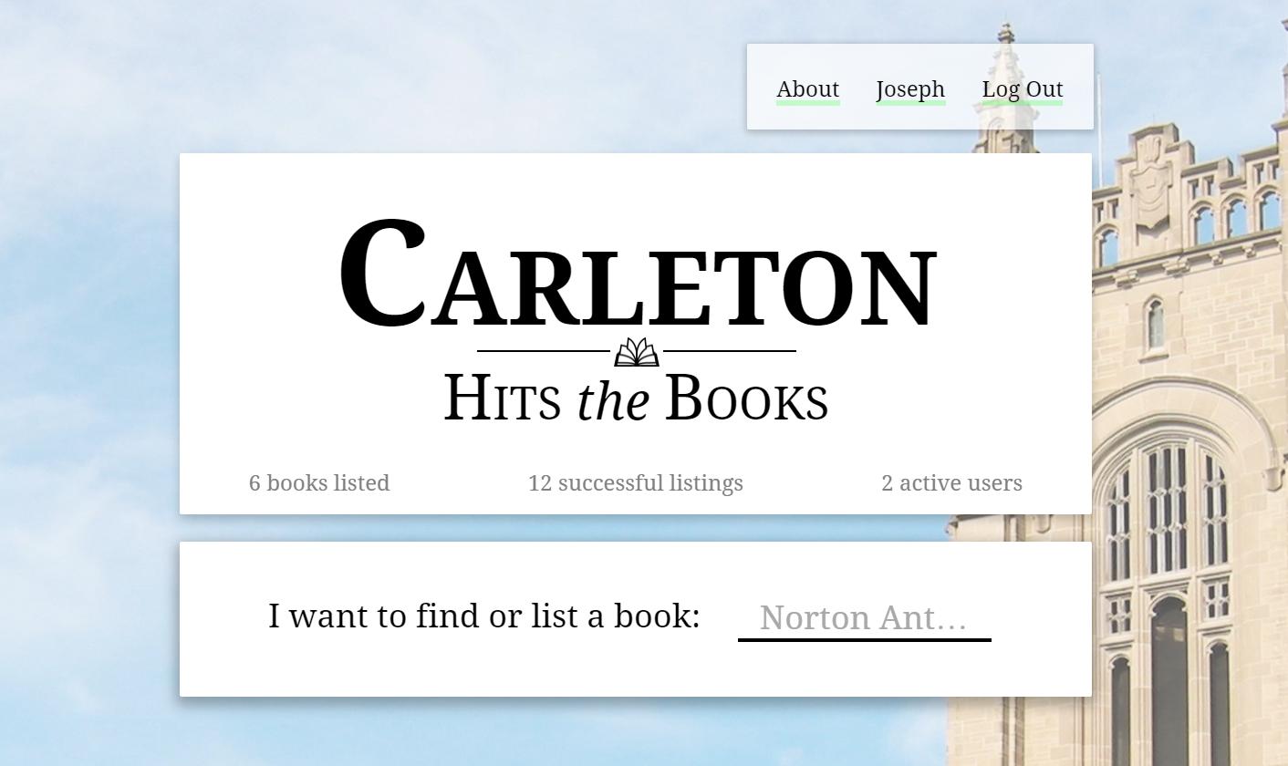
I am currently building a textbook exchange website as pictured below. During beta testing users kept trying to click the three snippets of text under the logo ("6 books listed," "12 successful listings," and "2 active users").

Clarification: These snippets are simply text; they are not meant to be clicked.

Clarification 2: "Successful listings" counts the number of books that sellers/renters have exchanged with buyers. You can interact with open listings (in particular you can edit yours and make offers on others) but the stats are there to demonstrate the effectiveness of the website.

Question:

What can I do to make these three pieces of text seem totally unclickable? They're already grayed out as you can see.

Example


Use in the wild:

Instagram uses a similar list of stats, and these are not clickable. Instagram

24
  • 50
    Why do you need to make them explicitly non-clickable? ARE the clickable but the users shouldn't click them? Are you seeing people try to click them repeatedly in testing? And if thats the case, why AREN'T they clickable? I would totally expect that clicking on "6 Books listed" would take me to a full list.
    – Mattynabib
    Commented Aug 17, 2016 at 0:42
  • 174
    If testing shows uses want to click them then take advantage of that. This is useful information. Make them clickable.
    – Mayo
    Commented Aug 17, 2016 at 1:36
  • 11
    what's your intetion in showing these numbers?
    – Kweamod
    Commented Aug 17, 2016 at 7:46
  • 35
    Considering these days clickable text looks exactly the same as non-clickable text... you probably can't. Commented Aug 17, 2016 at 8:24
  • 8
    @dan1111: better yet: make the text run away from the mouse cursor! Or make the cursor invisible when it gets near! Or, place a nice fat red warning message next to them saying “please do no click here”! Or, just don't display the page at all but only a 404 error! Commented Aug 17, 2016 at 13:55

15 Answers 15

131

tl;dr → use familiar patterns

  1. Make the text objects look less like navigational tab controls.

  2. The elements seem unnecessarily divided: Place the search field in the main header.

  3. Make search look more like search.

Simplified design suggestion

Position matters

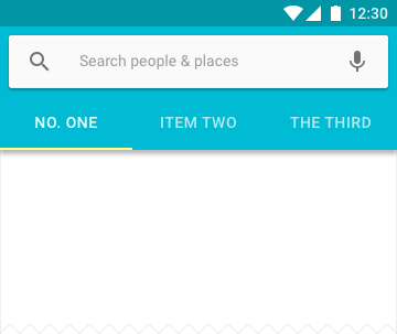
The subconscious factor making your test subjects want to tap those text objects is positioning. They appear to be tabbed navigation. Look at this example from the Material Design spec that is so popular on mobile and elsewhere.

Material Design tabbed navigation

It’s hard to retrain users

Despite your efforts to downplay them, the position appeals to users who want to explore the different views:

I wonder what books are already listed?

What is a "successful" listing?

Do I know the users that are active here?

Take a minute to think carefully about those questions. I think there are valuable user stories there worth investigating.

Iterate based on test findings

enter image description here

Someone, somewhere once said ...

You can only make it once, but you can make it better as many times as you need.

As others have mentioned, users want those things to be navigation. My imagined questions above are hinting at reasons users may want to navigate to the data behind those things.

You don't have to answer every user desire, but when you start to see a pattern you may have stumbled onto something valuable.

7
  • 45
    Ah, there's a search box! Having skimmed over the original design, the search box totally did not register as a search box until I saw your mockup that made it obvious that there's supposed to be a search box!
    – user56945
    Commented Aug 17, 2016 at 22:37
  • 2
    I love the treatment you made on the text. It definitely makes them feel less clickable. I don't know how but that's just how my brain reacted when I saw it. Commented Aug 17, 2016 at 23:16
  • 3
    @Andrew I think the bulleted formatting and being in a "sandwiched" position does it. The way they're spaced and positioned at the bottom of the box made them feel like a menu in the original layout.
    – ghoppe
    Commented Aug 18, 2016 at 18:37
  • 1
    @ghoppe I agree I think the bullets do it, text is usually bulleted not links/buttons so I read it as a subheader.
    – DasBeasto
    Commented Aug 22, 2016 at 13:48
  • 1
    This is a better answer.
    – JonH
    Commented Aug 23, 2016 at 19:32
125

Well, since people are trying to interact with this information, I'd use it as an advantage. As mentioned by Mattynabib, it really makes sense.

However, if for some reason you prefer not to, the answer would be to make this snippets of information a homogeneous message. The way it is now, it looks like a mix of a marketing and an interactive element (hence the clicks). So what you need is to keep the marketing side and get rid of this perceived affordance. And in order to do it, simply join the information snippets in a sentence, like

6 books listed, 12 successful listings and 2 active users

Note: I'm not sure if you really want to use this as a marketing copy. If so, I'd look for something better. Also, why "successful listings"? Are there unsuccessful ones? If so, why to do an implicit mention to that negative aspect?

9
  • 3
    Good answer, maybe replacing numbers with words will also make it look more like free text. Commented Aug 17, 2016 at 5:58
  • 3
    Might help the click problem, but kind of a kludge. Presumably the OP probably had a good UX reason to make these numbers easy to spot, scan for, and read, which this solution undermines. Commented Aug 17, 2016 at 11:39
  • 10
    Re: the speculation about "successful listings", my interpretation is that it refers to exchanges that have taken place. I agree that the phrasing isn't ideal; perhaps something like "12 books exchanged" would be more appropriate.
    – Mikkel
    Commented Aug 17, 2016 at 15:26
  • 2
    @Mikkel, "books exchanged" is far better. Thank you. We have actually changed the phrasing to exactly that in the time since I posted this. Commented Aug 17, 2016 at 19:19
  • 2
    I agree - listen to Mattynabib's answer below! ;-)
    – Mattynabib
    Commented Aug 18, 2016 at 13:50
45

The grey text actually makes them look more clickable as they stand out from the rest of the header. I would change them to the same color as the rest of the text (black).

Also, instead of "6 books Listed", I would use "Books Listed: 6". The colon subtly implies, "here's info" rather than "I'm a link".

7
  • 9
    Finally, the correct answer. I was scrolling down the page hoping someone would recognize this. When I looked at the OP's screenshot, it was immediately clear to me why the text looked like a link - it wasn't the same color as the header. Commented Aug 18, 2016 at 0:33
  • 1
    This is also why it does work in the edited-in example: the Instagram stats are shown using the same colour as the main text. The assumption grey text colour -> greyed out -> non-interactable is wrong.
    – Eric
    Commented Aug 19, 2016 at 8:48
  • 2
    It's more than just that they stand out more - making text grey on the web frequently indicates specifically that it is clickable, including on some of the most popular sites out there. Look at e.g. the headings on a Google search, or the Facebook 'Like' and 'Share' buttons. The OP's assumption that grey text -> non-clickable isn't just wrong, it's precisely the opposite of what modern websites have trained users to think.
    – Mark Amery
    Commented Aug 21, 2016 at 21:48
  • Really surprised this wasn't more upvoted. It's also the only difference between OP's work and Instagram's example.
    – gcali
    Commented Aug 23, 2016 at 9:32
  • I agree with this. It is the visual distinction (color change) that makes them stand out. I wanted to click on them also just by looking at them.
    – Jeff.Clark
    Commented Aug 23, 2016 at 17:39
33

They should be clickable if users can interact with those things.

If you are displaying something that summarizes content that is relevant to users, it should be clickable to reach the underlying content.

Presumably on a textbook exchange website, users should be able to view the books that are listed. So let them click on "6 books listed" to get to that view.

Are "successful listings" relevant to users of the site? If so, again, let them click on that to view all the successful listings.

The same goes for "users". Can users view the list of users? If so, let them click on it.

If users can't interact with what you are counting, why show it?

For example, if "successful listings" are not something users can interact with, then what is the purpose of telling them how many there are? It doesn't seem like useful information on its own, and it creates the expectation that successful listings are something relevant to users, that they can interact with.

Perhaps you just want to impress users with the amount of usage of your site. If so, make sure the information looks like a promotion and not meaningful data. e.g.:

CHTB: the second largest book exchange on the internet, used by 1234 users to post 5678 books (and counting!).

10
  • 2
    Could you elaborate on "If the information is relevant to users, it should be clickable." a bit more? The way I read that line right now is "all content should be clickable", because you don't place content on a website which isn't relevant.
    – MJB
    Commented Aug 17, 2016 at 11:57
  • 1
    I see, if there is underlying content, it should definitely be clickable, we're on the same page again ;)!
    – MJB
    Commented Aug 17, 2016 at 12:04
  • 1
    Hi dan1111, thanks so much for your answer. I added this clarification in my question, but "successful listings" counts the number of books that sellers/renters have exchanged with buyers. You can interact with open listings (in particular you can edit yours and make offers on others) but the stats are there to demonstrate the effectiveness of the website. Commented Aug 17, 2016 at 22:43
  • 2
    @JosephSlote On a side note, I would just call that "listings exchanged". "Successful listing" is awkward at best.
    – jpmc26
    Commented Aug 17, 2016 at 23:20
  • 2
    I can't interact with the text in your answer, why is it shown to me? You can't interact with the text in my comment, why is it shown to you?
    – user42005
    Commented Aug 18, 2016 at 8:58
11

It's a matter of relative 'clickiness' as well. Make the unclickable items less clickable by making the rest more clickable. The phrase here is: 'affordance'.

  • the position of the three not-clickable items is very prominent: in your design, it's in the center of the page and it intregrates with the logo and the pay-off. That gives them a strong click-affordance.
  • graying out hasn't helped you. In this design, it's easily understood as simply a stylistic choice to make this text gray.
  • Your 'search' input is maybe not clear enough. Try to make this look more like search-input:add a border, a search-glass and a submit button (for example).
  • You might also switch the position of the search bar and the 'unclickable statistics' and make the search bar part of the logo --> mimicking the Google default page.
3
  • 2
    By that definition, the greyness already makes them seem (even) less clickable IMO, but maybe I'm just a super-intuitive user... Commented Aug 17, 2016 at 14:56
  • @underscor_d I agree, it makes them less clickable, but not enough.
    – Ideogram
    Commented Aug 17, 2016 at 14:59
  • I meant that due to the dim colour, I wouldn't be likely to think they're clickable anyway... except that they list counts of things, which separately would make me more likely to think they are clickable... so it kinda breaks even IMO. Commented Aug 17, 2016 at 15:04
10

What can I do to make these three pieces of text seem totally unclickable? They're already grayed out as you can see.

*sigh*

In the olden days there used to be a standard that clickable text (a hyperlink) was underlined. And another one that grayed out text was inactive. How far have those standard been violated? Look no further than Stack Exchange itself:

Clickable links

Notice the links from my profile page are not underlined, and in gray. But they are clickable. Now that we have trained users to expect anything to be clickable, you can't just "design" that behaviour away.

As many others have said, since you are saying "6 books listed" it is logical to list those 6 books if you click on those words. Don't fight it.

6

enter image description hereSince the numbers "6 books listed" "12 successful things" .. are more like highlights.

I would try one of these to make it look like highlight or dashboard sort of numbers:

Increase the font - it makes it pretty obvious that its a heading of sorts. Have a panel for each item, in this case 3 panels. When I say panel it means having a light background and padding to the text.

Some thing like I tried above, but you can always play around with colors and fonts that suits your design.

5
  • 28
    If users are clicking on these sections all you've done is give them a bigger target. How does size imply "don't click me"? Commented Aug 17, 2016 at 1:42
  • 10
    I'm not sure that I'd interpret the text in the original example as links, but I would certainly interpret these as buttons. Plus the marketing copy now takes up a lot more space despite providing no value to the user.
    – Mikkel
    Commented Aug 17, 2016 at 15:28
  • 5
    So your suggestion to make them look less clickable is to make them look like buttons? lolwut Commented Aug 17, 2016 at 16:29
  • 1
    @EvilClosetMonkey My intention here is to make it look like informative blocks. Commented Aug 17, 2016 at 16:35
  • 4
    Well, with a "flat" design, they look like buttons. Blame Google? Commented Aug 17, 2016 at 19:09
6

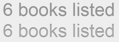
using inset text shadow gives the appearance of something set in stone: (with and without)

enter image description here

4
  • 15
    Sorry, I don't see how one of those looks any more or less "clickable" than the other. I don't think text style is the problem or the solution here.
    – user31143
    Commented Aug 17, 2016 at 13:45
  • 1
    @dan1111 I do but it's very slight and I agree that it is not the solution. Still, it is worth a +1 from me. Commented Aug 17, 2016 at 23:10
  • 1
    I would have tried to hover the top text to see if it gets underlined like a clickable link. I wouldn't have tried for the bottom one. Definitly not all of the solution, but the effect is there Commented Aug 18, 2016 at 11:15
  • Can't rely on this. Given that the effect is slight even at this magnification, I'd say at regular size one can't expect it to be seen in poor contrast situations, on low DPI screens, on CRTs, with users who are moving too fast to notice, with users without perfect vision, and/or with browsers that aren't rendering the styles quite as expected.
    – Mathieu K.
    Commented Aug 24, 2016 at 6:50
5

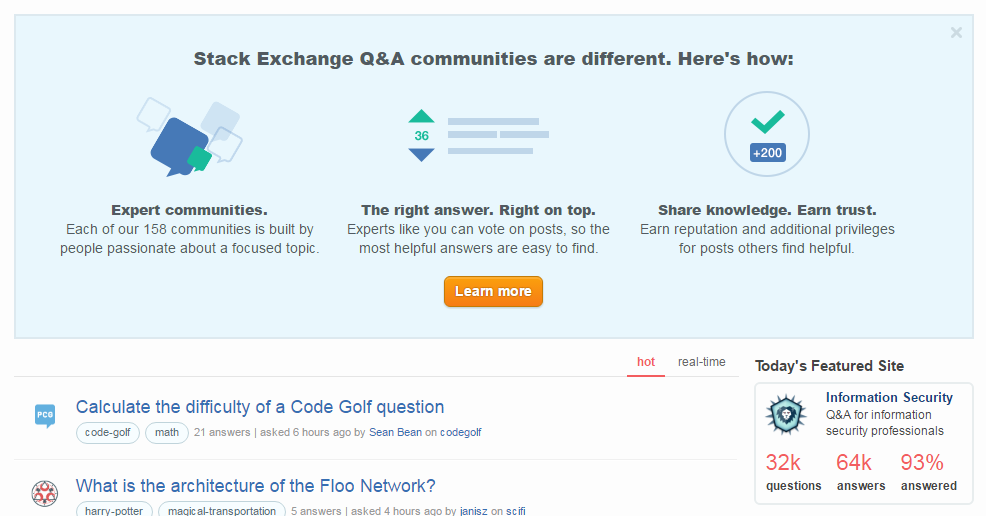
You want to make the numbers bigger, change the font/color to differentiate them, and put them on top of the information they are describing. For example, check out the layout of a certain very popular site (look at the bottom right of this image). This makes the numbers look more like meters/indicators rather than links.

From StackExchange

2
  • 1
    In that blue box in your picture, there are two things that I can definitely interact with, and three things that I'd wave my mouse over just to see if anything happens. The only thing that's clearly not clickable is the headline text.
    – Mark
    Commented Aug 17, 2016 at 21:47
  • I didn't realize that those stats aren't clickable but I never had the motivation to click them. Commented Aug 17, 2016 at 23:15
3

Theoretically you could make the text look a bit more "graphic" in nature, something more like a sort of a decoration on that panel; otherwise, I think graying it out is about as far as you can go - once they try clicking and it doesn't work, they'll probably stop.

But if you've tested this and people are consistently clicking there, you may want to consider finding out what they expect to happen when they click in those spots, and then consider MAKING them clickable... you could be missing an opportunity.

3
  • What do you mean by "hype-decoration"? Commented Aug 17, 2016 at 0:46
  • Something more like an advertisement, something graphic and integrated into the panel than a block of live text that might be a link. It's a stretch, but it's the only thing I could think of offhand to make text look LESS clickable.
    – Mattynabib
    Commented Aug 17, 2016 at 0:55
  • I edited to make that clearer. Also there have been some good comments around making it look more like a single-sentence context, which might remove the "clickable discreet chunks of content" patina from it.
    – Mattynabib
    Commented Aug 18, 2016 at 13:53
2

It's because:

  1. (probably hard to change) The content begs the question "which?" so people follow their urge to find out.
  2. (probably easy to change) They are in a body type font that suggests possible link material. Choose a presentational form - maybe sans-serif, maybe with thin caps, maybe with different weights and/or sizes between digits and letters etc.
2

Present it as a table

Links are typically shown as buttons or lines of text. Information is typically shown as a table.

Therefore showing the stats in a slightly more tabular format would deter users from trying to click it.

Example in the wild

In fact you already can see in your own instagram example how you could implement this in a subltle way.

Instagram has basically presented their statistic in a table with 3 columns and 2 rows. 1 row of key figures (slightly big) and 1 row with descriptions.

enter image description here

0

Make it look more complex than a single line of text.

Your Twitter example splits each stat into two lines with different font weight. That should be enough to discourage people from thinking they are links:

enter image description here

You may change font size, style, color, or add subtle graphics (such as a faint rule between the two lines) to further make it seem as something more complex than a single line of text, which is what a link usually looks like.

0

If making them clickable is not an option, you can try some other treatements. Leave them black, so they look like body copy. You can also add dots (·) between them, to make them look like stats.

The most important thing though is to style the number differently. In your instagram example the number is on its own line, you should do this too.

-4

You could precede those texts with an 'info' icon, with Font Awesome http://fontawesome.io/icon/info-circle/ or whatever you like. And make sure that texts' 'cursor' CSS property is not 'pointer'.

3
  • 14
    Surely this icon would just make them look more clickable, not less?
    – JonW
    Commented Aug 17, 2016 at 9:46
  • I have to agree with @JonW on this one.
    – MJB
    Commented Aug 17, 2016 at 11:56
  • Then, consider this answer above ux.stackexchange.com/a/98156/89792. Really what I would suggest too. As to my suggestion: ok, I agree an icon. But why no one notices 'pointer-events: none' in CSS , as a[t least partial] solution? Commented Dec 16, 2019 at 14:47

Not the answer you're looking for? Browse other questions tagged or ask your own question.