39

I have to make an iOS app, where there are categories and I have to show the decrease and increase in status of particular category.

For decrease I used a red down arrow. For increase I used a green up arrow.

But in some categories, a down arrow is good for sales.

So I am stuck with what to do with the icons and colors.

My original approach was to change down arrow color from red to green. But the problem is, colorblind people will not understand.

Then I thought of placing emojis of smile and sad. For good it will smile, and for bad it will be sad. Down arrow and smile emoji together. However this would be unprofessional.

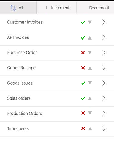
Please see this screenshot:

various categories, each with a red down arrow or green up arrow

7
  • 6
    This is a really interesting question! Why use color at all, won't the operator know wether up or down is good for any given category? Also if you were worried about color blind why not just use colors other than red and green, like red and black, or black and green? Commented May 26, 2016 at 8:09
  • 5
    Arrows going straight up or down in a list could also be interpreted as 'move item up or down'. Commented May 26, 2016 at 8:35
  • @AlbertRenshaw Then I have to put a legend, describing what colors meaning is. Commented May 26, 2016 at 8:53
  • 8
    Is the current ordering important? Consider separating the list into two sublists, one of "things which are good when they increase" and one of "things which are bad when they increase". I'm not sure what your exact business domain is here, but it sounds like you have a list both income generating items and liability generating items, so why not just make two lists? Commented May 26, 2016 at 13:05
  • 3
    What @HarrisonPaine said. Having a list where up/down may mean different things is utterly confusing and should be avoided at all costs. Also, don't be afraid of color. You can't rely on color alone to convey a message, but it doesn't mean you can't use colors, color blind people actually see colors, only that different
    – Devin
    Commented May 26, 2016 at 14:39

13 Answers 13

28

I'll make this an answer so I can expand on my comment.

Your main problem is not an arrow, icon, color or emoji thing. Your main problem is a conceptual one: you're mixing taxonomies with gradations that might be (they actually are!) absolutely opposed. Thus, you're adding a load where user has to make an interpretation of whether your taxonomy and your gradation method convey a good or bad thing. This is EXTREMELY confusing, the level of friction will go to the roof and sooner or later you'll need to redo it since it has more problems that benefits.

Instead, make 2 sublists: one where "up" is good and one where "up" is bad. You can keep your current arrow up/down method just as you have it now, including colors. And if colors bother you, choose color blind safe neutral colors.

The important thing is that up must mean up and absolutely nothing else, so your current arrows will make the trick. Then, what you need to define is whether for an specific subset up is good or bad.

As easy as that, no complicated things, straight to the point

Addendum

Just noticed one of your taxonomies includes the Goods word. Be very careful and try to find some alternatives since your gradation is between good and bad concepts, hence this wording might add an additional layer of friction. Or maybe not. Just in case, it's worth testing


Addendum 2

As an alternative: what about using something like in Gino van de Staaij's answer? I mean, a non-ambiguous icon stating objective information: amount is growing bigger / amount is decreasing. This way, you don't need to add any subjectivity and your app will measure real data. I don't know if this is possible, so adding this as an alternative path/suggestion

8
  • 1
    +1 it's great that you have expanded your comment into an answer, well explained!
    – Michael Lai
    Commented May 26, 2016 at 22:21
  • red and green color is unviresally known that red is for loss and green is for gain. If I use different color I may have to use legends to make user understand what excatly the color mean. Commented May 27, 2016 at 5:39
  • 2
    @AbhishekSharma, I said you can keep the colors if you want. Color is not an issue, all the issues are conceptual. for example: having a lot of invoices to process is a really good thing, it means I'm making lots of sales. However, if I don't have the capacity to process those invoices, it's a bad thing, because clients will resent on my lack of speed to process their requests. Exactly the same thing, yet it could be good or bad AT THE SAME TIME. That's my point: you're using a really confusing and extremely subjective measure that only you understand. Make it simple and it will work
    – Devin
    Commented May 27, 2016 at 16:32
  • 1
    @Devin yes buddy I agree Commented May 28, 2016 at 8:07
  • 1
    @Devin: great reply concerning the conceptual problem. This was actually what I wanted to say all along. Just couldn't find the angle obviously. Commented May 29, 2016 at 11:14
21

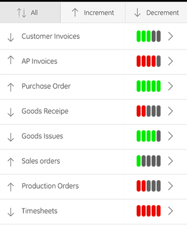
Perhaps you could use only black for the arrows so that the user knows of the increase or decrease, place them on the left, and then on the right use a "health-bar" style status report which would look professional and could indicate the positive/negative aspect and even severity. (Use colors other than Red/Green if you are worried about color blind issues)


(*NOTE: My colors may not correlate to arrow orientation as I just did it randomly without trying to uncover which arrows are good (green) and which are bad (red))

(Also, the arrows may not even be necessary anymore if you are adding these visual ads, sorting can be changed to performance based (i.e. 'good' v 'bad') instead of directional based (i.e. 'increment' v 'decrement')

enter image description here


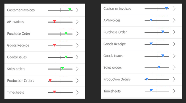
If color is an issue perhaps you can use a non-color-dependent performance indicator like this: (*Note, you can still add color to these to make it even easier for 95% of your users to read, it's just that color-blind people will still be able to read them even without the color information)— Color indicative version on the left, color-blind simulation on the right enter image description here

10
  • 2
    This does solve the problem, but it does look information heavy at the same time. Commented May 27, 2016 at 4:22
  • 2
    @shortstheory I agree, I guess what's important now is who the user is of this app. I develop apps for casual users looking for entertainment so simplicity and aesthetics are key to me. This seems, however, to be a business facing app, to a business-consumer more information may be a better user experience. (Unfortunately at the cost of aesthetics) I'm curious to see if anyone else comes up with a more elegant way of doing this! Commented May 27, 2016 at 4:56
  • One thing which might have problem will be the colors. Thats the main issue in this case. Commented May 27, 2016 at 11:24
  • If color is an issue perhaps you could use a non-colorBased performance indicator, like this one I just sketched (see link at end of comment). Middle is neutural or "average" preformance. To the right is over-preforming, to the left is underpreforming: imgur.com/PgtyECh . Commented May 27, 2016 at 19:15
  • @AbhishekSharma I've edited a demo into my answer above Commented May 27, 2016 at 19:21
12

I have always liked these icons, which indicate a trend on a graph. The combined shape and direction of the arrow indicate how the trend is progressing.enter image description here

I got these from Ionicons: http://ionicons.com/

6
  • 4
    I'm not sure how those might be used to show negative increments versus positive increments or negative decrements versus positive decrements. Could you expand your answer? Commented May 26, 2016 at 9:01
  • 2
    @andrew: The same as in your example: right+up=increment and right+down=decrement. Positive and negative are the qualities that are up to the interpretation of the stakeholder. So don't use any specific color, and especially no 'priming' colors such as red or green (priming meaning: red -> negative, green -> positive). Commented May 26, 2016 at 9:10
  • 3
    The OP is asking how to add the positive and negative layer to the icons - That's why I'm confused by your 2 icons - logically we need 4: Positive Up, Positive Down, Negative Up, and Negative Down. Commented May 26, 2016 at 10:21
  • Ah, I see what you mean. But why would OP need to fill the positive or negative connotation in? If you do not assign any meaning to the icon (refrain from colors, for example) isn't it up to the particular user to interpret that in the way that suits them best? Commented May 26, 2016 at 12:48
  • @GinovandeStaaij In the mockup provided with OP's post, there is a category of "Goods Issues" with a down arrow. I'm sure no one would think a decrease in issues is a bad thing, so it is pretty well understood that decrease is good. The question was regarding how to convey that this is both good and a decrease with icons. Commented May 26, 2016 at 15:17
8

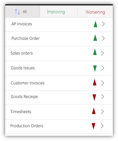
Put the good at the top and bad at the bottom (or maybe reverse this if you want to attract more attention to the bad). This way, you will have two sections divided by a clear conceptual mapping.

I would imagine that the main question is more along the lines of "In what areas are we struggling?" rather than "Did this section increase or decrease?" This design would allow the user to clearly understand that "These are doing well, and these are doing poorly."

Still keep the arrows, but color all the arrows (up and down) in the GOOD section green. Color all the arrows (up and down) in the BAD section red.

Whether you label these sections or not is up to you. (Good/Bad, Improving/Worsening, etc.)

Example:

example up/down/good/bad mockup

I changed the arrows to something that I felt might be more quickly processed. The thin lines don't provide as strong of a visual cue as to what direction they're pointing.

2
  • I'm not sure how this will help - colourblind users will not know where the split is. This approach could work if the "good" and "bad" items were physically separated, however.
    – Jon Story
    Commented May 27, 2016 at 16:07
  • @JonStory Certainly. This is just a mockup. I also mentioned that titles can easily be added for clarity to distinguish the sections further. Commented May 27, 2016 at 16:31
6

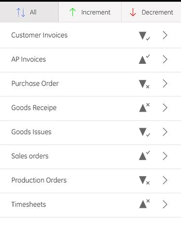
Perhaps instead of unprofessional emoticons, you can use a simpler symbol to indicate a good or bad result.

In this case, I used a tick and a cross:

enter image description here

But since the indication is probably more important than the direction, we can place greater emphasis on the ticks and crosses:

enter image description here

Note how the arrows are now smaller and faded towards the background colour, so they are visually secondary to the good/bad icons, but they can still provide their information if the user wants it.

I also like Gino's suggestion to use zig-zag arrows to communicate an upward or downward trend (as if on a chart), but I didn't have time to draw those!

An alternative way to display the trend would be with numbers: +20, -5, etc. Although displaying the values might seem like too much information, it could be argued that arrows without magnitude can be misleading or even dangerous.

For example +0.1 is closer to -0.1 than it is to +100, but arrows would represent the two positive changes as equivalent. Similarly, the concerning number in this dataset would be lost with only arrows: +3, +5, +1, -839, +2, +4, -3

As a compromise between numbers and arrows, double-headed arrows could be used for swings greater than 10, and triple-headed arrows for swings greater than 100.

3
  • why to + and - symbol over top buttons? This looks very useful. I will take a look to this. Let me see if this works. Commented May 30, 2016 at 3:49
  • To be honest the + and - were just placeholders and food for thought. If those are filters, then you should probably put 'tick' and 'cross' icons there, or 'up arrow' and 'down arrow' icons there, depending on whether users find it more useful to filter by indication or by direction. Commented May 30, 2016 at 7:18
  • In fact + and - can sometimes be alternative symbols for 'tick' and 'cross' (positive/negative concepts) but I don't think that is suitable for your case, because they could be confused with upward and downward trends. Two other positive/negative symbols are the thumb-up and thumb-down icons, but that's almost as silly as emoticons! Commented May 30, 2016 at 7:21
4

You are right to avoid the use of colour alone - especially when considering red/green states of the same shape.

The way to approach this is by changing the shape of the arrow and there are a number of ways you could do that. As a few of suggestions:

1) You could bring left and right into play, where right is progressive and left is retrograde - an arrow pointing up and right is a positive increment but an arrow pointing up and left is a negative increment. (NB: I think this is probably over complicated for general use)

2) You could try varying the line weight of the arrows - heavier lines could indicate a more desirable effect.

3) You could use solid shapes and switch between filled and outline.

Styling suggestions for arrows representing both positive and negative increments and decrements

These are just a few suggestions to help you think past your current block - You may find something else entirely!

2
  • 5
    I don't think it would be immediately obvious to me which of those were 'positive' or 'negative'.
    – Alex
    Commented May 26, 2016 at 12:18
  • @Alex - I agree! Check out Devin 's answer Commented May 26, 2016 at 15:46
4

To build on @Adriano Repetti's answer, and again borrowing from Information Dashboard Design by Stephen Few, I would like to highlight some assumptions about your view and make a suggestion.

As someone who is not colour blind, it still took me a while to figure out what all the arrows mean! Your interface confused me, so I tried to think about what you are intending me to do.

So I thought that it's pretty clear that you want me to input into this app whether these categories have incremented or decremented, since I last updated it. It is also clear that there is a judgement going on about whether increment/decrement has a positive or negative impact on each item - possibly indicating a desired or target value.

It follows form this that the 'All' button seems a bit redundant, as I am unlikely to want to increment everything at the same time (I assume this is what this does), given that some things will want incrementing and some decrementing.

Having the symbols on the other two buttons at the top to be the same as the icons in the list confused me for the longest time. Given that the 'All' button could go, maybe taking up a lot of room at the top of the screen is a good way to go.

As others have pointed out, trend over time is not well represented by a single icon, so perhaps a trend graph of some sort would help comprehension. As there is a target or mean to go by, perhaps a bullet graph would work.

I have done a mock-up. I removed the 'right' arrow, which I assumed means 'show me more details about this category', and left it for users to just tap on the category title to see more details.
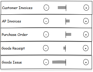
Increment/decrement categories

You can also vary the saturation of the bar to show importance - I am with everyone else in avoiding use of colour to give meaning. High saturation shows a warning, in terms of 'this is bad, pay attention to it!'

You could also swap the bullet graph for a spark line to show how it has changed over time.

7
  • Don't you think this will confuse the user? As it is confusing me. Commented May 27, 2016 at 5:41
  • Hi @AbhishekSharma - I don't think it will confuse the user, but perhaps I am missing something that you are seeing? Which bit do you find confusing? The vertical bar in the middle is the target value, the grey box shows how far you are from your target. Does that help clarify? Commented May 27, 2016 at 8:27
  • Actually it is not like that. We are not completing anything here. Commented May 27, 2016 at 9:26
  • Okay, looks like I misunderstood :) Commented May 27, 2016 at 9:33
  • Its like a status, where user is informed which values are going up and which one is going down based on the process done with the backend folks Commented May 27, 2016 at 11:23
2

I'd avoid to convey information only with colors. Green for "up" and red for "down" is not an universally worldwide accepted pattern (and color blind people may not see them). Given the fact that you don not need color then I'd simply drop it. Use a gray symbol, color is not needed.

To better give sense of trend (and to clarify symbol meaning to don't confuse it with move actions) you may use a slashed arrow . Any other option? Pick the most universally understood symbols: + and -.

Now the second point is how to highlight if positive trend is a good thing or not. You do not need to charge your UI with symbols and colors, what you probably need is to highlight only when a trend is bad. This solution has three pretty good outcomes:

  • You keep your interface simple, no unneeded symbols are visible. You do not overload users brain with unessential information. This is especially true in your case because you said it's a dashboard.
  • Users have not to learn any convention (thick down arrow is bad, thin down arrow is good and so on...)
  • You immediately highlight what should be noted (a bad trend). If nothing is shown then current trend is a good thing.

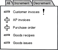
To put everything together in a mock:

mockup

download bmml source – Wireframes created with Balsamiq Mockups

In this example I prepended the upward/downward trend symbol but it may be moved to another position according to your overall app style (and it probably need to be smaller, BTW). Note that it may be omitted when view is filtered because it's redundant.

Which symbol (! in my example) is best one depends on many other factors: is it an alert or you just want to highlight it? Should an immediate action be taken? Is it something dangerous? Note that you may even drop this extra symbol and replace + and - (for example inverted colors or circled/boxed icon) but it may be much less clear if alert is not limited to few items (because you can't immediately understand which one is highlighted and which one is not). You may also use other techniques to highlight an item, hundreds posts about this are available.

Addendum: you may want to read Effective Dashboard Design by Stephen Few.

7
  • I never seen such interface before. Does + and - decribes increse in or decrease in status? This is a dashboard. The arrows are there which shows the status of category Commented May 26, 2016 at 9:56
  • "+" and "-" describe an increase in number (borrowed from math and widely accepted as positive and negative symbols). Status is vague word here but if you mean good thing or bad thing then answer is no, they don't carry that meaning but merely numerical trend. To highlight bad trends I'm using another symbol (see first list item) and it's used only to highlight bad trends (regardless their direction). Commented May 26, 2016 at 10:01
  • Consider a situation: Suppose there is total n no. of files which needs to checked. More the no. more will be the problem. And here up arrow is for more no. of files and if the down arrow then the no. is decreasing. so down arrow is good sign here. Commented May 26, 2016 at 10:10
  • Good, then put "-" near "no. of files" and nothing else. No highlight = nothing special. What if "no. of files" is increasing? Put a "+" sign and highlight it (in my example with "!" but read full answer, especially last paragraph, you may use other techniques instead of/together with). The point to understand is that you convey two information: trend (increasing or decreasing) and quality (maybe you call it status: bad or good). Because you want to highlight only "bad" (ESPECIALLY in a dashboard) then add something only in that case. Commented May 26, 2016 at 10:23
  • 1
    This is the right way! - You want minimal clear information for the user. The ! Exclamation mark can be universally understood to require attention, and you will have an added benefit: Our brain likes order, so if there are 2 Exclamation marks, it is like two unread messages - the user will want to do something to get them away.
    – Falco
    Commented May 27, 2016 at 11:06
2

Consider separating the list into two sublists, one of "things which are good when they increase" and one of "things which are bad when they increase".

I'm not sure what your exact business domain is here, but it sounds like you have income generating items and liability generating items, so why not just make two lists? This could be done "in-line", i.e. in the same vertical list, but with a divider, or on separate pages. In either case, segregating the two types of item would make it much clearer.

1

One thing to note in general, without considering implications of arrow cardinality or color: arrows that point straight up or down are confusing in general, since they can have multiple meanings:

  • This row can be collapsed or expanded by clicking the arrow;
  • This row can be moved up or down by clicking the arrow;
  • This row has changed in value compared to last time;
  • This row value can be changed by clicking the arrow.

The problem is that an arrow that just points in a cardinal direction has been used for different meanings historically. However, if your arrow points in an eastern intercardinal direction, so up-right or down-right, the arrow is no longer implying one dimension, but two dimensions instead, where one dimension is heavily implied to be time.

While this does not solve your problem directly, I do think it's something worth keeping in mind that can help resolve ambiguity in other aspects.

0

Why not show a numeric % change?

You can color the text green/red to help non-color blind people know if the number is good or bad (in the case of a negative percentage for one category being a good thing); color blind people would still have access to the same information at a glance without the courtesy of a text color hint.

0

How about simply a green circle for good, and a red circle for bad? I don't see how this portrays less information than your arrows - assuming that they universally agree with your assessment's that down in one category is bad, and up in another category is bad.

0

It's cool to care about colorblind people. I suggest to think a bit outside the box and to put a colorblind option in the app settings. This way you can switch to more adapted colors

Your Answer

By clicking “Post Your Answer”, you agree to our terms of service and acknowledge you have read our privacy policy.

Not the answer you're looking for? Browse other questions tagged or ask your own question.