1

We're building an iPhone app for delivery drivers. Each driver has a route of about 50 locations, 10-15 of which get scheduled for each day's deliveries, depending on which location needs restocking. Because the list of of locations won't change much over time, usually the driver won't need directions to each stop, only a reminder of the address.

But even if the driver doesn't need directions to every address every time, we do want to make it easy for driver to get directions/maps for locations, in case a new one is added, in case the driver forgets, in case there's unusual traffic, etc. We're showing the address of each location, so it's a no-brainer to allow a tap or long-press on the address to bring up a map.

But I was concerned that this gesture would not be discoverable enough, especially given the non-tech-savvy, blue-collar workforce using this app.

Also, this app will also be used as a sales tool to emphasize the "coolness" of our solution relative to our competitors who are stuck on clunky Windows Mobile handheld PCs with no touchscreens, no GPS, no maps, no photos, etc. Having some visual indication that we do mapping on this screen can help with our branding and differentiation.

Anyway, I'm looking for a middle ground: a subtle way to indicate the mapping capability, without the visual overkill of the "pin" icon in the screenshot below.

What's a subtle way to guide users from an address to a map?
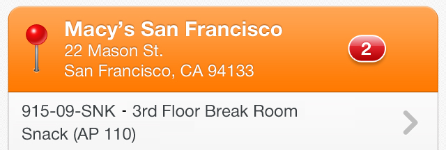
enter image description here

3 Answers 3

1

How about a tiny right arrow ">" navigation icon on the right edge of the address field?

Alternatively, a tiny ellipse in the same spot. This is evocative of the same thing you see on drop down menus on Windows and Mac to mean "there is something else..." .

In either case it can mean more that "thar be a map here" - it means you can change what "it" is without inventing and/or adding context-specific navigation icons.

1
  • I like this idea the best. Our designers tried small icons on the right edge of the address and it still provides a visual cue but is much less obnoxious than the huge pin. We're probably going to settle on a small pin to the right-- using the standard icon, just smaller and in a less conspicuous location. Commented Aug 25, 2012 at 19:08
0

I'm not sure what you mean by "visual overkill of the 'pin' icon." In my experience, icons need to be repeated and reused consistently so that a familiar and comfortable meaning is associated with it. "Overkill" in this sense is good for an icon. Eventually, the icon will become "invisible" to conscious thought and convey meaning without making the user think about it. As long as you are consistent with your use of the icon throughout your app, this kind of "overkill" might be a good thing for UX.

Now, for marketing, on the other hand, it may seem old and "used." That's a different subject next to UX. Sometimes old and familiar are better for UX than fresh and new. In contrast, differentiating your product depends on the unfamiliar and exciting.

Perhaps take the pin icon and do something slightly different with it. But, be consistent for the user's sake and stick to familiar or easily adaptable ideas.

1
  • Overkill meaning a very prominent UI for an uncommon operation. I wanted a subtler way to indicate mappabilty. Commented Sep 1, 2012 at 6:30
0

Definitely place whatever you're going to on the righthand side - a natural indication for western readers (perhaps do the opposite if localizing for other cultures) that further action can be taken.

As for an icon, a small folding map or a pin (of the inverted tear-drop style...but that's just me disliking the skeumorphic example above), would be the way to go.

Your Answer

By clicking “Post Your Answer”, you agree to our terms of service and acknowledge you have read our privacy policy.

Not the answer you're looking for? Browse other questions tagged or ask your own question.