4

I am creating a dashboard for a system where I will use various charts to display data to the user (as of now I have pie charts and line charts).

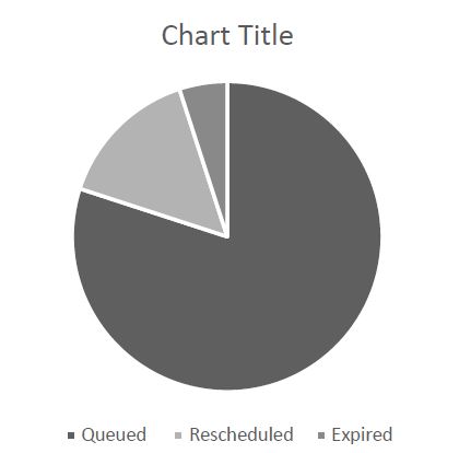
The pie charts will display items with statuses for different queues; queued items, rescheduled items and expired items. Something like this:

enter image description here

In my color scheme I have some status colors to chose from; green, yellow, orange and red. In addition to these there are some other colors to play around with but I am not sure if I should go outside the status color scheme, I guess I will have to if the status color scheme is not enough.

The expired items is important to the user because he will have to do some sort of action to remove them. The rescheduled items will be run again within due time, without a manual action. The queued items is of course waiting to run, but the problem is that this number is "good" if the queue size is normal, but if the queue size is big, the user will have to do an action, or at least investigate the reason for the big queue size. This problem make me doubt if the green color (which other wise would be a good choice) is the right color for this purpose.

What would you say is an intuitive color of the different statuses?

1
  • Don't use pie charts. Commented Jun 27, 2016 at 0:20

4 Answers 4

4

Agreed about threshold color coding, as that's the point of using color in these status type of visualizations.

Consider ditching green and using neutral when there's no action.

Then, for the ones where the user needs to take action on warnings or something bad, use yellow, orange, red to go from bad to worst repectively. This may vary internationally, but is a general rule of thumb in the US.

A couple of resources you might find interesting to help more with your specific problem.

2

My suggestions:

1

With pie charts, if you have a 500 item queue and 1 item is 'expired' then it simply won't show on the chart - it's just too small.

I think we suggested that you use stacked bar charts instead of pies: Data visualization for queued items. The height of the stack can show the length of the queue without crushing the 'expired' items.

1
  • Hi!, thank you for your comment, but this question is about the colors. the pie chart is just an example :)
    – efrethe
    Commented Jun 16, 2016 at 10:04
1

If you're using a charting library with your data, you could possibly set up a color rule on the queue series. So if it goes over a certain threshold, it could change color from green to yellow, or another "warning" type color.

Here's an example where the bars change color depending on their value: https://www.zingchart.com/docs/json-attributes-syntax/loader/rules-abstract/?q=rules%20(abstract)#zcdemo

Your Answer

By clicking “Post Your Answer”, you agree to our terms of service and acknowledge you have read our privacy policy.

Not the answer you're looking for? Browse other questions tagged or ask your own question.