13

I am building a web application that deals with a lot of tables/lists of records. I am currently building an "AJAX edit-in-place" feature, so that you can edit a record while being on the same page. You will click the edit button/link and the table row will slide a form down so you can edit the record.

My question is, what is the best way to display these actions that you can take? I've seen this done different ways in different applications: edit/delete links, buttons, buttons that appear only when you hover over the row, a "drop-down arrow" that when you hover over it, a "tool tip" appears with the actions as a list of links.

What is the best way to display these. Please provide links to articles/studies that support your answer (if possible).

2 Answers 2

7

The last thing you want when you have a lot of tables/lists of records is to make the data less readable by having more noise and clutter from permanent buttons, links or drop down arrows, so I favour the hover approach in this instance.

Change the cursor on hover, to aid visual feedback. Align edited text with cell content where relevant so that it doesn't appear to jump. Ensure to provide a mechanism to cancel without change.

Highlighting changed items and allowing revert are nice additions.

Here is a good resource at Pattenry.com - with some links for lots of jQuery plugins.

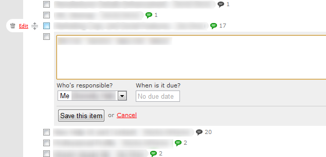
I think 37 Signals have done a nice job with edit-in-place to-do list items on BaseCampHQ (See their to do lists tutorial) as seen in the image below - sorry I had to blur out the actual content...

enter image description here

1
  • This is an old question/answer, and a few years back I would've favored a similar approach based on hover, but today you have to think of mobile/touch interfaces too, and hover doesn't cut it anymore. Commented Nov 30, 2016 at 14:38
0

Likewise, I favour the 'slide open' approach. Only showing edit controls on opening a row for editing means much less clutter.

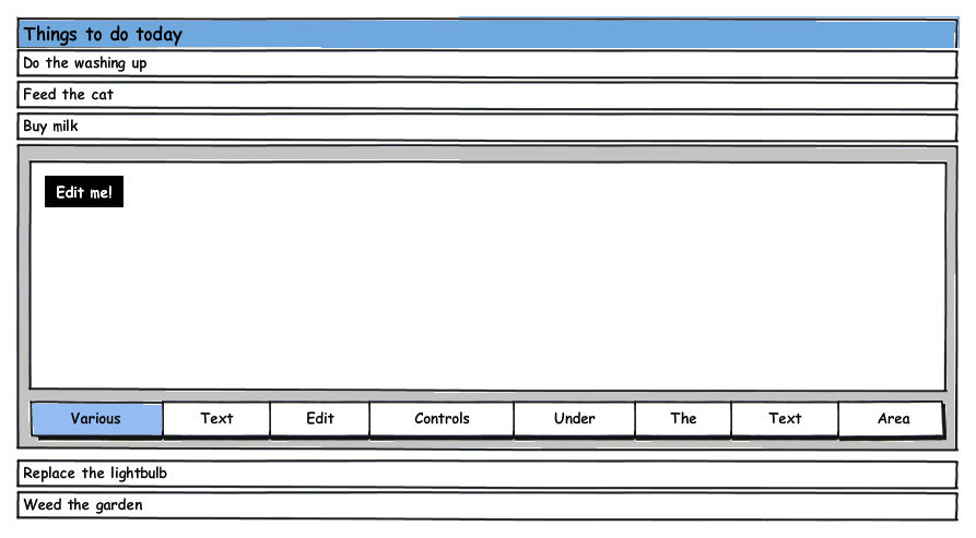
Might I suggest a solution a bit like the following?

enter image description here

Click a row to 'expand' it, whereupon the entry becomes a text box (ideally already in focus, in a different colour to your 'closed' records).

I'd put the text controls below, flush with the textbox. Why?

  • they're 'close to the action' - users don't have to jump around the page to edit the text
  • users see a lot of text controllers that already do this (eg TinyMCE)
  • users read top-to-bottom, so they see the textbox first, the controls second. This expresses the heirarchy of 'thing to be edited > the editing of it'.
3
  • hmm...interesting. I can't say that I've ever seen this approach before. I wouldn't expect a bunch of buttons unless it was a wysiwyg editor, and even then, I would expect them to be at the top. I like the idea of clicking the row to edit it, but that only leaves me with a save button and cancel button. Maybe a delete button somewhere.
    – Andrew
    Commented Jul 13, 2011 at 21:06
  • Interesting - why do you expect them at the top? Are you thinking in terms of word processors (which typically do just that)? Commented Jul 13, 2011 at 23:22
  • Exactly, wysiwyg editors are an imitation of word processors. But that's beside the point. I don't have a wysiwyg textarea field, so I don't actually have any buttons except "Save" and "Cancel".
    – Andrew
    Commented Jul 14, 2011 at 3:48

Your Answer

By clicking “Post Your Answer”, you agree to our terms of service and acknowledge you have read our privacy policy.

Not the answer you're looking for? Browse other questions tagged or ask your own question.