2

in our internal business application we have a list of results. The user can do two different actions:

  • open (and edit) a record
  • view the history of a record

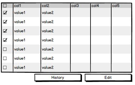
Now both of these actions can be performed for one record or for many records at once.

For viewing the history, we have this stupid technical reason for that we have to restrict the maximum selected records to 10. So how can I make this clear to the user?

Basic mockup

Mockup

There were the following approches:

  1. Hide the history button when >10 records are selected. In my opinion that sucks, because the user might think "WTF did that button go, I knew it was there the last time...:"

  2. Make the button inactive when >10 records are selected. Optional: provide a mouseover/tooltip on that button that indicates WHY it is inactve. My opinion: well... is it "best practice" to require to hover over an inactive button to see why that is so ...?

  3. The button remains active and when clicked, the user gets a message informing him that he may select only up to 10 records. My opinion: definitely not good UX either ;)

  4. Make the button it inactive, when >10 records are selected and put a small text ("max. 10 records selectable") under that very button.

So I was wondering if you got any better ideas, if there is any real "best practice".

Because thos approaches came from our UX expert already...

PS: if there is already a question for that, please show me the way - my hour-long search did not show anything like that.

5
  • 4
    This is a tough one, because no matter how you spin it, it will seem weird to a user to have these seemingly unnecessary limitations. In my opinion, the best band-aid would be option 4, because it signifies the strongest that there is an issue and what is causing it. What exactly is the technical limitation? Is it resolvable within reasonable time and with a good enough business case? Commented Jan 26, 2018 at 12:31
  • 2
    The 10 item limit can be addressed in training, but you might have a hard time justifying it, as these "technical limitations" tend to sound like BS to business users (correctly). Have you done any user-testing to see how close they get to the hard limit and if so, how often? Commented Jan 26, 2018 at 13:46
  • Yeah, technical limitations always actually ARE BS ;) but noone here is willing to change any of that. Blame it on me, never questioned the requirement ;)
    – roland_w
    Commented Jan 29, 2018 at 5:34
  • @roland_w I wouldn't blame it on yourself... unless it was your job to question the requirement, but I am pretty sure that's what the UX expert is normally paid to do (then told that nothing can be changed so come up with the next best thing) :D
    – Michael Lai
    Commented Jan 29, 2018 at 12:22
  • @michael lai: well, as a requirements guy I think it IS my job ;) I guess I can't blame it on the UXer... because the requirement for that "multiple history" is - thinking about it - nonsense.
    – roland_w
    Commented Jan 29, 2018 at 15:13

2 Answers 2

0

As you mentioned before, this is a technical limitation that you have to communicate on the user interface so the reason why the suggestions by the UX expert fall short is because there is no perfect UX solution for something that doesn't make sense to the users - you can only try to make it EASIER for the user to use/understand.

Having said that, if this is a constraint that can't be removed, then perhaps you can be more proactive about letting the user know that they can only select 10 items if they want to view the history, the same way that certain textarea fields show you the number of characters remaining if they don't want users to go over (but they still need to disable actions or show messages if the user exceeds it).

But if that's too intrusive or in the way (because you don't want to always show this), then you really only have the alternate options on that list, and I would say that not disabling the button is better and showing a message if they have picked more than 10 and tried to click the button is probably more user friendly because there is more flexibility for them to change their actions.

3
  • I'm going to accept this as the answer, because thats what our UXer suggested too. I just was not too sure.
    – roland_w
    Commented Jan 29, 2018 at 5:32
  • I guess your UXer must be sticking to some good standard practice then :D Actually I probably would still prefer to ask the users, but I usually like to have more than one strategy in place because we are not mind readers after all...
    – Michael Lai
    Commented Jan 29, 2018 at 12:20
  • He is. :) And yes, user questioning would be great, if we just could do it ... blame it on the project lead ... :)
    – roland_w
    Commented Jan 29, 2018 at 15:08
3

Developers have a much deeper understanding of systems and, at times, that can really hurt them. We know quite often that a limitation is stupid. Either something is broken in the code and nobody wants to fix it, or business makes arbitrary rules or guidelines in absences of any true understanding of how software actually works.

Either way, this history functionality is still a feature. And if you explain it in a marketing sense, now you can view up to ten records at once! How many history records could the user view at once before? One? Zero?

Either way, make sure to show them this information as robustly as possible. Make them feel like 10 is a lot, because it actually is. Remember, the mind can't process more than 3-5 things at a time. 10 is an automatic overload if it all pops up at once.

So, you can do a number of things:

  1. Create a button that "activates" history mode, and then display some text above your data-table saying "Select Up to 10 Records" and disable all other rows once ten items are selected.
  2. Only allow 10 records to display per page (kinda annoying solution, but a solution nonetheless).
  3. Have the history button show how many more records can be selected in the label, then have it count down to zero until the limit is exceeded, in which it becomes disabled.

If you feel the users of your app will definitely need more than 10 and you want to get around this limit, you can be crafty and do one of the following:

  1. Allow them to open up your software in more than one window or tab.
  2. Have each history record open in its own window or tab.
  3. Have them go back and forth easily where opening up sets of ten becomes really simple. Maybe create a queue where the user can select more than 10, but only view 10 at a time.

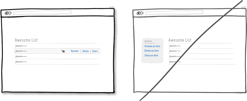
Also, you might want to think about how you present your controls in the list. GoodUI's 19th rule could come in handy here: Try Direct Manipulation. Have your controls scoped to the item you wish to interface with. If you want to select multiple items, you can still allow the checkboxes, but keep the controls within or near what they're controlling.

enter image description here

A good example of this can be found in the WordPress backend. Controls for a particular item in a list are visible only when it's hovered over, but the ability to make a series of edits are still available either way.

enter image description here

1
  • We do already have the direct manipulation. But added to that, we need a multiple edit (talking about tens of thousands of records a user wants to edit at once). And hence we thought a history of "a couple of items" would be useful too. If I could, I'd scratch that multi-history, because it adds no serious value. Argh...
    – roland_w
    Commented Jan 29, 2018 at 5:33

Your Answer

By clicking “Post Your Answer”, you agree to our terms of service and acknowledge you have read our privacy policy.

Not the answer you're looking for? Browse other questions tagged or ask your own question.