22

As I see this answer from @JDB stating

I hate it when a modal dialog appears asking me to confirm an action and the only way I can confirm that, yes, this is the record I want to delete, is to view the information underneath the immovable dialog.

I usually have to cancel, double check, then click again.

Does this apply to mobile apps as well?

I have not seen any movable mobile modal boxes, even iPhone guidelines and google-design have no mention about movability of modal boxes.

Any specific reason why mobile modal pop-ups are not supposed to be movable?

3
  • Because of the mobile screen estate and also it would be difficult to move the dialog around with one hand holding the phone.
    – adamsoh
    Commented Jan 19, 2016 at 6:56
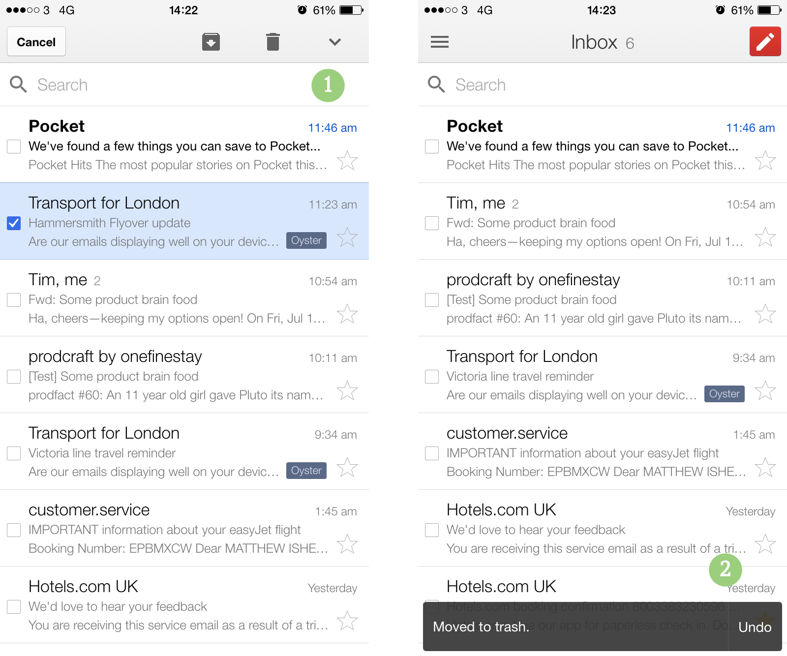
  • A workaround for this problem is to enable the user to undo the previous action as often as possible (such as with a non-disruptive popup at the top or bottom of the screen). Google Inbox for iOS implements this well and often avoids a modal dialog.
    – intcreator
    Commented Jan 19, 2016 at 17:52
  • I'm still curious if you can make them movable. Either iPhone or Android.
    – Insane
    Commented Jan 20, 2016 at 10:48

3 Answers 3

35

If a popup confirmation is so uninformative that a user might need to move it out of the way to decide whether to proceed, then the problem is a bad popup, and allowing it to be moved is not solving the core problem.

Assuming you really do need a popup that comes before the action and fills the screen, to get an informed response from the user before performing the action (otherwise, the "just do it, then allow 'Undo'" pattern in nuwa's answer is very good), make sure that the popup itself contains the necessary information to make an informed decision:

Don't:

Are you sure?

You can't undo firing this nuclear missile!

Okay Cancel

A full-screen popup demanding full attention is clearly appropriate for confirming this non-undoable action - but this doesn't contain enough information for a user to confirm that they are not making any mistake.

Do:

Nuke Bhutan?

The procedure to fire nuclear missile GR-921 from submarine 8QR at target Thimphu, Bhutan will commence immediately. Once started, this procedure cannot be stopped. Estimated launch time: 18:06.

Show missile flightpath [button uncollapses map image]

Launch Missile Cancel

This demands the appropriate level of attention for the decision to be made, and allows the appropriate decision-relevant details to be reviewed as the final decision is confirmed.

A slightly more everyday example:

Buy this 6-month subscription?

Your credit card ending 1292 will be charged $92.60 and a 6 month subscription to Visit Bhutan magazine will begin on 3rd February 2016.

[Maybe a collapsed box with legal/other info here - only if necessary]

Subscribe Cancel


A detailed recent related answer on confirmation messages


A comment mentioned delete actions, and when its appropriate to demand full attention like this. Here's a good example:

Delete gurvinder372's account?

gurvinder372's account will become immediately inaccessible. All their personal data will be permanently deleted, and their 214 posts will become attributed to "[deleted user]". A standard email will be sent to their registered address.

Delete Account Edit email message Cancel

It's appropriate because there are immediate, irreversible consequences, and it's an action users won't do lightly.

Here's a bad example, where a full-focus confirmation popup is excessive:

Delete email from WarezCorp?

The email "Buy top quality discount..." from WarezCorp received 12 minutes ago will be moved to the "Trash" folder.

SHUT UP I do this action like 50 times a day Cancel

It's not appropriate because it's a routine action, that can be undone harmlessly. A simple undo button in a toast notice is more appropriate - and as nuwa explains, also solves the problem in this question since the user is never taken away from where they were.


Another consideration is, if the user does hit cancel, how easy it is to get back to this point?

Suppose for some reason someone did want to double-check the whole of the previous page(s), for example if they want to re-evaluate the alternatives to the option they chose.

Moving the popup and trying to do this task behind a moved popup is clearly less user-friendly than one-click cancel to hide the popup, then one-click repeat action to get the popup back again. Especially if you grey the background out and prevent clicks.

If they know they can just hit cancel, then hit the same button that got them here, there's no problem. They'd only be wishing they could move the pop-up if they don't trust it to be that simple to get back to where they are.

This might be something to user-test. If the user seems reluctant to use that "cancel" button, it's a clue that the procedure to get to this point is complicated to a point that they're reluctant to have to go through it again. If they don't hesitate to hit "cancel" (or, the browser back button?), that's a sign that they trust your UI to not do anything weird and that they know it's going to be effortless to get back to the point they were at when they hit "cancel".

An alternate label to "Cancel", like "Go back" or "Back to list" or "Back to cart" might perform better, depending on context.

7
  • thanks for bringing the perspective of making pop-up fully informative by itself. Definitely worth a go if the destructive action is not taken very frequently. What are your thoughts on the amount of attention these long messages are going to demand from the user? Read somewhere that our average reading speed is 200 words per minute, so one would demand a an attention span ranging from 10-15 seconds per delete action. Thanks again. Commented Jan 19, 2016 at 17:29
  • 1
    Yeah you should only use this kind of confirmation if you want people to stop and take several seconds to consider the consequences. Delete email: definitely not, that would be maddening. Delete another user(s)' account(s): demanding multiple seconds of attention will often be entirely appropriate (also, the information should be familiar, so they'll be skimming not reading unless they see something unexpected) Commented Jan 19, 2016 at 17:35
  • 2
    The Dragon King will not stand for this!
    – KRyan
    Commented Jan 19, 2016 at 19:10
  • @KRyan I pressed cancel! I pressed cancel! Commented Jan 19, 2016 at 20:28
  • 1
    Remember to ask for email twice, its important field.
    – PTwr
    Commented Jan 20, 2016 at 10:28
16

In terms of mobile,

  1. A mobile screen does not have the space to fix your problem by moving the popup. You can move the modal window and still not see the information you want to because it has limited space.

  2. A popup usually covers the information below by a black overlay so that it stands out. Just moving the popup won't be enough then. You will have to get rid of the overlay as well.

enter image description here

So how do you solve your problem?

  • It depends on the information you put on your popup. If the popup is related to an action that needs to be performed on a specific item, it should give enough information to the user to make a decision.

Ex: Instead of saying "Are you sure you want to delete?" let the user know what they're deleting. A name, a path, number of items they're deleting. Anything that will be useful for them to decide.

  • Wherever you can eliminate a popup - do that.

Ex: Tap and hold to perform certain actions. You might have noticed certain actions such as "Delete" are available once you tap and hold an item. This itself is a type of confirmation from the user. But you can't be too sure. Which is why this type of thing should allow your user to undo whatever they've done.

enter image description here

6
  • 1
    liked the tap and hold idea, +1 for the same, but how can I make this tap and hold more intuitive since I cannot make out just by looking at the interface (gmail or yahoo for example) that there is a tap and hold interaction available (oops, a totally new question)? Commented Jan 19, 2016 at 8:22
  • add a dragable area - that's an area that looks a bit more rigid, like this: i.sstatic.net/nlnjp.jpg
    – Eran Bar
    Commented Jan 19, 2016 at 8:41
  • 2
    At the moment most UI's doesn't show any indicators. We rely on the user's experience with other mobile apps and if they can't find it they will learn it - from another person or by looking it up. But once learnt it's something they will remember. Popular apps (ex: Gmail) uses the tap and hold gesture. So we can only assume our users are already familiar with that type of interaction and they will test it out. To decide if you want to go for this sort of interaction I suggest you test it out with your users. See how much trouble they're having. Based on that you can decide the best approach.
    – nuwa
    Commented Jan 19, 2016 at 8:41
  • 1
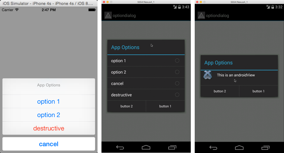
    Also consider that interactions are different from one OS to another. While Android users will definitely be familiar with this gesture iOS users might not be. But I have seen iOS apps where the tap and hold gesture is used.
    – nuwa
    Commented Jan 19, 2016 at 8:44
  • Wow... Titanium, that was a horrible experience for me, how do you like it?
    – Andrew G
    Commented Jan 20, 2016 at 0:14
1

since mobile screens are smaller, the screen realestate is more expensive and interaction is different, If you plan the screen properly, and test your app on many devices, you won't need to create a movable modal, the idea is to have all the relevant information for the current step that the user is in, on screen. if you plan on popping up messages, make sure they fit in with the background so that either:

  • you can still see the relevant info behind them or
  • the pop up contains all the info that the user needs in order to proceed to the next step
2
  • can you share any image or link where I can see relevant info behind them thing and also user can see which item was clicked on? Sounds interesting though. Commented Jan 19, 2016 at 12:08
  • @gurvinder372, try my app, iair, its on ios, so I hope you have an iphone here is the link: itunes.apple.com/il/app/iair/id851156481?mt=8
    – Eran Bar
    Commented Jan 24, 2016 at 11:54

Your Answer

By clicking “Post Your Answer”, you agree to our terms of service and acknowledge you have read our privacy policy.

Not the answer you're looking for? Browse other questions tagged or ask your own question.