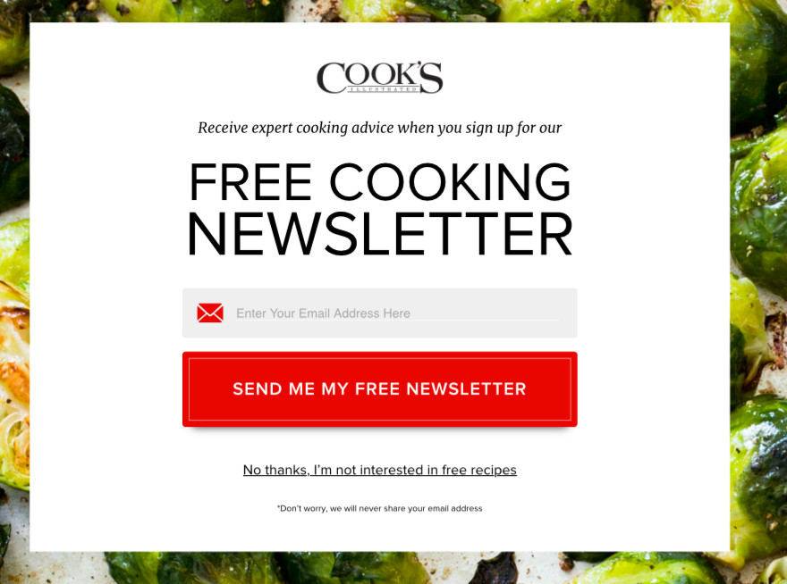
On several sites, I’ve noticed a type of email subscription modal pop-up message that can’t be closed by clicking an “X” in the corner, but instead requires clicking on a sentence that describes what you’re refusing.
Here’s an example from the Cooks Illustrated website:
To close the dialog, you have to click "No thanks, I'm not interested in free recipes". I was wondering what difference it makes to user experience (have any studies shown that it has benefits?).
I would guess an "X" and a descriptive sentence compare something like the following:
“X” in corner: users can find and click it more quickly
CON: as a result, some people who would like to subscribe might close the popup before realizing what they're refusing. Fewer people subscribe than with a descriptive sentenceDescriptive sentence: takes longer to process
CON: as a result, people might get annoyed by it and leave the site
In other words, I’m thinking there is some kind of trade-off (based on my own reaction of annoyance to these types of pop-ups). But maybe the “annoyance” effect is actually negligible. That would explain why people use them, in any case. (Or maybe there is some negative effect on UX, but still a net gain in profitability.)
What evidence is there about the effects of these two ways to close a modal email subscription popup?
(I read a related question "Is it necessary placing exit/cancel/close button if there are 'x' (close button) at the pop up window" that mentions a third pattern, having both descriptive text to click and an "X", but I don't think that's so relevant here. If you know of any advantages this has over the other two options, please explain!)

