1

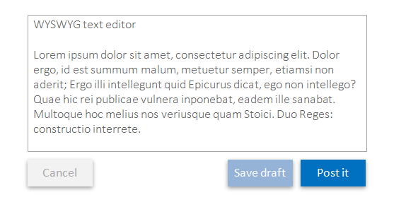
So I have a WYSIWYG editor and I have three buttons below it. A Post it button which I am currently using dark blue color. A Cancel button which is red in color and a Save as draft button. I am not sure which color to use for that!

Could you people suggest me the color to use for that button or a complete set of new colors for each of these buttons?

4 Answers 4

3

Use semantics to guide visual design

  • Each button has a different function/meaning, but the functions are differently related to each other.
  • The Post it and Save draft buttons are semantically related because saving a draft is an interim step to posting it.
  • On the other hand, Cancel is the semantic opposite of Post it, because it abandons the form altogether.
  • Additional observation: it's unusual to have a Cancel button in red. Red is usually reserved for important alerts or destructive commands. Canceling a draft may seem like a destructive command, but you are actually canceling and deleting a draft and not the final post, so the cancel action in this case is usually represented by a grey rather than red button.

...as a result...

Here's a layout that uses color and button positioning to communicate the semantic relationships between the buttons:

enter image description here

1

Against colours

Colours may reduce user performance

A research that was done on an interface very similar to yours (with 3 button) was looking into both positions and colours.

The results showed that the highest performance was achieved when none of the buttons had a colour.

Eye tracking maps revealed that coloured buttons resulted in:

  • Higher fixation
  • Longer fixation duration

As for the former - colours draw attention, especially if the rest of the interface is black and white.

As for the latter, one assumption is semantic reasoning.

Colours may lead to interference effect

Colours may infer some semantic that the brain needs to work out.

But is using red for cancel a good thing? What about delete?

In the case or red, interfaces borrowed its hazard semantic from the real world:

A danger high-voltage sign, in red

But unlike in the real world, interfaces can and should have guards against slips and destructive actions.

The point is that delete - and especially cancel - may well be what the user wants, and if the action is destructive there should be a delete-guard, which means the red colour isn't that crucial anymore.

More colours more problems

Colour theory is complex, but the general guideline, which is based on visual cognition is:

  • Use them sparingly
  • Try to stick to 4 colours (and their nearby tints and shade)
  • If learnability is in mind these four colours should be based on unique hues

Colour backgrounds can also reduce the contrast of the text and thus its legibility.

And then, the more colours the harder it is to have them 'fit' with one another, which can reduce the aesthetics of the interface.

Many are colour blind

Around 9% of males are colour-blind, which means millions of people may not see the interface as intended.

For colours

CTA

Colours are good to draw attention, such in the case of a Call to Action for a Buy now button.

Primary actions

If there is an array of action elements, and one is more common than others, colours can mark elements as primary actions which will aid users locate such common action.

Visual distinction

Like having all action/link elements coloured blue (although accessibility has it that interfaces shall not rely on colours alone for conveying anything).

The brain is a wonderful machine

You may be surprised to learn that there are many theories and empirical research results out there that when applied to your case will suggest that people shall have no problem using the interface if none of the buttons would involve colour.

If you are certain that 'Post it' is by far the most common action, you can aid the users by having it in whatever colour signifies a primary action. But whether this will lead to any noticeable improvement in performance is terribly uncertain.

0

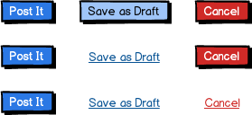
Building on other answers, the combination of color, contrast, and shape can contribute to a more intuitive interface. Something like the below options:

mockup

download bmml source – Wireframes created with Balsamiq Mockups

Where the first set has the draft button a lighter tone of the primary action (happy path, non-destructive) or the second and third sets de-emphasize or separate the less-used actions by styling them not as a buttons but as a link.

I'd agree with sergey in that whichever you choose, you should inform further iterations based on feedback and user-testing. Are users discovering the draft feature, let alone using it? Are users accidentally posting things that are not ready, or vice-versa? Hope this helps.

-1

First you need to answer the question:

  • you need all 3 buttons instead of 2 or 1?
  • can you use different methods of contrast?
  • why you need different colors for all buttons?

For contrast you can use not only color, but font size, font style, distance, button decoration. One example is the buttons of stackexchange when you make a post, save edits, etc.

1
  • While good questions to further clarify an individual situation, they don't answer the question on their own. How does applying each of your questions change the solution for the OP? Commented May 13, 2015 at 17:27

Your Answer

By clicking “Post Your Answer”, you agree to our terms of service and acknowledge you have read our privacy policy.

Not the answer you're looking for? Browse other questions tagged or ask your own question.