59

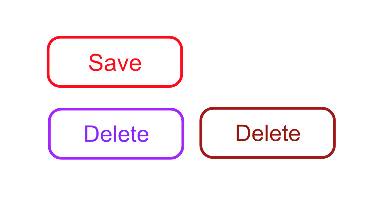
I'm having this question wrapped around my head for quite some time. The thing is that my main application has a red color theme. And for just cancel buttons I used to use just gray colors but now that I need a "danger" color... What should I use? Purple? Orange? Using the red again is awkward, maybe a darker red?

PD: I cannot use blue because it's our competitors color.

enter image description here

11
  • 5
    Mauve. ;-)
    – DevSolar
    Commented May 15, 2019 at 7:19
  • 12
    Red is a warning colour only in (some) western cultures. I believe far eastern cultures use red to mean wealth or money. Bottom line (as the answers show) is to not use only colours, but icons and text for a lot of UI.
    – Neil
    Commented May 15, 2019 at 12:56
  • 6
    you need both a color AND another thing : many, many persons are color blind (in several variants)... Commented May 15, 2019 at 15:35
  • 1
    Looking at the icons you posted in your question, I would be nervous to click Save and comfortable clicking Delete (I'm from the US). Is the red color theme central to your brand, or can you change it? If you plan to market your app in the US, you'll have to work really hard to work against the stress that the color red tends to invoke there. However if your target market is elsewhere, then it may be a non-issue.
    – bob
    Commented May 15, 2019 at 18:05
  • 1
    Yes, you are right. I will use green on "save" and yellow on "delete". Red themes are so difficult to work with... Commented May 15, 2019 at 18:47

10 Answers 10

106

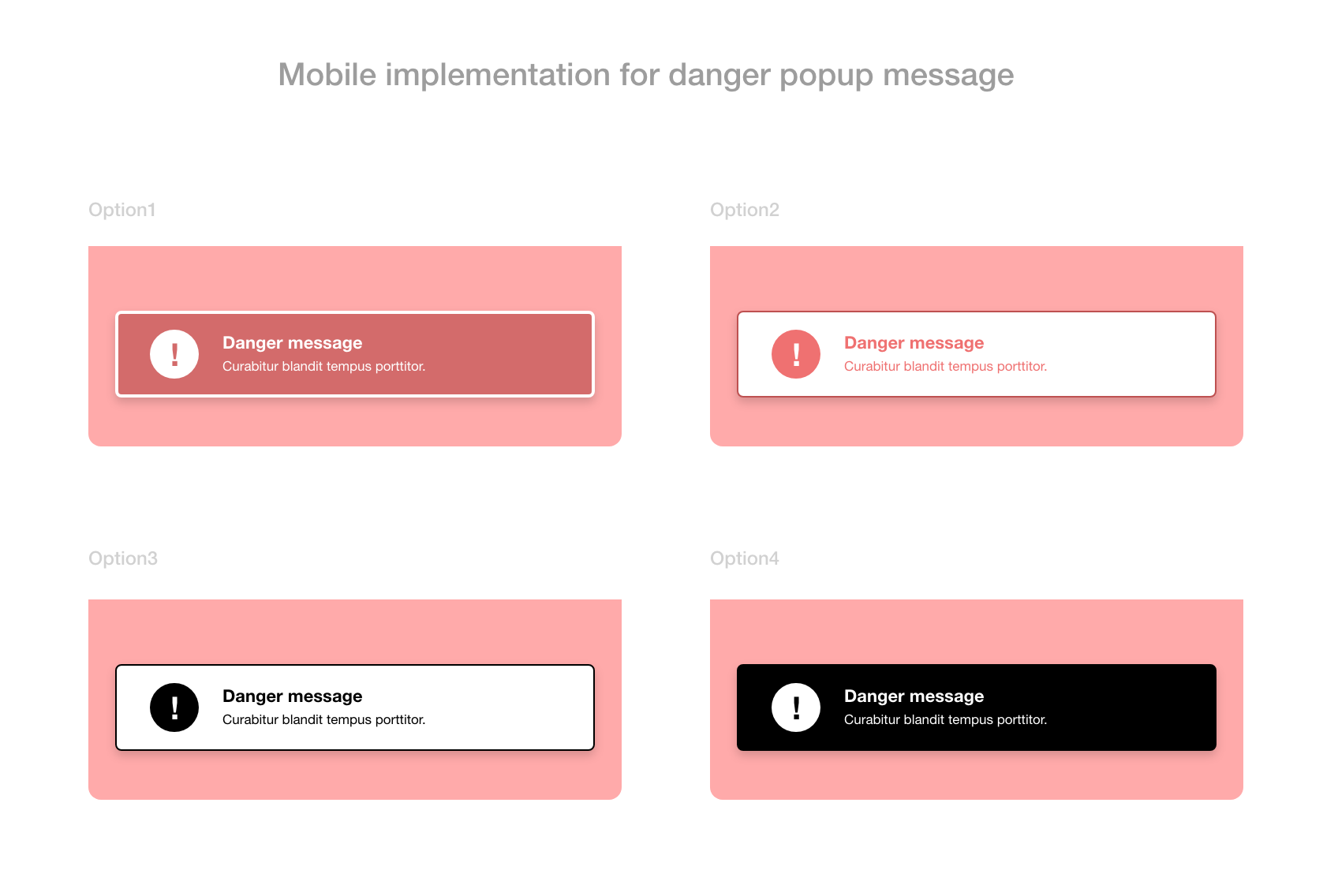
I think you need to play around. If your screens are red and you are about to use a warning or Danger. I have the following suggestions:

1- You can still use red but in different degree in order to differentiate between the app color and your danger action.

2- You can use pure white popup and, apply red icons, exclamation mark or signs within this popup.

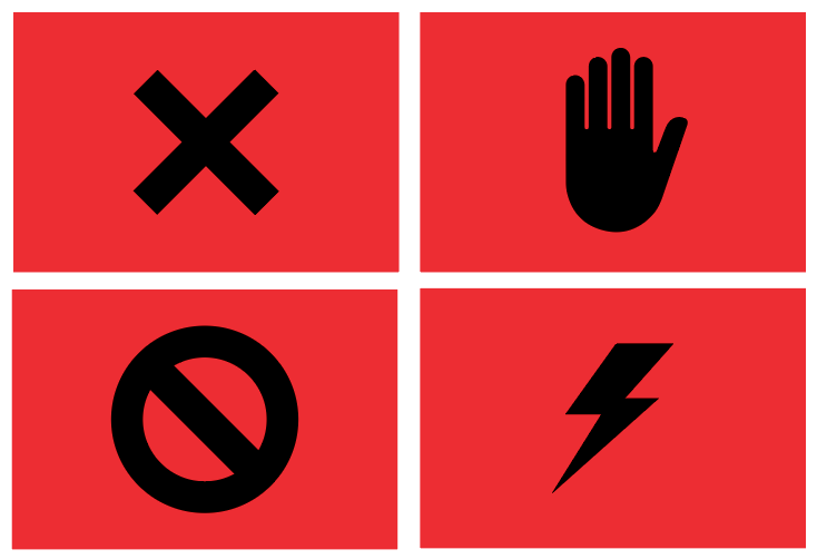
3- Another suggestion is to use black color, and use white signs over the black popup. This may be a change.

If you can provide us with a screen of your red system, I can give you a straight forward solution.

enter image description here

8
  • 44
    I like how the the black text on white option looks, but the white on black really stands out.
    – 習約塔
    Commented May 14, 2019 at 15:51
  • 45
    Nature's warning colour is black stripes on yellow: "I sting". Black text on yellow ground is used for much warning signage.
    – nigel222
    Commented May 14, 2019 at 16:38
  • 4
    using yellow and black it could be a solution but I think it will be overwhelming and more for construction I think. Also, it will not match the red theme as the owner suggested to use. Commented May 14, 2019 at 19:28
  • 4
    In Europe, Black is used as a more dangerous color than red at least for the Piste color scheme: Green, Blue, Red, Black wiki.
    – aloisdg
    Commented May 15, 2019 at 9:52
  • 3
    @Khalil_Hanna Tone it down as much as you think appropriate. I can imagine the above black on white pop-up with a fairly fine diagonally striped yellow-and-black border. Or the ground of the circular shriek as yellow, on the pop-up with the black ground.
    – nigel222
    Commented May 15, 2019 at 12:44
56

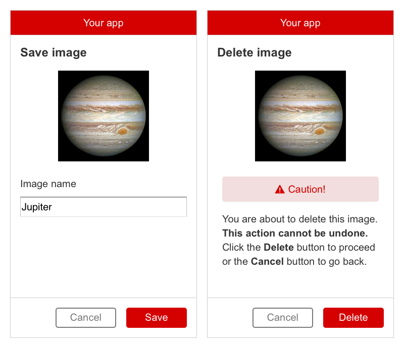
Rather than focusing just on the colour of the button, it's better to focus on the experience as a whole for that particular task. You don't necessarily need a separate danger colour for a delete button. You can use your standard red button, but support it with other danger messaging. Like this:

enter image description here

If your user is about to do something dangerous, it's better to use an alert and messaging to highlight the danger, rather than just rely on button colour.

It's also worth saying that there's nothing inherently dangerous or scary about a red app. I designed for Coca-Cola for a while, and their main brand colour is red. They're a very good example of how to apply red branding to websites and apps, if you're looking for one. They mainly use black, grey and white as their accent colours.

2
  • 27
    That caution message is scary. I'd definitely click 'Cancel'.
    – 習約塔
    Commented May 14, 2019 at 16:26
  • 1
    Actually, the question was so simple at the top, you need a good color for Danger action regarding your "red" application. Actually, designing a new theme is another story, we try to help depend on the given requirements, from your input I can understand that even you have a problem in dealing with one color! So, my suggestion is to include another color add to red let's say "Red and Black" as a primary color. and use gray color and all its degrees as secondary. In this case, you can have space to play. Commented May 14, 2019 at 17:53
36

One absolutely key thing to note here:

Do not rely solely on colour to convey meaning.

Colours are handy for conveying a visual message, but you need to consider accessibility when making these kinds of UX decisions. If your user has any form of colour blindness or other visual impairment, you need some other kind of indicator (icons or wording) to convey the meaning. The fact that the button is titled Delete is great, but if you're concerned that it's 'system-critical' information, then that needs to be conveyed in way beyond simply using colour as an indicator.

This article covers the use of colour with regards to accessibility, and has a paragraph specifically on this:

"...ensure accessibility by making sure you don’t rely on color to relay crucial system information. So, for things like error states, success states, or system warnings, be sure to incorporate messaging or iconography that clearly calls out what’s going on."

Also, considering that red is your app's key colour: ensure that you're using a contrast of at least 4.5:1 to adhere to WCAG 2 level AA at a minimum. This is a really handy tool for checking that: https://webaim.org/resources/contrastchecker/

7
  • 2
    Absolutely! Apparently something approaching 2/3 of men have some sort of color misperception, and that doesn't even address people with low/nonexistent vision Commented May 14, 2019 at 22:51
  • 1
    Good call : this is the most important thing here : never rely on color to convey a meaning, as a quite big percentage of the population is color blind in various degrees (and culturally, colors may mean different things too). Always incorporate the meaning in several different ways (text + color + some symbol?) Commented May 15, 2019 at 15:37
  • 2
    @GeorgeM Approaching 2/3 of men? Do you have a citation for that? Wikipedia gives much lower figures. en.wikipedia.org/wiki/Color_blindness#Epidemiology
    – Rosie F
    Commented May 16, 2019 at 6:52
  • Right. I.e: What if the user is color blind?
    – Coreus
    Commented May 16, 2019 at 8:16
  • I think OP is intending the color to be an additional channel supplementing the text which says what the action is.
    – WBT
    Commented May 16, 2019 at 13:33
10

As the number of viable options increases, it may become more difficult to make a final decision. Once you've narrowed it down to a few, you can consider allowing users to select the scheme they prefer.

Some color schemes to consider:

  • Red = danger = your app is dangerous. Change the main color of your app.

  • Blue = competitor's color. Competitor = dangerous. Use blue for danger. While a lighter blue may be mistaken for a positive alert (such as success), a dark blue may not.

  • Use black and white. The examples in Khalil Hanna's answer are striking. The problem is black/white may be confused with ordinary text. Black + orange/yellow may not have the same problem.

  • Use standard colors regardless the main color of your theme. Green = success. Yellow/Orange = Caution. Red = danger/warning. Etc.

    However, as Aline points out, the Google Material Design Color Usage advises: "Since red is a brand color, don’t also use it to convey an error state. Choose alternative alert colors that don’t use brand coloring." Their example uses orange. But purple seems a viable option as well.

    Material Design Example

1
  • 1
    Since I can't change the main color of my app because of the brand rules I think that I am going to go with the orange. Also, I'll try with the blue one as danger hehehe Commented May 14, 2019 at 15:23
5

The "danger color" should stand out from the color scheme of your app. It is also good to consider meaning. Red/Orange/yellow, in most cultures, indicates danger, alert, attention. Usually, if I see a blue or green message, I automatically think it is a success feedback. I think you should use orange or yellow, to stand out from the main colors.

In Google Material Design, they use orange with red themes: https://material.io/design/color/color-usage.html#meaning

5

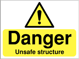
The first color scheme that comes to mind to indicate danger is a combination of yellow and black, particularly if the black is in diagonal stripes. I would suspect the association with danger comes from bees in nature.

Simply typing yellow black sign into Google will result in a lot of signs that indicate danger of some sort. Sings about poison, about danger of falling off, the tape used around crime scenes, etc.

I have personally seen message boxes with a thick, yellow and black diagonally striped border, and they always make me think there is something potentially dangerous, likely a possibly dangerous decision to be made. Seeing a button with a rounded triangle with the same pattern would tell me that I should be very cautious if I press that button.

To me, plain red is not actually as strong, and would need white and black to fully get across the same level of danger.

5

If you are already using the colour red, then use yellow and black. It is a natural warning sign of nature, and will definitely draw attention. It is used also on many danger signs for construction sites.

enter image description here

2

In western countries, there is nothing culturally more dangerous than black on red:

enter image description here

8
  • 1
    What about yellow on red?
    – 習約塔
    Commented May 14, 2019 at 19:37
  • 1
    Or the trifecta...black & red, on yellow: 123rf.com/photo_6253376_danger-symbol.html
    – Tim Grant
    Commented May 14, 2019 at 20:16
  • 1
    @Danielillo Then there's the not-yet historical conscious, which I also thought would be implied.
    – 習約塔
    Commented May 14, 2019 at 21:59
  • 3
    @Danielillo "In western countries, there is nothing culturally more dangerous than black on red" Do you have any source supporting this argument? I believe that black on yellow background and white on red background are much more common than black on red background for danger sign in western countries.
    – zakinster
    Commented May 15, 2019 at 9:35
  • 1
    I like them! These icons are abstract and clear, I think this can work more like a separate sign, and for printed materials. Commented May 15, 2019 at 13:35
1

GETTING ATTENTION

COLOR LACKS MEANING

Color alone does not convey meaning, and as such by itself it should not be relied on for any expression of "danger" or "warning." Further, visual impairments such as Deuteranomaly (6% of males affected) make certain color contrasts invisible, not to mention cultural differences as several have mentioned.

CONTRAST, SYMBOLS, and TEXT

Colors such as red, yellow, orange were chosen not because the color has a specific meaning, but because the color provides a certain color contrast, luminance contrast, and "eye catch," and thus stands out against the background.

It is more important to have adequate luminance contrast, and to use attention/attraction oriented symbols that are clear in their intent.

Luminance contrast does not rely on color contrast which may be misperceived due to impairments or cultural differences, and helps the symbol to stand out. Using a higher luminance contrast than surrounding stimuli (text, buttons, etc.) is what will help gain attention and user focus.

Color contrast can help increase awareness in terms of cognitive recognition of a warning, but it must be a secondary design consideration. For instance, if the market is North America, green is possibly a bad choice for a warning — But green in combination with it's opponent color red (including purples) creates very strong edge detection in normal human visual perception.

Understandable symbols acan be very useful for conveying meaning in a way that (ideally) does not require translation. Though again cultural differences may have a strong influence.

In Las Vegas, the MGM Grand Hotel was originally designed where the front entrance was through a giant emerald colored lion's mouth. Shortly after opening thought, they tore it down and rebuilt the entrance to remove the lion's mouth because they discovered that a lion's mouth had a particularly negative symbolism in some asian cultures.

Within the realm of computers though, there are common icons that have attained an international acceptance of certain meanings — the well understood is typically the better choice, especially for conveying a warning.

Text is king, language differences notwithstanding. Clear and simple text is the best way to convey a specific meaning. A single word with a pop-up tool-tip of additional information is my personal preference for usability.

Animation and motion will affect attention if that is the goal. A single blinking red LED on a wall of 1000 red LEDs will surely grab your attention for instance.

TL;DR

In short, it is more important to have good/high luminance contrast & descriptive text and symbols than any specific color combination.

Here's an example of using luminance contrast, a modification of your example delete button vs the save button:

SAVE DELETE MODIFIED

0

Something to consider about creating User Interfaces is that colour should never convey meaning. However, you can highlight destructive buttons by making them different from other buttons or the rest of your interface. Instead of thinking about colours you could use, try thinking about how to make the button look different.

Change the design

  • Borders - If your current design has buttons with no border, try adding a very distinct (thick?) black or white border. This makes the button "pop" from the rest of the interface.
  • Size - Try playing around with the height or width of the button. Size can help differentiate destructive buttons from normal buttons. But it doesn't always have to be about the size of the button, maybe you could change the font size of the label?
  • Font Style - Talking about fonts, how about adding an underline, italic, or bold to the label to make it stand out?
  • Style - Maybe add a shadow or only have borders and no fill colour. Play with the design and make it look different.

Colours

Everyone's creative side varies, so if you do want to keep your current style but change the colours I would recommend looking at a colour wheel for colours that are opposite your reds. This will help make the button stand out. You can also emphasize the button by going for destructive colours like yellows, reds (obviously darker or lighter), black or white (if it suits your design.)

Design is a very challenging part of the development process, so playing around will definitely help. Get people's opinions - get them to choose a design. Make some mockup designs. I hope this helped.

0

Not the answer you're looking for? Browse other questions tagged or ask your own question.