3

In our product we have a sidebar which contain some widgets. However, certain pages don't need any widgets.

On these pages does it create a better UX:

a) Keeping the sidebar as a blank column. This creates unnecessary white space but keeps consistency between pages as the user navigates around

b) Widen the main content across the page into a single column layout. This maximizes the space but the user may be distracted by the inconsistency in layout.

3
  • There is also the approach that econsultancy.com do, of having a side panel that scrolls at a different speed to the main content so there is never an empty column on the page.
    – JonW
    Commented Apr 11, 2015 at 11:16
  • Is the sidebar on the left or the right side of the page?
    – tohster
    Commented Apr 11, 2015 at 16:01
  • @tohster The sidebar is on the right side of the page
    – webade
    Commented Apr 14, 2015 at 15:00

4 Answers 4

1

For consistency and to avoid an uncomfortably long line length, I would maintain the same layout and leave that column empty. There's little value in filling the whitespace for the sake of filling the whitespace, unless the empty space makes the layout look broken to such an extent that it is distracting.

2
  • 1
    I agree but would add that if it's quite a different area of the site content-wise then it won't be too problematic to go single column as a shift in layout might help to distinguish between areas.
    – Chris
    Commented Apr 10, 2015 at 10:59
  • 1
    @Chris Agreed, it does depend.
    – Matt Obee
    Commented Apr 10, 2015 at 11:04
1

Try changing the user's perception

If you have a sidebar that is flush with the edges of the window, it will be perceived as part of page layout and users may consequently:

  • Expect it to be present on other pages.
  • Be surprised or disoriented when it's missing.

To fix this, you can try to visually disconnect it from page layout and make it part of page content instead, so that users don't associate it with layout and don't miss it when it's gone on other pages.

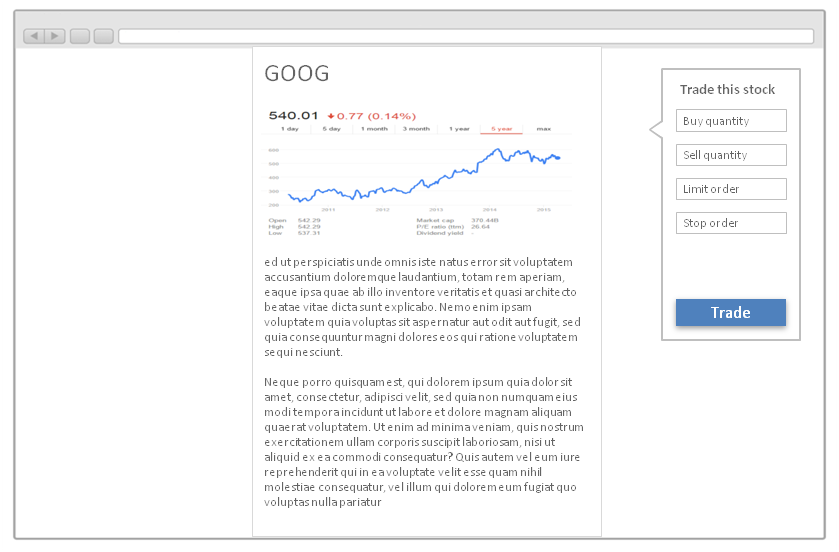
Floating the sidebar helps accomplish this by disconnecting it from window alignment. It can still have a persistent fixed position as the page body scrolls. A callout may help further connect it to the content:

enter image description here

If you use this approach you will have to implement some responsive rules to prevent the floating sidebar overlapping the content on small screens, but hopefully you get the idea.

0

In similar situations I've removed the sidebar, and centred the content area whilst keeping it the same width (to maintain a consistent number of characters per line). So the space that would have been the sidebar is now split left and right. This does depend on the overall design though, and whether it sits nicely with the other layouts.

0

I would convert the sidebar to an off-canvas vertical slider that toggles to view on click or hover.

So that way, you can simply hide the toggle button without having to fiddle with the sidebar as it will be off-canvas while still maintaining a consistent look with other pages.

Your Answer

By clicking “Post Your Answer”, you agree to our terms of service and acknowledge you have read our privacy policy.

Not the answer you're looking for? Browse other questions tagged or ask your own question.