0

In planning the design of an enterprise web app with a large number of pages, I am trying hard to keep the layout clean with a lot of white space and as little clutter as possible.

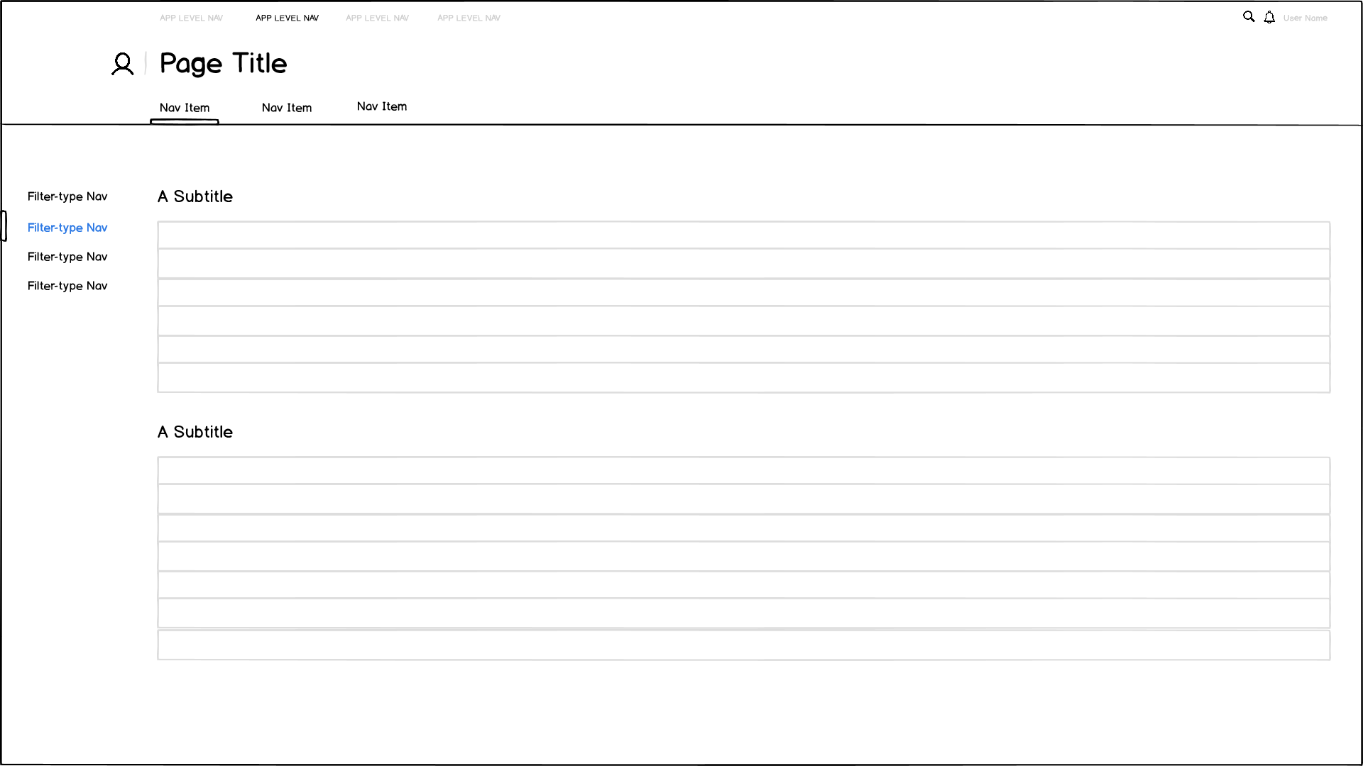
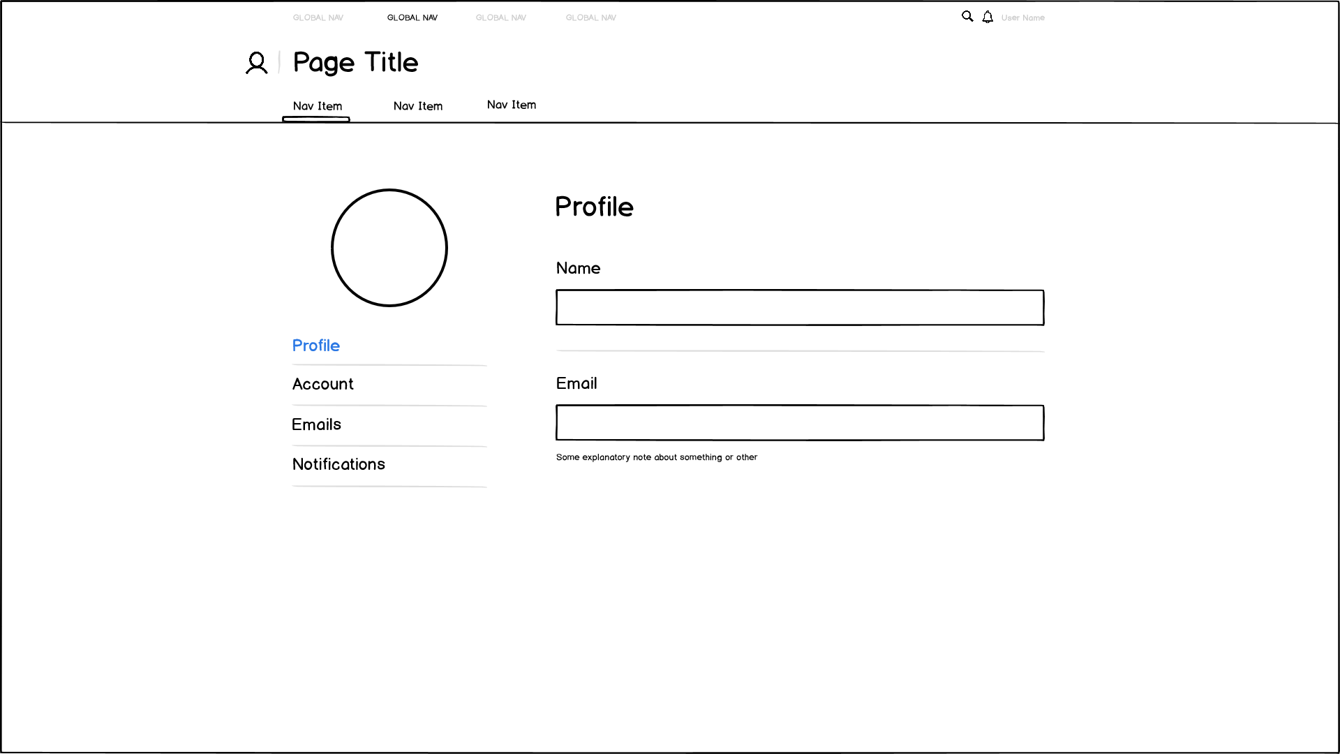
With this, I would prefer to have a centered, fixed-width column layout, something like this:

enter image description here

I prefer this because in my opinion it is less cluttered and feels cleaner for the user. I want this app to be as un-enterprise-esque as possible.

A comparison site would be Github, which succeeds in maintaining the same centered, fixed width size across its entire site. Github is the best example of a productivity web app I could find that accomplishes this.

StackExchange also accomplishes this, however it is easier as non-consumption tasks have a pretty narrow scope.

The problem I am running into is that some pages in the site will require more space to be productive. Take an example of a Gmail-type page:

enter image description here

People have to stare at this page all day and restricting an email listing or a data grid to a fixed width such as 1080px isn't practical.


What can I do about this? Switching between centered and full-width layouts between page changes seems inconsistent and rough on the user. Keeping the nav-header at the center while the content of same pages are full-width would be ugly in my opinion. And I feel if I succumb to a full-width layout for all pages, simple pages will become inescapably utilitarian.

I'm looking for bright examples of sites pulling off the best of both worlds. Unfortunately enterprise and productivity apps aren't as showcased as single page apps and commercial sites.

1 Answer 1

2

Why don't you segment your forms into practical groupings / categorizations and then linearly display these groups: Sender, Attachments, Message - providing less requirements for increased screen space an allowing you to retain your centered fixed-width column layout.

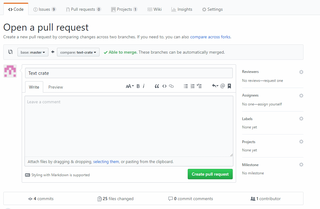
Additionally you can also have an access system via a fixed navigation above the form - exactly the same way in which GIT displays their menu items: Branches, Commits, Pull Requests etc.

So in the image below from GIT you could substitute: Code, Issues, Pull Requests, for; Sender, Attachments, Message (whatever is applicable), They fill out the required info and then hit the Create pull request (Continue) button and progress to the next required category.

Git example

This can then be rehashed later for any content which can be logically grouped; presenting a common interaction for the user for various content.

Additionally by grouping the content into categories, if done effectively, can increase productivity with the application as people will remember where sub-categories / interactions are located - just like GIT.

2
  • ps I'm new to posting here, so please give me hints on how to improve this answer.
    – Zze
    Commented Mar 6, 2018 at 4:50
  • Thank you for the work put in to this answer. My only concern with this, while it could definitely be done, is that you start to shape a wrench into a hammer to fit your needs, and what I want is the best possibly productivity flow for the user while maintaining aesthetics (impossible, yes I know). Another example page I need literally needs to behave like an Excel grid--look and feel like one. I would absolutely never, ever use excel if it didn't bleed off the page and I could only keep it in the center of my screen. Data grids behave similarly.
    – dthree
    Commented Mar 6, 2018 at 5:11

Your Answer

By clicking “Post Your Answer”, you agree to our terms of service and acknowledge you have read our privacy policy.

Not the answer you're looking for? Browse other questions tagged or ask your own question.