4

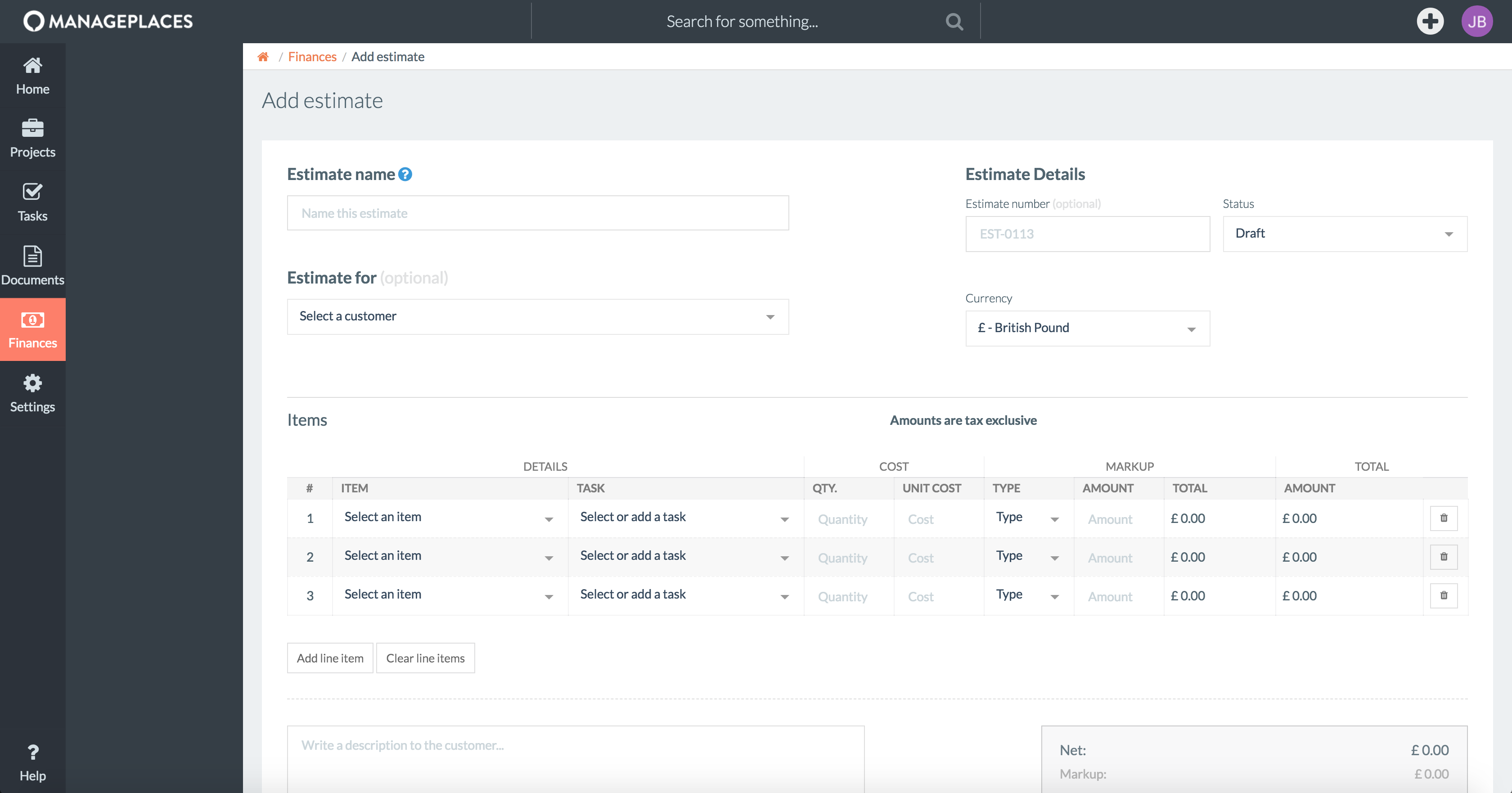
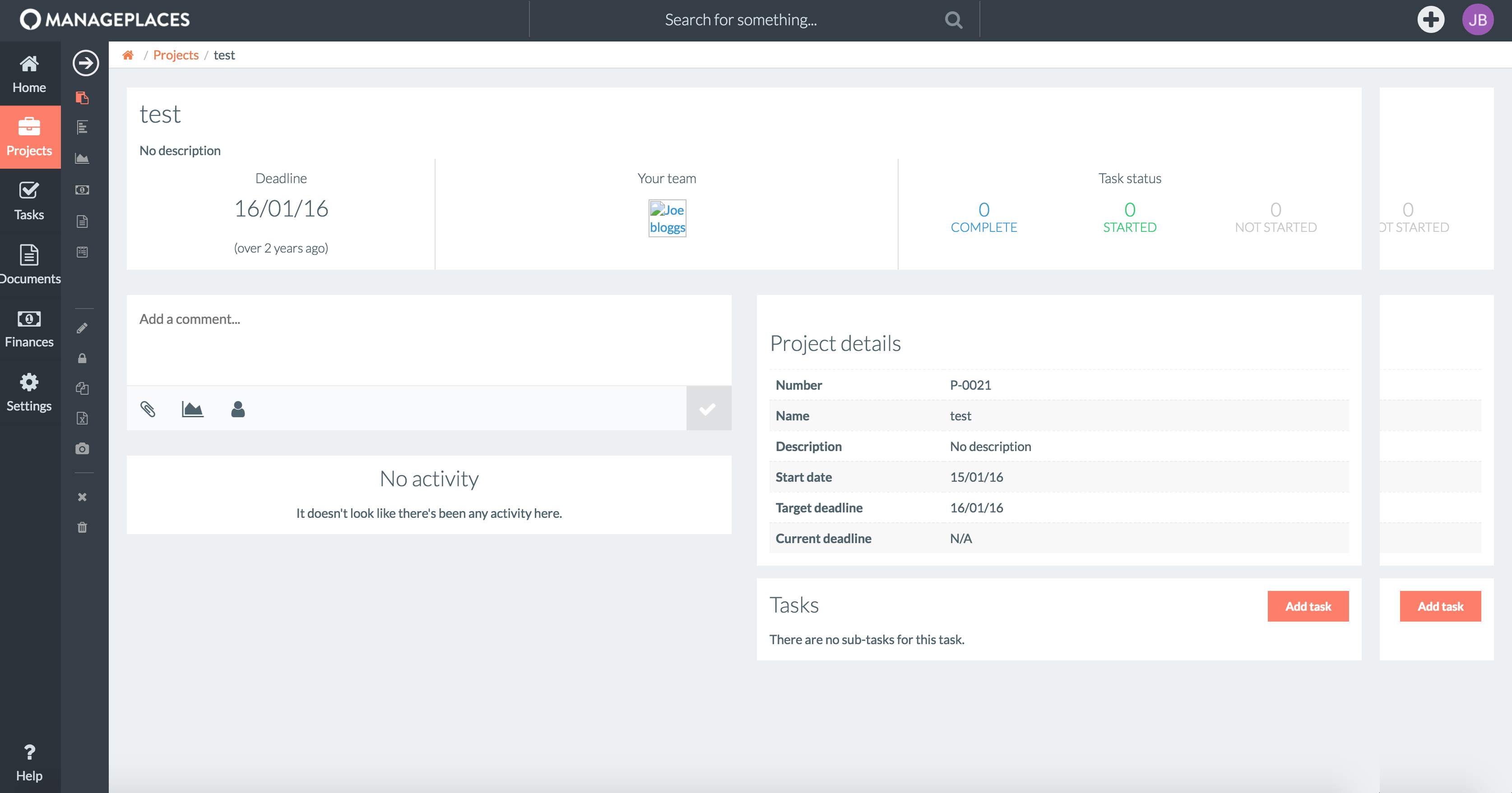
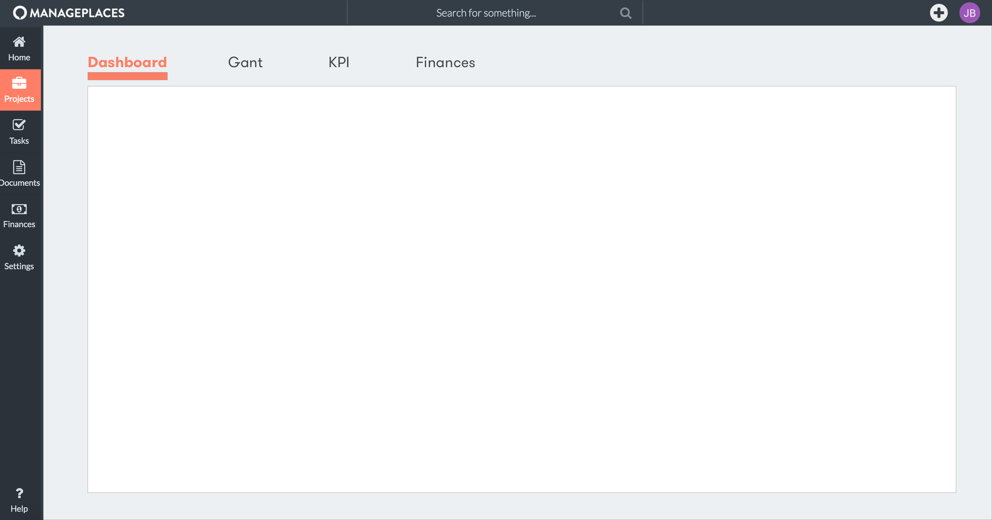
In our application, we've got a dual sidebar design. On the far left is the main navigation sidebar, with all the top level pages. Next to this is a contextual sidebar, with links relevant to the page your on. On some pages, these are tab links which change the content you're viewing, on others they can be filters.

On some pages however, we don't really have any content to put in here, so this leaves me with a few questions:

  1. From a UX point of view, does this navigation system make sense in general?

  2. Is it a bad idea to only show the secondary sidebar on some screens? It's currently always shown for consistency but it is wasted space on the pages where there's nothing to show.

Edit

Here are a couple of screenshots of what we currently have. You can see the empty sidebar is just a waste of space really.

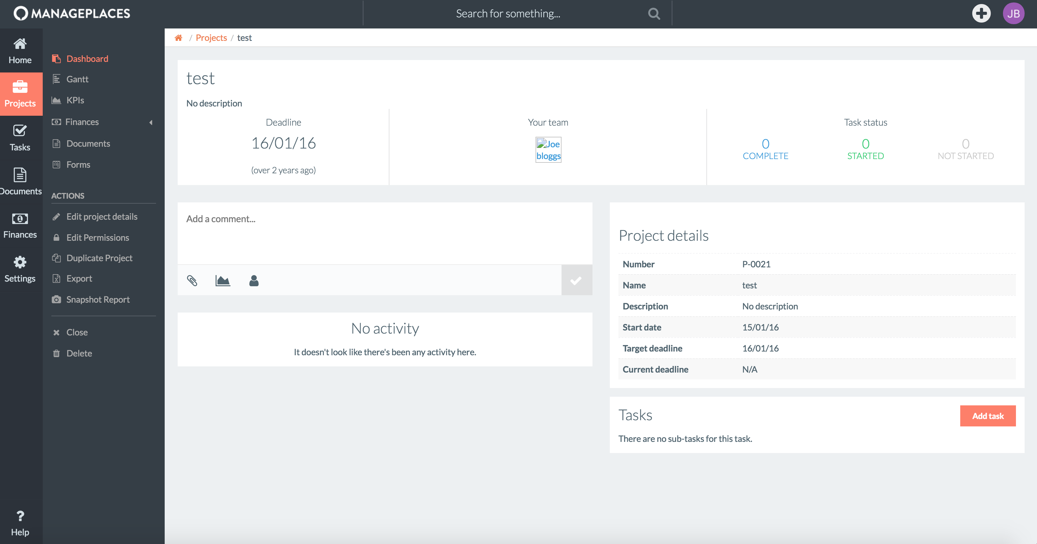
Sidebar with content

Sidebar without content

2
  • A visual would help us understand your question a bit more. Commented Aug 10, 2018 at 6:19
  • 1
    @RobE updated :)
    – PaReeOhNos
    Commented Aug 10, 2018 at 8:15

5 Answers 5

1
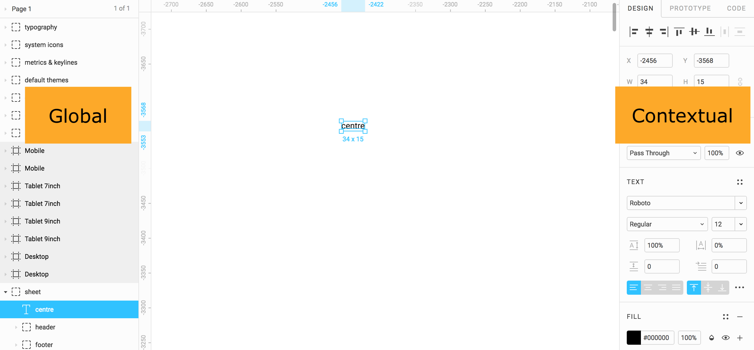
  1. It's hard to tell if it makes sense from a UX point of view, because a lot will depend on the user, their profile, backgrounds and habits. However, it is often seen to have a global view on the left and a contextual one on the right. You can see this pattern in a lot of "studio" applications like Figma. enter image description here

    1. Your users are better having only what provides value to them. So if there is nothing that can be useful in the secondary sidebar, you should get rid of it.
1
  • The contextual model you reference is generally an "inspector" or "detail" view of the selected object(s) on the main stage. That is not a navigational pattern in any application I've seen. I think that would carry a considerable amount of mental overhead for the user. Commented Aug 9, 2018 at 19:09
1

I really really like the look of it, great job! Here's a very quick fix, the arrow is a bit bigger for demo purposes.

Arrow allowing user to collapse second sidebar

Collapsed second sidebar with icons

Another method would be to extend on hover but that may lead to accidental clicks or actions

1

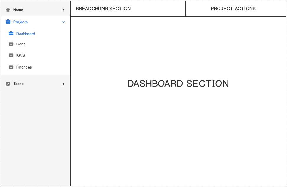
You need to restructure your side navigation bar. The nesting of elements should be within a single navigation bar and actions should be brought in the main view instead of keeping them in the navigation bar. By structuring it this way you will be able to avoid that empty secondary navigation bar.

Check out the wire-frame given below for the concept explained above:

enter image description here

1
  • Wouldn't this be a bit confusing in that the content within the projects option in your example would change? The projects view is a listing, so I would be wanting to show filtering options instead of those menu items, but when looking at an actual project it would be the options shown above? Side note I am planning on remove the actual actions in the sidebar - i hate them.
    – PaReeOhNos
    Commented Aug 10, 2018 at 12:22
1

I'd like to reply to one of the comments but my score isn't high enough yet. Sorry!

Going to your questions:

  1. Yes in general lines. -expanding on 2-

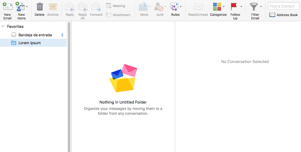
  2. I'm gonna jump into conclusions and guessing you are not finished defining the elements at the side navigation. Why? The selected category is called Projects, which I guess will encompass multiple different project in which KPI's / finance / documents /etc are common subcategories for all of them (eg. Project > X company > Y Subcategory). Currently you have no way in which user will be able to select one of those. The solution @Sheraz shows on the wireframes could solve this first micro-issue (if remains true). As for the secondary/contextual navigation, I've seen them plenty times before but mostly on email providers (gmail / outlook to name a few), not so commonly on dashboards- example bellow. I've never seen an empty gray column with no content whatsoever. They are usually acompanied by some sort of information if the content is null. Some more info could be found here enter image description here

As an extra note:

I do not dislike how it looks, but its pure opinion and not a relevant flair. Could you test it out to see how it performs?

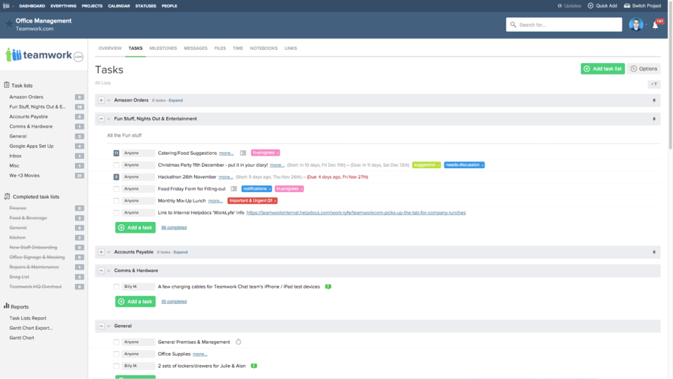
I think tabs could be a good solution based on my experience. You'll save the space and avoid all thats being discussed here.

Find an example from "teamwork" bellow

enter image description here

What about using tabs for these contextual navigations as seen bellow

enter image description here

Best,

Fede

1
  • I've since revisited the design and we've actually switched to tabs as a few people mentioned it being the best option and after playing around and also dropping support for a mobile UI (introducing native app instead) it made it workable. I'm not sure I follow your point about the users not being able to currently select one of the subcategories though?
    – PaReeOhNos
    Commented Nov 9, 2018 at 9:12
0
  1. Yes, secondary navigation is quite normal and can appear anywhere on the page. But in a bar along the top you can share space with breadcrumbs, for example (see also @Sheraz answer).
  2. No, because you are showing things exactly as they are. You can’t get much clearer than this to tell users about your site structure, and therefore what they can expect.
7
  • So it wouldn't be a problem from a consistency perspective? I was always under the impression the one of the most important things from a UX standpoint was that the app remains consistent? In this design I thought that simply removing the sidebar on some pages would be too inconsistent?
    – PaReeOhNos
    Commented Aug 10, 2018 at 8:16
  • @PaReeOhNos Consistency can also mean ‘never show empty containers’. Rigidly applying layout components should not be your primary guideline. If you must, you should consider moving it to the right, for example.
    – user109724
    Commented Aug 10, 2018 at 10:57
  • Fair point. From a design perspective then, would it be less confusing to have that sidebar stay as it is and then suddenly disappear on some pages, or adjust its design so that it looks more like its part of the content? Say make the background of it transparent so it becomes a menu within the pages content if that makes sense?
    – PaReeOhNos
    Commented Aug 10, 2018 at 12:23
  • To visually move it to the margin of the content makes sense, but in that case I would move it to the top or the right. Otherwise you are trying to solve a problem of your own making. A ‘tool bar’ at the top would be my choice, after just not showing it in the first place where it is not needed. (That is my answer anyway, feel free to disagree!)
    – user109724
    Commented Aug 10, 2018 at 12:47
  • We had the options in a bar across the top originally, it just started to get very cluttered when we expanded the system and didn't seem very nice.
    – PaReeOhNos
    Commented Aug 10, 2018 at 13:48

Your Answer

By clicking “Post Your Answer”, you agree to our terms of service and acknowledge you have read our privacy policy.

Not the answer you're looking for? Browse other questions tagged or ask your own question.