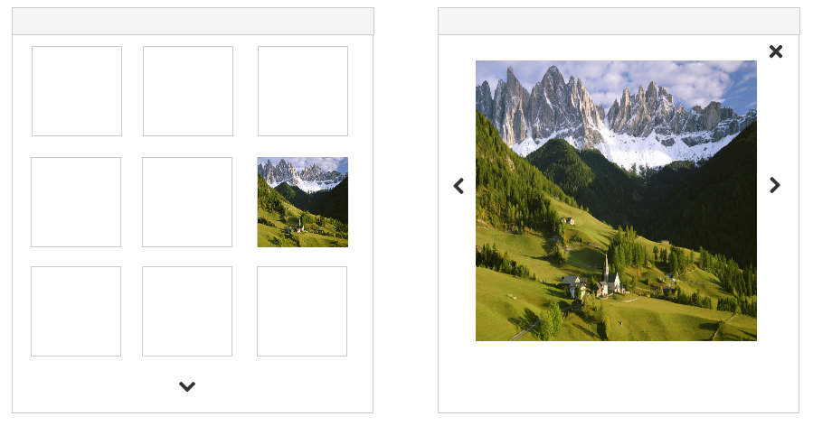
I'm desiging a site for a client that wants to implement and image slideshow on interior detail pages. I'm curious if people still use sliders or if an image grid would be best for UX.
Thoughts?
I'm desiging a site for a client that wants to implement and image slideshow on interior detail pages. I'm curious if people still use sliders or if an image grid would be best for UX.
Thoughts?
Sliders are still used (Facebook on iTunes website). They usually provide nice, large images so you can view the individual screens properly. A grid, however, often contains smaller images, but, you almost always get an instant overview of quite a lot of images (like so). Both options are viable. My advice would be: decide what suits your project best by determing the amount of images you want to show. Slider for i.e. up to 5, maybe even 10 images. Grid when more than 10. People hate scrolling, so try to keep scrolling to a limit.
Edit: Google Play also uses a slider to show app preview-screens, but I can only provide 2 links max.

You could use either approach, depends on the context of what the End User prefers. Grid is faster to scroll as suggested by @EdwinLambregts above. E.g. you scroll through the images, click on one and you get into full view with the options to go to next image/previous. Clicking on X will get to back to grid view. Alternatively you can launch into full view on page load. Again it depends