I am working on the checkout flow for the mobile device, and it has 3 steps, Step 1- shipping details, step 2- payment details, step 3- order summary and confirm to buy. The flow starts with cart page where user can see product info, edit it, apply coupon code etc and from here can proceed to checkout. Is it a good idea to show product info again (product image, colour, size, quantity) in the 3rd step of checkout considering the fact that checkout funnel starts with cart page where all the products with full details are shown. I am wondering if the summary page would be overwhelming with too much information to digest thus defeating the purpose of the step? Suggestions?
-
3Single-page checkout. Forget about 3 steps and other nonsense, especially on mobile where users have the least time and patience to deal with loading times.– dnbrvCommented Mar 11, 2015 at 4:12
-
Actually, e-commerce is the most highly researched area of usability and there are no indications that single page check outs work better. There are a million things you can do to optimize the conversion, but no evidence that single-page vs multi step is one of them.– Yonatan GaliliCommented Oct 8, 2015 at 6:36
6 Answers
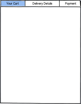
I agree with Roel in part that Cart Summary > Delivery > Payment is fine. I just wonder if you can make all 3 accessible at all time so it is sequential but you can jump back if you want? Something like this:

download bmml source – Wireframes created with Balsamiq Mockups
So if a user has finished the Cart section and hit 'next' or something then they can still tap the 'Your cart' tab to jump back but preserve the data that has been entered in the later tabs.
I think that your checkout process is clear enough without the order summary as an additional "check" for the customer. The most common process would be the following:
- Cart Summary
- Delivery
- Payment
- Confirmation/Thank you
Lots of people use their online shopping cart as an informal shortlist. They are basically curating the contents of their order after putting it together and then decide to act on it or not. If they do, you want to roundup the process as smooth as possible:
Delivery > Payment > Confirmation
I second @dnbrv in the comments. Just do a one page checkout experience, and minimize the fields. Always keep in mind that any checkout experience is a stressful experience (need to put in sensitive information, need to get the address correctly, etc), and you need to do what ever it takes to make it an easy checkout experience.
Amazon implemented an interesting flow: You just need to confirm the your order and pay then and there. They skipped everything else (mainly because they already have everything saved, but this gives you an idea of minimizing the friction).
If you implement a one page checkout experience, I would highly suggest firstly to show the products that they are buying front and center (with the price breakdown and how much it will cost them in the end with taxes, shipping and other fees). Then break it down with shipping information, billing information and finally a confirmation section (summing up everything).
Best of luck!
Best thing you can do, is
1) Give users brief description/photo and price of the product, which will takes them into Product details screen if they want to - after click
2) Prepare prototype/mockups of the checkout process and just take few rapid usability tests - it will answer your question even better then any declarative studies/surveys etc.
Good luck ;)
It's a good idea to give a quick summery on the confirmation page as the user will want at this point an overview of the transaction and to know what is being paid for. this is in fact the goal of this page.
However as Baymard Institute's excellent Check Out Usability Study recommends
Keep the elements around the checkout form to a bare minimum so customers can focus on paying for their products.
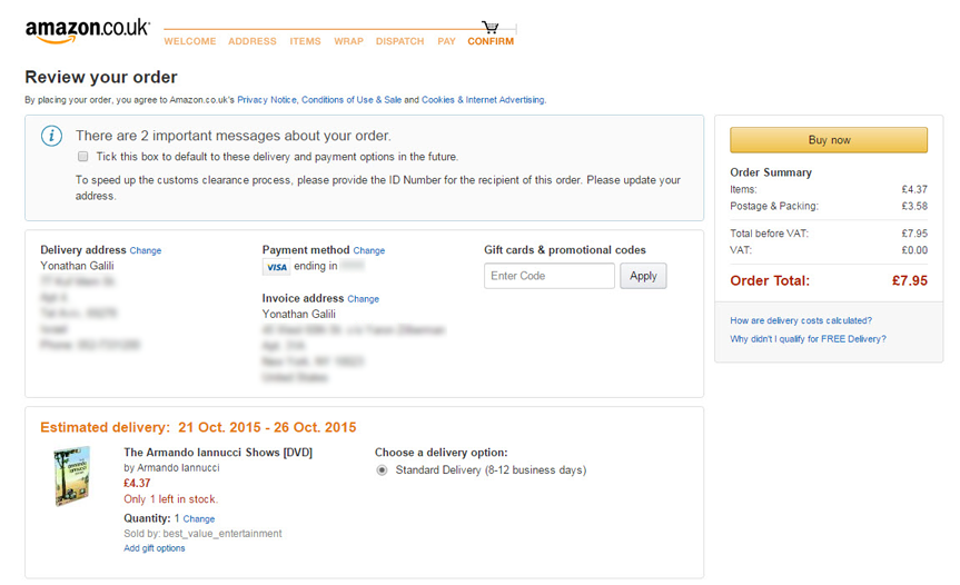
This is how Amazon does it
NO need to show all details. Just Product thumbnail, name and quantity.
Customer has already made up his mind to buy something and that is why he has put it in his cart. Also showing too much information may distract the customer.
This is my opinion. You can consider A/B test. I was doing this study and research for more than 3 months for my company and finally designed a new one which is delivering more business.
-
4Could you elaborate on why you think so, and maybe add some reference to support your statement? Thanks! Commented Mar 11, 2015 at 7:13
-
Sure. I would like to give you a real life example. You go to the supermarket to buy pasta and red sauce. You go to the pasta section and take one packet or a few and read everything on the pack. Maybe you will check price and ingredients and color and decide which one to buy. Then you will go to the sauce section and pick one. Then you come to the cash counter. The guy will scan it, total is displayed on the counter and then you give him your CC and so on. Please tell me what is the possibility of you checking all the details on pasta packet at cash counter again? Commented Mar 11, 2015 at 7:23
-
3Sorry but this example doesn't match online shopping experience, because online your are not buying everyday things only. Did you bought pasta online recently?– FrankLCommented Mar 11, 2015 at 9:25
-
User experience is important. Online or offline does not matter. I buy these things online here in India and once they are in my cart, i do not check item details again. This is where user survey and A/B testing comes into the picture. Commented Mar 11, 2015 at 10:09
-
2You can't just base UX recommendations on your own subjective experiences. You aren't designing the system for yourself.– JonW ♦Commented Mar 11, 2015 at 11:01

