14

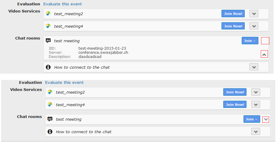
On a website I have a pane that can be expanded to show additional information. The "show more" button (red square 3) turns into a "show less" button when expanding it.

What results in better UX? The button staying on top (red square 1) when expanding it or the button going down to the bottom of the expanded pane (red square 2)? Or is there a completely different way to let users expand/collapse content that's even more user-friendly?

examples

3 Answers 3

25

It's good to keep buttons in the same place.

Here is a use case that could be pretty common. Let's say a user wants to just quickly glance at the additional information for the meeting. It's easier for the user to put the mouse in one location and click to expand (and retract), as opposed to clicking, expanding, moving the mouse to the new button location, then retracting. It's less mouse movement on the part of the user.

Along with the icon change and dropdown motion, this should be enough visual feedback for the user that their next click action in the same location will retract the dropdown they just expanded.

Here is an example of what I am talking about. This is how the dropdown would start:

Start

As you can see, the arrow is point down to indicate to the user that there is more content. Then once it's clicked, this is how it would look to the user.
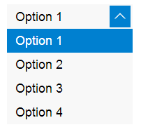
end

image source

The button would stay in the same location, but the arrow would change directions, indicating to the user that if they click in the same location, the dropdown will collapse.

In this particular example, they had the button change colors as well. For your particular case, I don't know that you need the arrow color to change, but it couldn't hurt to do some user testing to find out what your users prefer.
2
  • 5
    That's exactly the first thing I thought when seeing the button move down ;) Commented Jan 29, 2015 at 14:01
  • 1
    It might also be nice to add a little screenshot to your answer showing how the icon should change to indicate expand and retract. :)
    – Franchesca
    Commented Jan 29, 2015 at 15:49
3

In general you don't want your controls to move. All generalities in UX are subject to the specific context and workflow of the user, but it's a good baseline.


Digging a little deeper into the reasoning behind hiding the information, you need to consider the user looking at this screen.

  • The information hidden within the collapsable area doesn't seem necessary to the task. It isn't editable and only shows what you'll be joining when clicking "Join". If that information is useful to all users, hiding it is doing them a disservice. If that information is only useful to advanced users (who might be using it to connect to that server from an external tool), then you really haven't given them any way of knowing what information is hidden behind the toggle.

  • Adding extra controls to a screen can often slow down a user. If 90% of your use cases are just clicking Join, you're slowing down some percent of users who see the button and want to know what it does. Is saving three lines of vertical space worth it?

  • For the advanced user looking to copy this data from one screen to another, I'd ask if you even need to close the panel. If all they are going to do is transcribe or copy'n'paste the data into another screen, the next step is probably just to close the window.

If you had more information on the use cases for the screen, we might be able to provide a little more insight. Ultimately it all come down to your users!

Good luck!

1
  • It's part of an event page which shows information such as a detailed timetable (e.g. for a meeting) so having everything expanded - it's indeed information most people won't need - would waste quite some space. Commented Jan 29, 2015 at 14:38
2

Microsoft's Ribbons are an interesting example.

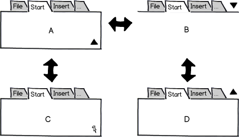
In Office 2013, there's a button at the bottom of the ribbon to close it (A), and no button to bring it back immediately (there is a button next to the minimize button that opens a menu to select how the ribbon should behave however). Instead. you need to click one of the tabs to temporarily open the ribbon, then click the pin icon (C) at the former location of the triangle:

mockup

download bmml source – Wireframes created with Balsamiq Mockups

In Explorer on Windows 8, there's a triangle button in the same row like the tabs. It either points up or down and toggles the ribbon (B and D).

If I remember correctly, Ribbons in Office 2007 and 2010 had a triangle button at the right bottom of the ribbon to close it (A), but a button in the row of the tabs to open it again (B).

A-C is a little counter-intuitive at first, because you might seek for the "open it again" button at the top right window corner, but you actually need to click on a tab to reveal that button.

B-D is easy to learn and allows to quickly open and close the ribbon. It might feel a bit odd to have the close button above the thing you actually want to collapse.

A-B does not have that issue, but the button changes location and can thus be frustrating to users who want to toggle it quickly (or undo the action because they accidentally click on the button repeatedly).

2
  • I have Office 2007 and it does not have any buttons for opening and closing the ribbon.
    – kinokijuf
    Commented Jan 29, 2015 at 21:16
  • You're right, I googled for some screenshots and there is no button at all in Office 2007, and the Ribbon in 2010 uses B-D. I might have seen A-B in 3rd party ribbon implementations.
    – CodeManX
    Commented Feb 4, 2015 at 10:48

Your Answer

By clicking “Post Your Answer”, you agree to our terms of service and acknowledge you have read our privacy policy.

Not the answer you're looking for? Browse other questions tagged or ask your own question.