2

I have a table view that's showing attributes of a record, very much like Edit Info screen in the iOS Contacts app.

Also like that screen, I'd like to show a "Delete Record" button at the bottom.

It seems to me there are two possibilities:

Choice 1: Button in Last Row

In the iOS Contacts App, this button is the last row of the tableview. The button is not visible unless you scroll down.
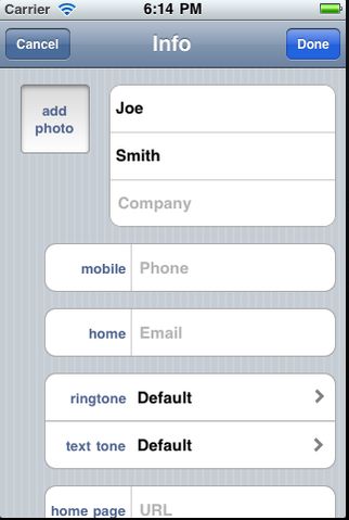
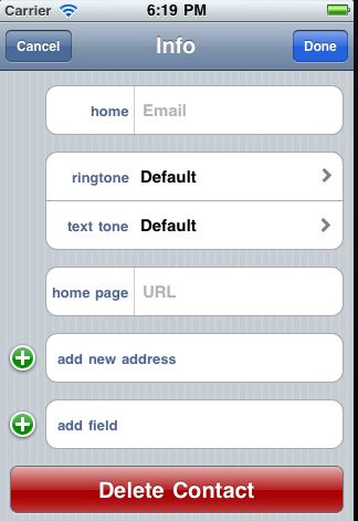
enter image description here

enter image description here

Choice 2: Button outside table

But you could also fix the button at the bottom of the screen, so it's always visible. Chews up more real-estate, but avoids burying the affordance.
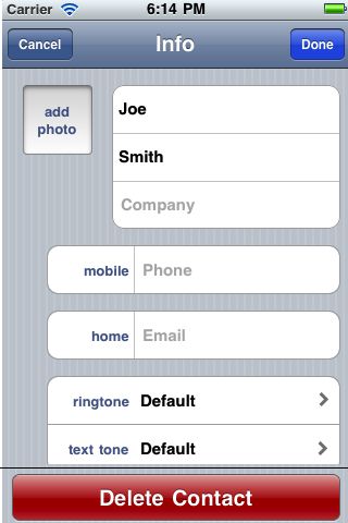
enter image description here

Which is better, and why?

Is there an alternate design I should consider?

Other notes that might be relevant:

  • table wouldn't have strictly fixed number of rows, but not many either (say max 10)

  • hitting the delete button is not expected to be a particularly common operation, but I'm worried about it being hidden at the bottom of a row.

2
  • is there also a list of objects view (eg. preceding screen) where the deletes can happen via swipe gesture?
    – Erics
    Commented Sep 30, 2011 at 2:08
  • No, in this case there happens not to be: preceding screen is also showing details of a single object, and this screen is one of its attributes. (To continue using the contact example, preceding screen is Employee Details, and this is "Supervisor"; the delete button means "I have no supervisor", etc.)
    – ckhan
    Commented Sep 30, 2011 at 2:16

1 Answer 1

3

When it comes to designing for the iPhone, I tend to keep to the Apple HIG, and the patterns that iPhone owners are most likely used to.

Almost everyone with an iPhone uses mail, calendar, contacts, etc. So whatever the pattern in there, it is likely that they either were the right patterns, or people have come to expect them.

Deleting a record is not something that you want to emphasise, which is what you would be doing by placing the delete button so prominently. Yes, it would be more visible and easier for someone to find, but not that much easier.

Overall I think Apple got this one right and I would follow the way that they did it.

Your Answer

By clicking “Post Your Answer”, you agree to our terms of service and acknowledge you have read our privacy policy.

Not the answer you're looking for? Browse other questions tagged or ask your own question.