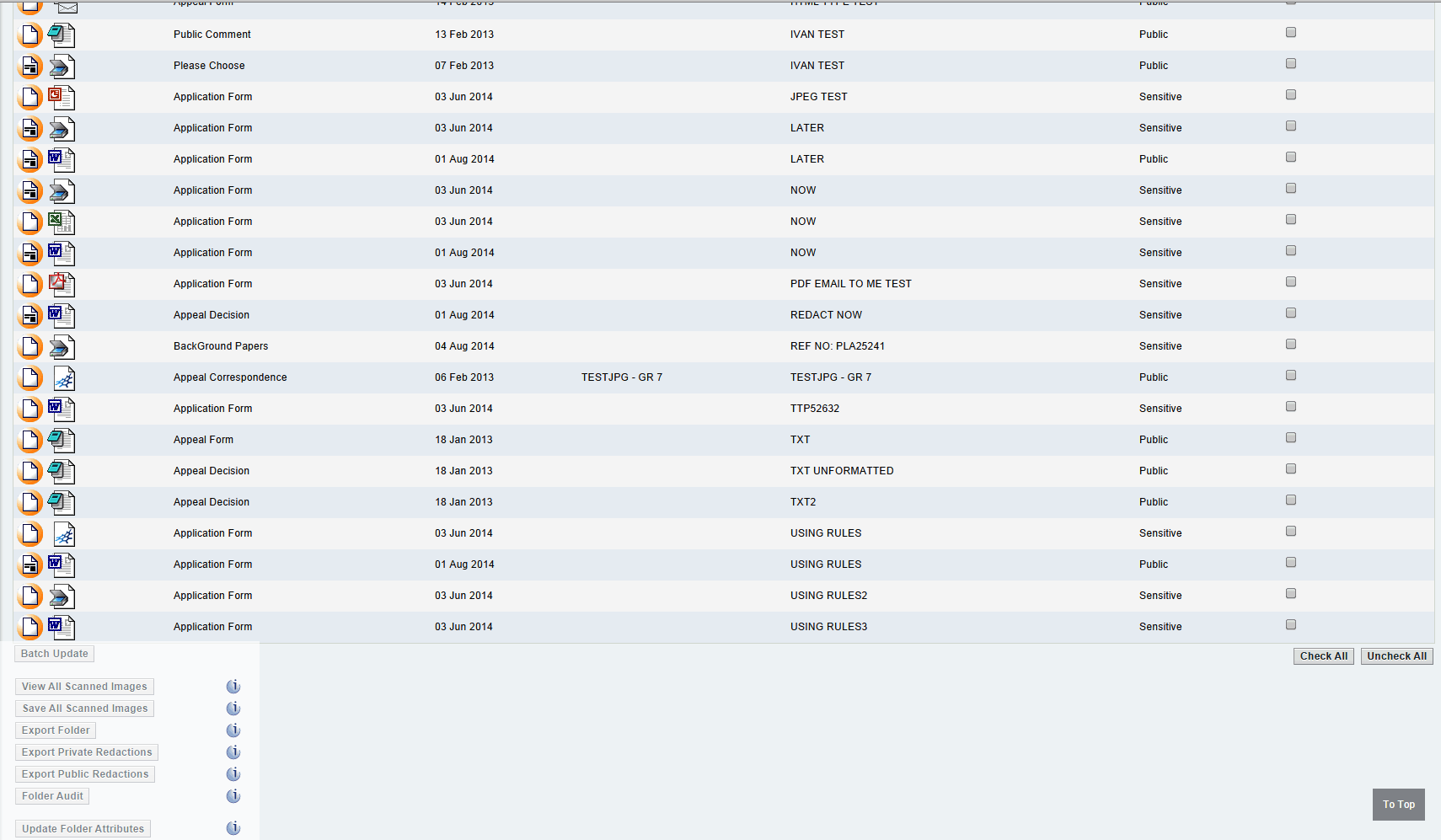
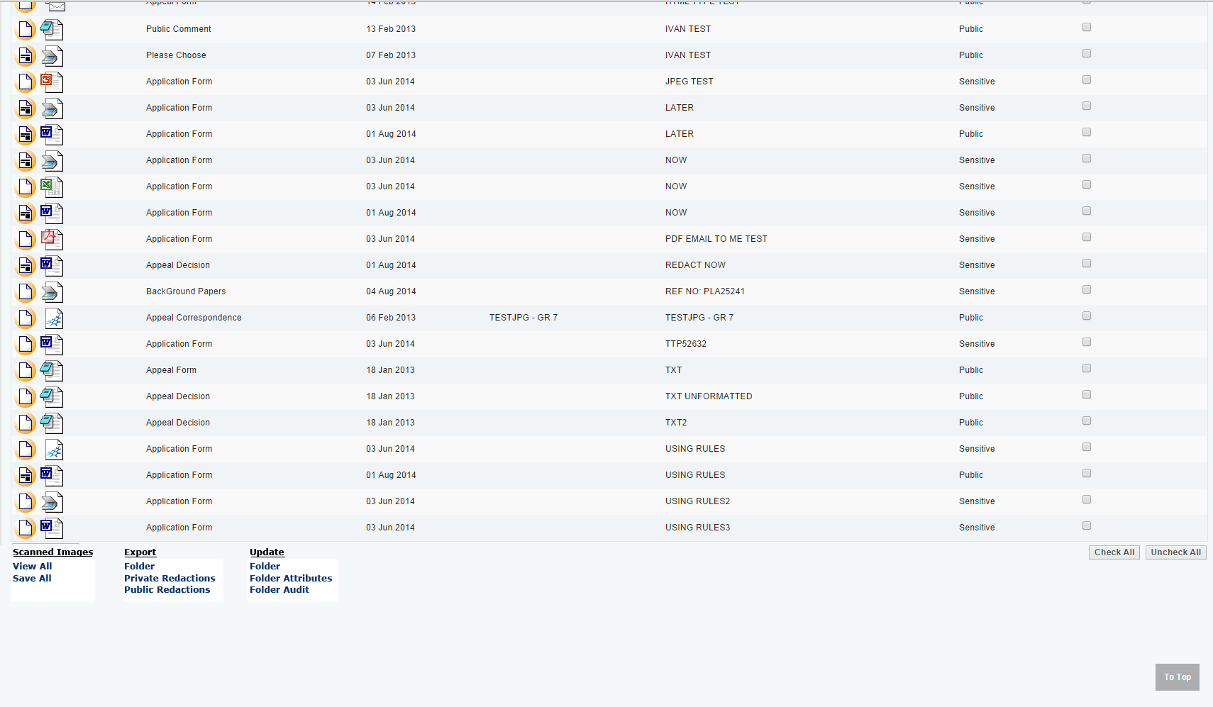
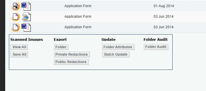
I agree that organizing the buttons into categories is an excellent choice. The groupings make sense, and it's easier for the human brain to chunk these pieces of information. So it's already better.
Here are a couple of things to think about. I'll give you a high-level strategic approach and some possible quick wins.
Quick wins:
- Is there a way to space the buttons out so that they appear underneath the columns which they affect? If the column width is consistent, and this application is not being viewed on a variety of screen widths (it's not responsive, I'm guessing?), this could be a nice, logical way to tie actions to their respective columns.
- Visually, I would recommend creating a way to draw the eye down to this box of actions. There is a path of color that leads down the page by virtue of having the icons on the left. Incorporating a bright color in this box can draw the eye down. (That said, don't go bonkers - make sure it's stylistically matching the page so it doesn't look like an ad, because then people will ignore it.)
High-level strategy:
Consider the "verbal approach". If you think of the buttons in the box something like "Options" or "Actions" this can help guide your strategy.
These buttons are the Verbs: things you can do. And the items in the table are the direct objects.
So if you were explaining to a coworker or a friend what you'd do on this page, how would you describe it?
The answers you create to these questions will help you derive a solution based on your own knowledge of this application and your experience as a designer.
Good luck!


