Background:
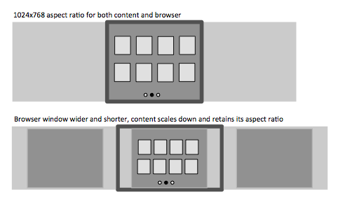
I am contributing to a dashboard-like browser application where current thinking is to use a tablet metaphor. The viewport is fixed aspect ratio (1024x768 that scales with a 1024 width minimum). Multiple pages of the dashboard are paged horizontally like on a tablet with the ‘little circles or dots’ indicating what page you are on. When you click or tap one of the elements the item expands to a full screen view. The majority of our users are using this application on the desktop in the browser. Here is an example of the structure:

This feels wrong to me, forcing the tablet metaphor onto the desktop, which has a different set of constraints. I want to scroll vertically. I want to expand the height of my browser to see more content, not to be forced to a specific aspect ratio (the content is chart and image heavy, they scale when you change the browser window to keep the tablet aspect ratio). This is just my subjective opinion, it’s not based on anything other than gut feel for what is the best experience.
Question:
Is there documentation, research, or accepted best practice that suggests whether this approach (I.e. adopting tablet metaphor on desktop right down to forcing the aspect ratio) is valid, and/or when it is appropriate?
