I need to justify my choice of screen resolution for a website that has to run on old PCs. When did 1024x768 first become popular? Are there stats somewhere about how far back you'd have to go to find a desktop with resolution smaller than 1024x768? Failing that, anyone want to take a guess?
-
6You may be asking the wrong question. It's not just about screen resolution. I often surf with windows that are only 600-800px wide. If you can't accommodate that scenario you'll cut out a number of users.– Alex FeinmanCommented Aug 29, 2011 at 18:21
-
2Are you assuming only people on desktops will use your site?– DA01Commented Aug 29, 2011 at 19:51
-
5also note that screen resolution != browser viewport size.– DA01Commented Aug 29, 2011 at 19:52
-
Text is usually easier to read when lines are not overtly long, which is why browser window often indeed is not as wide as screen.– ZdsCommented Aug 29, 2011 at 20:14
-
Thanks for the caveats everyone. There will be a mobile version of the site, so I'm really only worried about the desktop / laptop scenario.– iftheshoefritzCommented Aug 30, 2011 at 10:15
5 Answers
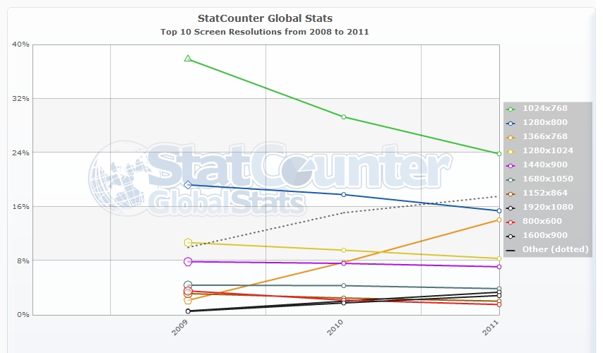
statcounter only goes back to 2009, but their graph shows that as far back as then, it was already the majority:
 http://gs.statcounter.com/#resolution-ww-yearly-2008-2011
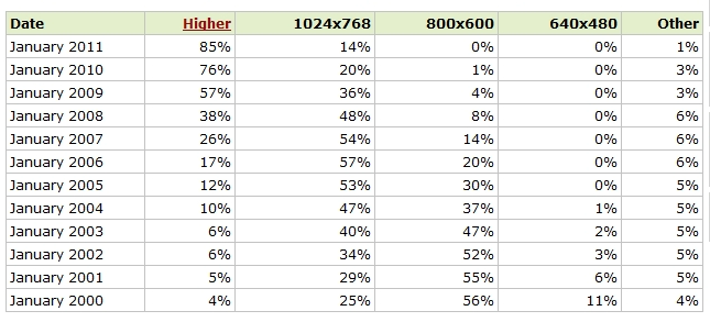
I am loathe to mention w3schools.com, but they have a good chart showing their own stats, and at the very least, it correlates pretty well to the statcounter data:
 http://www.w3schools.com/browsers/browsers_display.asp
I would not use this as a primary source generally, because it's w3schools, but as a reference as to when screen resolutions started changing, it's an okay reference, at least backed up (kind of) by another, more reputable source. It's also the only reference I could find that goes back further than 2009 for screen resolution.
-
2+1. If he's justifying to his boss/customer, then saying "since 2005, over half the visitors to w3schools had a 1024x768 resolution or higher" might work. Commented Aug 29, 2011 at 18:20
-
1
This subject has been a FUD mess for 15 years. Factors that made it complicated:
- Browser chrome.
- Plugin bars, like Yahoo search bar
- Scale fonts vs Zoom. Drastically different behavior.
- Liquid Design. (stretches based on percentages)
- Different design depending on screen resolution.
- Maximized vs. floating browser windows. (viewport)
- Mobile browsers
- Pinch zoom and horizontal scrolling
Its not so simple as 1024x768. Most laptops/desktops have better monitors HOWEVER, when you plugin to a projector, often you are in 800x600 mode and people forget to change it.
You need to look at Google Analytics and see the different environments that are possible. Make 80% of the people thrilled and dont worry about the 20%. You cant please everyone. Thrill some people and your business will be in good shape.
-
1+1 purely for mentioning Google Analytics. That is the place to check to be sure about your customers' resolutions.– deizel.Commented Aug 29, 2011 at 21:59
-
+ 1 for mentioning that its "a mess" ( ie complicated ). There are a lot of factors which drive what 'an average user' sees in their browser– PhillipWCommented Jun 24, 2021 at 8:08
A long, long time ago... :-)
Possibly the late eighties, more like the early nineties. My 286 bought in 1986 (when 286's were still young) had x 640x480. The 386 I bought a couple of years later had 1024x768 monitor. And I wasn't what you would call an "early" adopter.
This is of perennial interest, but is potentially a black-hole, hall of mirrors, [insert favorite cliche here].
With the advent of so many handheld devices, and the Rate of Change in those devices, thinking about the world in fixed viewport sizes becomes increasingly problematic.
Consider looking at the design problem in a way akin to this: How will the design appear at various viewport sizes, and how will it respond to/adapt "on the fly" to changes to the viewport size. (Popular these days as "responsive design".)
And yes, then add a dose of HCI technology (click versus gesture, mouse pointer vs fat-fingers).
Sorry if off topic!
Regarding desktops, I was first exposed to IBM compatible PCs in the late 486 era and I remember support for 1024x768 being the norm at that time (though only in 256 colors). On the other hand the 386 I got given used came with a monitor that could only do 640x480.
The switch to widescreen brought with it a reduction in vertical resolution, but I think on the desktop side less than 768 vertical pixels was rare.
With regular full-sized laptops I think 1024x768 became the norm in the late 1990s. So a bit behind desktops, but still I would imagine any full-sized laptop with the specs to handle a modern web browser would have a screen of 1366x768 or better.
However ultra portable laptops are another matter. The original EEEPC had a screen resolution of 800×480, the 900 series increased this to 1024×600 and this remained the norm for netbooks through the height of the netbook craze.
