3

I've been requested to design a dark interface which spreads a little light as possible. I'm interested in academic studies / researches about white text on black background.

Is it really tough to the eye or a myth? is it really less readable than black on white?

In all the researches I've found (see below) it was inconclusive, and in some it was rated by users almost as high as black on white.


Research studies I've found so far:

  • Hill, A. L. and Scharf L. V. (1999), " Legibility of computer displays as a function of color, saturation, and texture backgrounds. In D Harris (ed), Engineering psychology and cognitive ergonomics, (Sydney, Ashgate), pp. 123-130

  • Wang, A., Fang, j,. and chen, c. (2003), "Effects of vdt leading display design on visual performance of users in handling static and dynamic display information dual tasks". International journal of industrial ergonomics 32, 93-104

  • LIN, C. 2003, Effects of contrast ratio and text color on visual performance with tft-lcd. International Journal of Industrial Ergonomics, 31, 65 – 72.

  • PASTOOR, S. 1990, "Legibility and subjective preference for color combinations in text" . Human Factors, 32, 157 – 171.

  • RICHARD H. HALL and PATRICK HANNA 2004, "The impact of web page text-background colour combinations on readability, retention, aesthetics and behavioral intention", University of Missouri – Rolla, Missouri

2
  • Check out this article and the discussion below the article for good references to research on this topic. Commented Feb 13, 2014 at 16:23
  • If you are searching for more references, use the term 'display polarity' as shown in Table 1 and this abstract from recent research on this question. Commented Feb 13, 2014 at 16:46

2 Answers 2

7

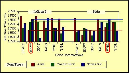
In the 74 times cited study Readability Of Websites With Various Foreground/Background Color Combinations, Font Types And Word Styles there is limited to no evidence that black text on White background is have higher redability than white text on black background:

enter image description here

On can see that Times New Roman is equal, Courier New slightly faster and Arial slightly slower on white on black color combination. So there's no scientific proof of that one is better than the other, and is probably a personal preference more than anything else.

There are also a number of ebook reader apps which lets users decide which color scheme to use. Personally I prefer black on white during the day, and white on black during the night {to avoid waking up my whife :-)}

Edit

On the notion of italicized text vs plain text, the author says

generally plain word style is faster than italicized word style

However, Black on white wasn't the fastest combination:

Surprisingly, black on medium gray (x=15215.21) and black on dark gray (x=16088.70) had significantly faster RT's than black on white (x=17176.3; F (4,80)=3.37

So it's fair to conclude that it is still dependent on the individual users preference, with her reading ability, possible glasses or the need for correction. Other factors may be age and how well trained the user is for reading on screen. From the looks of it - there is no evidence of one over the other, at least not in this study.

5
  • 1
    The BK/W is also italicized and the W/BL is plain. Couldn't that affect readability as well?
    – Pesikar
    Commented Feb 11, 2014 at 9:16
  • @Pesikar Sure, but there other variables to take into account as well. From the looks of it - there is no evidence either way. Commented Feb 11, 2014 at 9:36
  • I think the guidelines you added to the graph are misleading as they compare italic bk/w vs plain w/bl whereas the more interesting comparison would be plain w/bk to plain bk/w. Note that it shows w/bl (blue), not w/bk (black) in the graph. white on black is not given at all in the graph nor in the linked article (afaics) Commented Feb 11, 2014 at 10:33
  • @BenSchwehn That's true. I need new glasses, and will fix the image after lunchhour (in Sweden). Thanks for the heads up! Commented Feb 11, 2014 at 10:40
  • 1
    The author of this research wrote "Some evidence for an effect of halation was found in the current experiment. The mean RT for light text on a dark background was x=17559.24, while the mean RT for dark text on a light background was x=16909.33." This is not the same as "there is limited to no evidence that black text on White background is have higher redability than white text on black background" as suggested by the answer above. Commented Feb 13, 2014 at 16:15
0

While I personally find the "black on white" preferable in a well lit room, I find "white on black" less stressful in a dimly lit room. However, the readability of a UI with "white on black" without adequate "white space" or in this case "black space" is quite poor.

So there are other factors such as environment lighting, UI element spacing, content alignment, containment, font weight and style, user engagement time that can make one preferable over the other.

Your Answer

By clicking “Post Your Answer”, you agree to our terms of service and acknowledge you have read our privacy policy.

Not the answer you're looking for? Browse other questions tagged or ask your own question.