I am in the last month of my last internship of my IT studies. And as in the five last years, I have to write an internship report (that almost nobody will ever read). The last one. And to give a little more about the context: I study computer programming and IT project management
As a (junior) web developer, I've always been interested in ergonomics, usability and readability of computers UI. For all the others internship reports I had to write, I tried to use my experience with computer UI into printed this reports. The aim was first to make them more usable, more readable; and second to make the reader feels something different than a 50 pages of black on white Times New Roman report without any image or color.
Here is what I tried so far :
- Structure the content as website (as with header, a footer, and a page content structured likes
<h1>,<h2>,<p>... in HTML) - Style this structure replicating A Book Apart (great) books design. As for the inside than for the cover. I read few of this books and beyond the (nice) content the legibility is very good: it's a "pleasant" object, not like these 50 pages of paragraphs-only reports I was talking before
- Use syntax highlighting for and specific fonts for
<code>blocks - Follow the "web UI" trends: flat design and round flat icons to illustrate/decorate each part main idea (1 part ~= 1 pages)
- Hilight importants word in each paragraph with bold
- Use a breadcrumb in the header
- And more globaly, use a good proportion of text/images/schems to not "flood" the reader
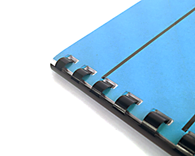
I also thought about gamification, but it looks hard to gamify a printed report without any user interaction. And also about the bookbinding of the report: does something more usable than this stuff exist?

For this last report (and the most important), I thought gathering your past user experiences and your ideas about enhancing an internship report could be a good thing.
