4

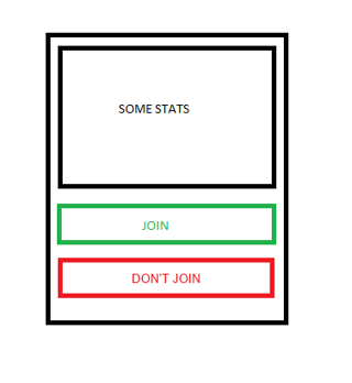
we are currently working on alarm system for firefighting groups. Basic action of our app is that you can confirm your contribution in rescue action, or you can deny it. This is basic view of it: enter image description here
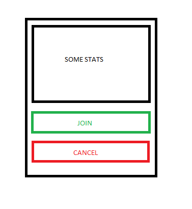
I would like to ask how to be sure if user is doing conscious choice. For eg. if alarm is going to start at 3 am. we want to prevent misclicks. Would it be better to make confirmation window like in javascript confirm('Message'), another button like 'Are you sure?' or what? What about visibility of these buttons after decision? Should they disapper? It will be mainly used as mobile/web app.

2
  • To clarify, this screen will pop up (perhaps in the middle of the night) and the user must perform an action to either accept or reject it?
    – Matt Obee
    Commented Jan 28, 2014 at 10:44
  • Exactly. I'm not sure which way will be better - another button or pop up?
    – hugerth
    Commented Jan 28, 2014 at 10:48

5 Answers 5

5

Rather than a second button or popup to ask for confirmation which I imagine would be a little fiddly and frustrating, consider using a long tap/click. The user would have to hold the appropriate button for ~3 seconds in order for their response to be accepted. I'd show a progress meter on that button while they are holding it.

mockup

download bmml source – Wireframes created with Balsamiq Mockups

1
  • Very interesting solution. Me and my team need to discuss this option now, because we would need to modify web browser's behaviour a bit. (and how to implement it on desktop also).Thanks for your answer.
    – hugerth
    Commented Jan 28, 2014 at 23:00
2

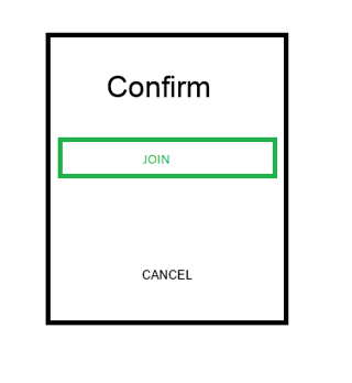
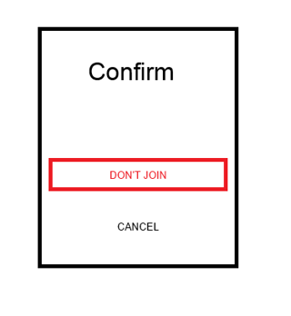
I didn’t think I would ever favor a confirm button click, but in your rare case, this is actually the best method. The circumstances here are a possibly overly tired user, who is woken up by an alarm and that has to take action. The user may be disorientated or affected by tranquilizers, which will have effect on the result.

So at night time, which you’re user can set for themselves, but has a default set to 10 PM to 6 PM, your best option is to implement a confirmation on the given choice. I'd rename cancel in the first screen to "Don't Join".

enter image description here

The confirmation screen would show which one you selected last, and you need to confirm again or follow the cancel link back to the first screen.

enter image description here enter image description here

2
  • +1 for the user pattern. Do you think that ACCEPT DECLINE are better wording than Join and Dont Join?
    – Abektes
    Commented Jan 28, 2014 at 14:39
  • @Abektes Absolutely better! Use Accept/Decline instead! Thanks! Commented Jan 28, 2014 at 14:57
2

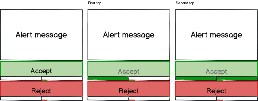
I think Matt's solution is the best but I'd also suggest a double tap with a visual feedback. The first tap fill an half of a rectangle and the second fill it completly, the choice is validated then. With this solution they don't have to wait for some seconds and can answer faster.

mockup

download bmml source – Wireframes created with Balsamiq Mockups

0

The usually preferred option of "Undo" might work in your case.

You can sound the alarm and give the user the choice to join or not join. After tapping "Join", you can give him 60 seconds (or some other time, whichever works best in testing) to think it over, during which time he can tap "retract join" (you probably need better wording for this one). The application only submits the answer to the central server after the 60 seconds are over.

I am listing this solution for completeness. It has two drawbacks.

  • you are losing 60 seconds in response time. This can be a problem in the case of fire.
  • the user will probably think that the first decision is being recorded. He might feel ashamed to retract the decision even if he doesn't want to join, because he thinks that his boss will know he retracted.

So if I were you, I'd probably favor Matt Obee's solution. But I thought you might want to know the alternatives.

1
  • That's right - every second is very important for us. Because of this we need some kind of compromise between speed and reliability...
    – hugerth
    Commented Jan 28, 2014 at 23:07
0

Altough I like @Mattboee's answer, I think there is a problem with it:

Some users won't understand that you have to long click on the button, as the recommended interface is not usual at all.

I wouldn't recommend a popup either, as it's too much intrusive.

Here's what I recommend:

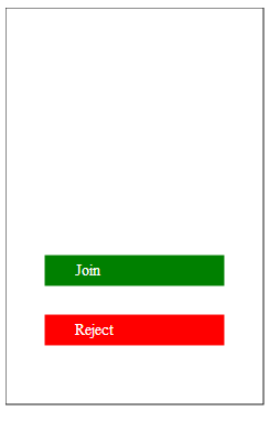
Start screen

Start Screen

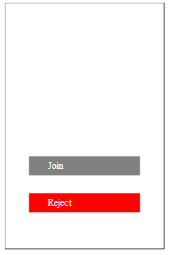
After click on join, the join button becomes gray (disabled) for 600-800ms

Disabled join

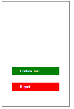
Then the button text gets replaced by Confirm Join and enabled again (duration 800ms)

Confirm Join Enabled

Here's a small demo of it: http://javascript-ninja.fr/confirmjoin-demo/test.html

2
  • It isn't very intuitive for me - I would probably close my app after first click I think.
    – hugerth
    Commented Jan 29, 2014 at 10:38
  • Maybe adding a text at the top saying "Join not yet confirmed" would help the users
    – edi9999
    Commented Jan 29, 2014 at 10:55

Your Answer

By clicking “Post Your Answer”, you agree to our terms of service and acknowledge you have read our privacy policy.

Not the answer you're looking for? Browse other questions tagged or ask your own question.