4

A feature of a website I'm designing requires the user to perform various steps inside a "lightbox" / modal box. This is a requirement, I cannot embed the process inside the main layout.

I don't want the user to lose her progress if she is clicking outside the lightbox by chance. I don't want to force the user to use the "close" button either, and even in that case I think the message will do no harm. Hence I think that a confirmation message is the best option.

I would like to ask for advice for the wording of such message, since I don't want to be too technical (i.e. don't want to mention "lightbox" or "modal" etc.)

My best idea so far is:

If you continue your transaction will be canceled and all the details will be lost. Do you want to cancel your request?

I'm not sure because of the "continue" in the first part of the message. The user is (possibly) asking to abort the transaction, and I am asking whether she wants to continue this action.

Any advice is welcome!

1
  • what is the application about? like banking app etc??
    – sree
    Commented May 18, 2012 at 13:23

3 Answers 3

2

Always make your buttons descriptive of the action you're performing; Continue/Cancel aren't always the best.

Explicitly describe the action on the Cancel button, something like

Cancel current transaction

With the "get me back to the transaction" button saying something like

Continue editing transaction

Leave the "safe" option selected by default and emphasized. This way you make sure if they just click the "default" button they stay safe, and they have to read to select the dangerous action.

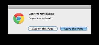
Your original wording leaves it unclear what you're "continuing" or "canceling"; never "continue to cancel". I love Chrome's "Leave this page" dialog in this case:

enter image description here

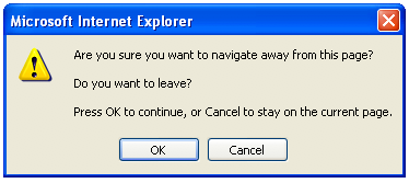
Just looking at the button you know what to do. Contrast this with old IE's dialog:

enter image description here

In IE, just reading the button doesn't tell me the action. When at all possible, just reading the button should make it clear what the button does.

1

What about a simple "Are you sure you want to cancel this request?" with a yes/no option?

2
  • The information that all the information will be lost (it may be a 4/5 step process with some choices) is the most crucial in my opinion.
    – Daniele
    Commented May 18, 2012 at 13:00
  • I think cancel would convey that sentiment pretty well though. (Assuming those 5 steps are all happening in the lightbox). Commented May 18, 2012 at 13:11
1

If I saw such a message it would scare crap out of me: I didn't do anything bad intentionally, why is the system so mean?

A good system must:

  • keep everything produced by user safely and reliably
  • tolerate dumb user actions quietly
  • and don't scare them unless there is no other way

My best guess there is no right wording for this and should be no confirmation at all, because: that confirmation popup should not be there, lightbox should not close at an outside click, and since there is a dialog there must be 2 buttons

Let me explain:

  • once you asked a user to do something (displayed a form) there always must be 2 ways to get out of this situation: fulfill what you want or to say "no"
  • both options should be clear for the user, hence there must be a clear invitation on the screen for this, conventionally it's 2 buttons: ok, cancel
  • without any of these user feels there's no way out, which is bad experience, so consider keeping the cancel button on that dialog (as well as ok button, just in case)

That was a good "any advice", so don't judge too quickly

5
  • I agree with this. This task you are explaining is more critical than just viewing a photo (which is the normal use of this pattern) so clicking outside of the box shouldn't do anything, the user should have to seek out and use a close button if they really wanted to close it.
    – Wander
    Commented May 18, 2012 at 14:38
  • Thanks for your answer, but don't judge too quickly my requirements. The fact is that in all other cases (on the same website) a click outside the lightbox is allowed and closes the lightbox. Here I want to keep the user safe (not losing data) and informed. I don't see why this is bad behavior. Nevertheless, thanks for your advice :)
    – Daniele
    Commented May 18, 2012 at 14:52
  • It's sad to hear that these lightboxes are common practice on your web-site. I would reconsider using them if I could. Well, to answer your exact question: don't get too much into details about transactions and other stuff, user doesn't like thinking much, keep it simple: "Do you want to close it?", "Have you finished?", "Are you sure you finished?" Commented May 18, 2012 at 14:58
  • @bonomo I hope to not get off topic but could you explain why you say it's sad to hear lightboxes are common on the website?
    – Tim
    Commented May 18, 2012 at 18:28
  • I don't have anything against of what you call a lightbox (meaning an in-place popup window that closes itself by any click outside of it) if it is used to convey an optional message, like a tooltip. But when it comes to essential workflow steps carried out in a lightbox, this is when the idea of using them stops looking so harmless. Again it depends on the importance of the lightbox content, I am just saying that to me asking a user to put some information is a quite a big deal and using an ephemeral lightbox doesn't seem suitable/reliable/safe enough. Commented May 18, 2012 at 18:54

Your Answer

By clicking “Post Your Answer”, you agree to our terms of service and acknowledge you have read our privacy policy.

Not the answer you're looking for? Browse other questions tagged or ask your own question.