3

I am designing a web form and want to make it as slick as possible.

One of the fields on the form, asks users when their house was built. There is a list of options for them to choose from e.g.

  • between 1800- 1850
  • between 1850- 1920
  • between 1920- 1940 etc. etc.

I initially designed this as a slider where the user moves the little house up the slider to where there house was built (from YYYY to YYYY) but I can see in usability testing its not working. What would be a better approach? I've tried to avoid dropdowns on the form up to now so am reluctant to introduce a new method of entering information. Thank you.

Update

This is the slider that is causing the problems. the 'between 1920 -and 1940' appears dynamically as the user moves the slider.

slider screenshot

6
  • If your sliders work the way I imagine them, then I would have thought that they are a good choice, I have not seen problems with them until now. Maybe you can post a screenshot so we will know what exactly we are talking about here?
    – Rumi P.
    Commented Jan 14, 2014 at 15:39
  • @RumiP. I wouldn't be surprised if the users were confused by what the slider was asking them to do. A slider doesn't make it clear whether you're trying to select from a series of options or if you're trying to set a specific point in a range. They're not that commonly used on web-forms, so some users will be unfamilliar with them.
    – Racheet
    Commented Jan 14, 2014 at 15:47
  • 1
    @Anon - I would like to mention that you should not have 1800-1850, 1850-1920, 1920-1940. It should rather be 1800-1849, 1850-1919, 1920-1939, etc. Otherwise, they would have two options for one year. Commented Jan 14, 2014 at 16:11
  • Thank you for adding the screenshot. This is not a standard slider, so it is more clear now where the confusion comes from.
    – Rumi P.
    Commented Jan 14, 2014 at 18:12
  • It's somewhat misleading to title this a range of options, as it is rather a range of ranges. Commented Jan 14, 2014 at 18:29

6 Answers 6

6

Radio buttons? This is a very finite list so it doesn't seem like you'll take up too much y-axis space, and this might more explicitly communicate to the user what they're being prompted to do.

3
  • Radio buttons are definitely the best way forward. They're the conventional field type for selecting from a small number of ranges.
    – Racheet
    Commented Jan 14, 2014 at 15:45
  • Radio buttons are not always clear. Especially when you start to stack them horizontally. He would need 8+ radio options to fit in the same span as his current slider. Its an okay solution, and it could be done easily, but it might not look as good. He said he wanted to make a 'slick' interface. Are radio buttons slick?;p Commented Jan 15, 2014 at 5:46
  • Slick is knowing how to do something as simple as submit a form, which has obviously been over-complicated up to this point. Commented Jan 28, 2014 at 18:48
2

The confusion comes from a bad fit between your level of measurement and UI element. You should tailor elements to the data.

Years are usually counted with integers, so a timeline is an appropriate representation for them. But in choosing hard, preselected intervals, you have done what is called "binning" the data. After binning, you are left with just a few categories of data. But the timeline still looks like the timelines we all know, which are for single year numbers.

If you are really just interested if a construction year falls into one of these bins, look into methods for representing categorical data. Choose one of those, and order them chronologically, reflecting the fact that they are not in fact categorical, but ordinal. This will give you data which is rather easy to work with, but not as precise. The radio buttons from the upvoted answers are a very good solution. If you don't want to use them for some reason, you can probably make some control with similar functionality which looks different, maybe breaking up the timeline into very distinct intervals and making only one selectable at a time.

The slider as shown fits the idea of choosing a specific year. If it is jumping from one invisible predefining interval to another, then it is clear why the users get confused. If you want a precise year, use a normal slider with a single pointing element. If you want any possible interval, use a slider with two pointing elements - you may get intervals which are much wider or narrower than what you expect. If you want a guess at the year with a gliding "uncertainty" interval for it ("I think it is from 1958, but it could have been also as early as 1956 or as late as 1960"), then your slider looks quite good provided it can be pulled so that the center falls on any year in the timeline, but this would be a very unusual control, so you'd have to also teach the users what the meaning is. All these ways will provide you with a different form of data, which will have different uses than the binned data possible with radio buttons.

1
  • Lovely analysis of the underlying problem.
    – Erics
    Commented Jan 15, 2014 at 2:12
0

This looks to be a similar to problem to how different websites ask users to enter their date of birth. Pull downs can be annoying as you have to click your way through.

If you have a finite list of options, then you go could with radio buttons. Do refer to "Code Mavericks" input on mutually exclusive date ranges.

Unless there isn't a really strong reason as to not ask the actual year, I would have gone with a simple numeric input of the year of purchase.

  1. The range calculation can be handled at the backend.
  2. Also, as a User when I read "Which year", my answer would be in year and not range...
0

When your house was built

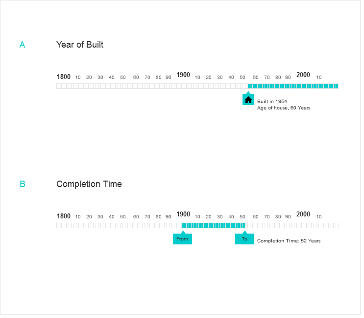
You don't need a range to mention that. What matters is that year of built and that would be one value instead of a range. If the idea is to know which year building was started and when it got completed, this is a different question but if question is exactly when your house was built, that is ONE value.

BUT in case you had to use a range, you can use something mention in the option B **enter image description here**

1
  • Although it is true that the build completion date for a house is in one specific year, the people being asked for this detail may not know the exact built-date. They might only know that it was built sometime between 1920 and 1940 (i.e. the approximate era, as guessed by the architectural style)
    – Erics
    Commented Jan 15, 2014 at 2:07
0

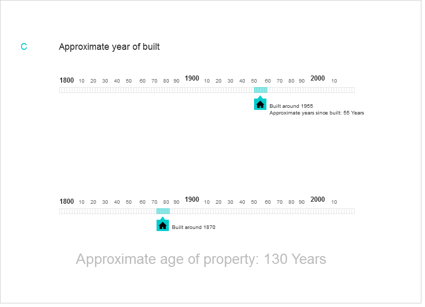
Yes that is likely that people wouldn't know the exact age. In that case you can consider something like that. In this execution, slider is not very specific and doesn't want you to be very accurate. Approximate should be mentioned with the number of years and age can have a jump value of 5 years, like Average age of property: [30,35,40,45] years etc.

I am suggesting to apply some transparency to the "selected year" and let few years appear underneath. This give user the impression that a "range" is being refereed. In case selected area is opaque, the user can assume that the left or the right end of the slider is pointer.

Hope this helps.

enter image description here

0

Is there any reason you cannot add a tool tip that is visible until user starts to slide the slider. Don't ever expect a user will know how to use something. Explain as much as possible.

So start the slider at the leftmost edge and put a simple explanation box with an arrow pointing to the slider cursor, directly under your label, 'When was the house built". Write something like "Click and drag until you find the appropriate year." When the data starts to change, slowly fade out the tooltip. Consider fading back in when the user stops sliding. Try to make the tooltip arrow point to the slider cursor when it fades back in.

Your Answer

By clicking “Post Your Answer”, you agree to our terms of service and acknowledge you have read our privacy policy.

Not the answer you're looking for? Browse other questions tagged or ask your own question.