4

A taxi sharing application that I'm working on as part of a university project has a "request seat" option. I've spent the afternoon working on the interface (arguably the most important UI element of the app), but I have the feeling that what I have produced so far is clunky and leaves a lot to be desired for.
enter image description here

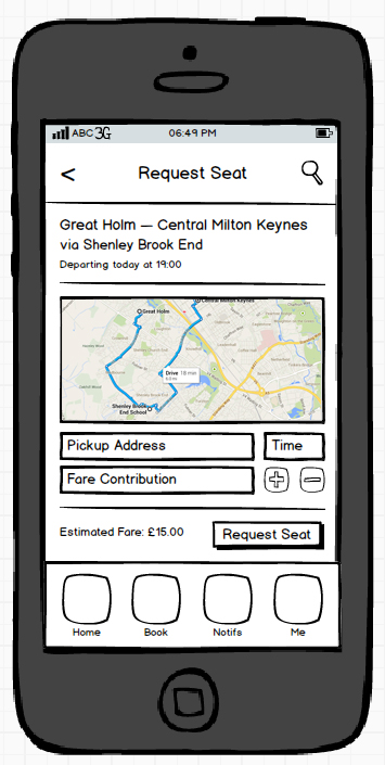
The top section of the screen shows the current journey that the user would be requesting the seat for, and any pickups (via) that will be made.

The middle section of the screen shows the route being taken.

The bottom section allows the user to enter a pickup address (no destination address is taken because it is implied that the user requesting a seat on the journey is going to the same place), specify a pickup time (once again within a predefined range) and specify their fare contribution (using the +/-). As the user enters their address, the estimated fare value is updated along with the map in real-time.

What I think

The top/middle section of the screen seem alright, but the bottom section can be simplified. Hence, I have the following UI-related questions:

  • Is there a better way to position the pickup address/time, fare contribution fields? Are the +/- controls necessary? How could I streamline this screen's design to make it better?

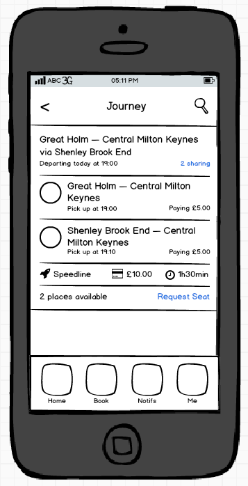
  • The user is currently able to specify a fare contribution of their own but this seems rather unfair, is there anyway to enforce a principle wherein the software provides a minimum fare in view of what everyone else is paying to make it as accurate and fair as possible. How could this be implemented into the existing UI? I've included the "journey" screen (which appears prior to the "request seat" screen - the user clicks on the request seat button to move onto the "request seat" screen above).
enter image description here

Please share your thoughts.

1 Answer 1

3

It seams to me as though two thought pop out immediately:

+/- buttons Basically I think you are asking the wrong question for this one. You have phrased it rather like you are not sure if you should allow the user to pick the fare or not; I think that is a separate - entirely business related decision to make.

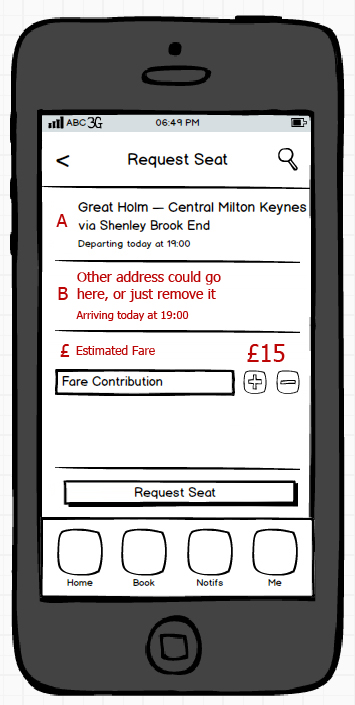
I do think that the +/- buttons are a bit vague, you need to explain this better; why are they able to change the fare? Most users will be used to seeing a set fare. Also below this you have "Estimated Fare - surely this is the same as what I have just changed? I am sure it is clear to you, but it is a little confusing to fresh eyes!

As for the UI I think you have duplicated some information, or split it perhaps a little bit unevenly. On the first screen you have two separate addresses, try bring these together, or if they are the same address, scrap one.

Map UX With regards to the map; I would scrap it. This isn't because for the purpose of the UI but rather speed, your users could be in rural areas (or indeed driving around the million roundabouts that are in Milton Keynes :]) and thus need the screen to load with the minimum data requirement for the best speed. Thus I think having the map here could cause a lag and that would be very bad.

As for your actual question I would lay out the UI a bit more like this (sorry for the crude Photoshop-ing) and I know it is different that is just my experience in simplifying things giving better results. Overall it looks good though your plans seam to be fairly well thought out so best of luck in your project!

Taxi App UI - With Changes

4
  • Note: if you are not actually producing the app, just the idea, perhaps add the map as it does give it life. Perhaps below the title bar and above the addresses "Timeline" sort of style
    – tim.baker
    Commented Dec 28, 2013 at 23:22
  • Thanks Tim - the estimated fare, changes in real time with whatever address the user puts in and the map updates in realtime to map out that route, so it prevents the user from trying to share a journey that would involve the driver making their end from on end of Milton Keynes to another (common sense really). The estimated fare gives an indication to the user of the impact that their requested pickup will have on the current fare (in this case it has shot up from £10 to £15).
    – methuselah
    Commented Dec 29, 2013 at 0:31
  • With regards to the +/- buttons, the fare contribution would have a minimum value which the user can choose to increase (or decrease back to the minimum value). In this case, as there are 3 people sharing the journey, it makes sense for each person to pay £5. I like what you've done in simplifying the UX, and you've raised an interesting point about the map (could I perhaps have an option to switch it on/off). But the manner in which you've structured the journey now implies that the taxi is going from Great Holm - Shenley Brook End - Central Milton Keynes - Pickup point B.
    – methuselah
    Commented Dec 29, 2013 at 0:37
  • When really it should be Great Holm - Shenley Brook End OR Pickup point B - Central Milton Keynes. How can make the UX necessary adjustments to have it appear this way?
    – methuselah
    Commented Dec 29, 2013 at 0:38

Your Answer

By clicking “Post Your Answer”, you agree to our terms of service and acknowledge you have read our privacy policy.

Not the answer you're looking for? Browse other questions tagged or ask your own question.