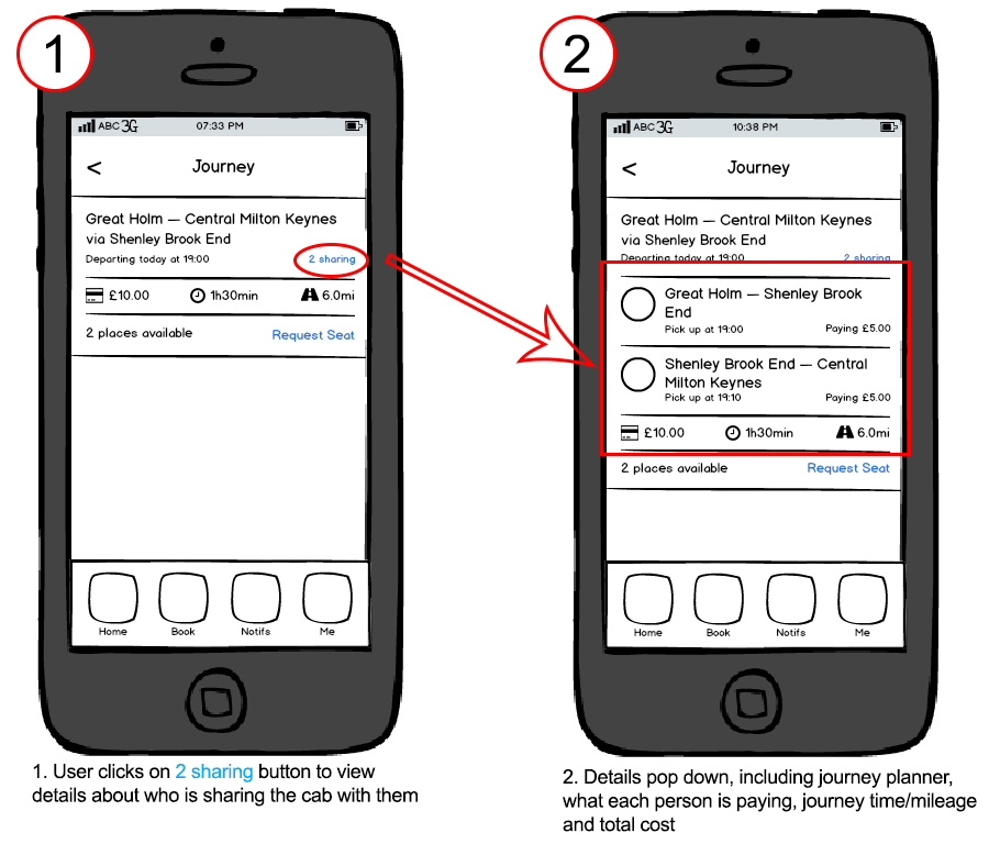
One of the features of my mobile application, is the facility to request a seat on a journey. The user can view details about the journey, and then selects the "x sharing" link to pop down information (seen on screen 2) about:
- Who is on the journey (denoted by profile picture)
- Where they are being picked up from
- How much each of them is paying
- The total journey time
- The total journey cost
- The total journey mileage
Now I have 2 questions to ask regarding this UI
1) Is the 2 sharing link on the first screen too small and unnoticeable? Can I make it more appearent to the user in anyway? Note that its different to the Request Seat link which takes the user to a different screen.
2) How can I reduce the clutter on the second screen? All of the information is important to have, but it looks a bit messy...

