7

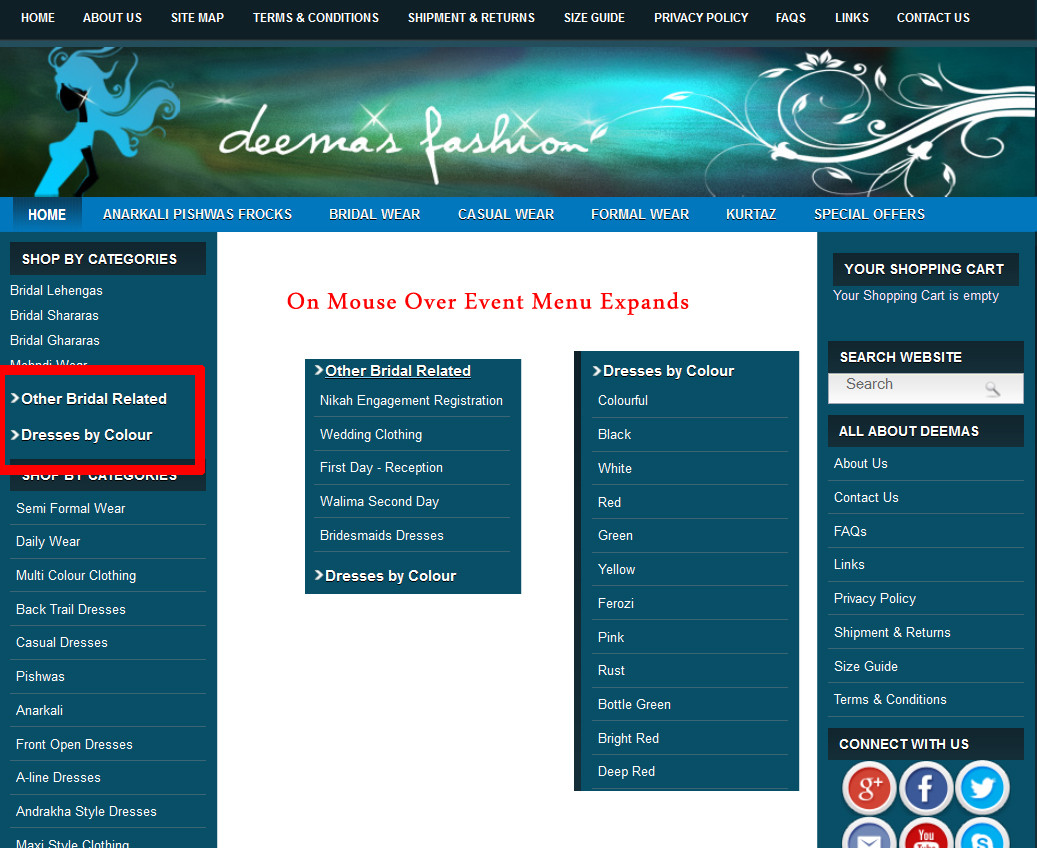
On my Clothing Website navigation panel. On mouse over or click event the jQuery menu collapse / open. Example picture is attached below.

What is the best sign or way to show that it has more menu options or links after click?

Will my customers (females & age 15 years+ ) know that it will open on mouse over or mouse click?

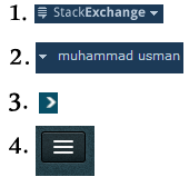
Options of Signs to show that menu expands

jQuery expandable menu in action

4
  • Example picture is not displaying. Can you please attached it again
    – Andy
    Commented Dec 2, 2013 at 10:37
  • I realize this wasn't your primary question, but as another point I would say to prefer mouse down versus mouse over. The explicit action is better because it allows the user to direct the flow of the experience. As long as you indicate the availability of more information sufficiently (as you are asking about) then you should leave it up to them to make the decision to expand. Commented Dec 3, 2013 at 21:35
  • Related questions: ux.stackexchange.com/questions/37686/… ux.stackexchange.com/questions/5735/…
    – Velkommen
    Commented Dec 4, 2013 at 12:16
  • I'm trying to answer the same question, so the insights here were very helpful. I'd like to point out, however, that the "hamburger menu" isn't as ubiquitous or as well understood as we in the UX community like to think - in fact, quite the opposite so be careful using it unless your audience is likely to know what it means. Mobile Menu AB Tested: Hamburger Not the Best Choice?
    – user48540
    Commented May 22, 2014 at 16:17

9 Answers 9

7
+50

Definitively if you want to base a decision on the visual side only, you may be be falling short for the right solution. If you want to go the extra mile try this:

  1. Load the site with its categories and sections expanded. Then
  2. Collapse it after the site finished loading. This allows the user to get a good idea that the categories have content. They might even get familiar with their Information Architecture (IA) or spot something they are interested in while the site loads.
  3. Use jQuery animations to go from expanded to collapsed; this way they know this is not an error, and they have an idea on where all that text went.
  4. On the visual side:

    • Common icons like ">", "+" for collapsed or "v", "-" for expanded.
    • Changing them during the animation works well.
    • using bold letters.
    • proper indentation.

Needless to say, that if you plan your IA according to your target audience (15yo females) and name the categories in a way that they recognize, the visual assets that you use become almost irrelevant, because they'll know that they need to go there.

Try to get familiar with the terms 15yo females use so that you can drive them to the sections that you want; i.e. naming the category after what a 15yo female will get engaged by.

There's a few tools like Optimal Workshop That allow you to plan and test that information architecture. Might require work, but you'll notice that the visual assets are the least of your problems.


However, if you don't wanna go the extra mile, you cal always find inspiration here:

5

I find that the + and - signs that have been used in operating systems for a very long time are the easiest to understand.
The triangle is a bad choice because it seems to point in the same direction even when rotated (because it has 3 tips).
The arrow is okay as long as it is no just a triangle. Its inconvenient is that it draws too much attention.
I don't find that the multiple horizontal bars means menu or anything.

Sub-menus need to visually be at a lower level than main menus. It must be done with alignment and eventually other appearance details.

4

Iconography is culturally specific, not universal.

Which is to say none of these patterns are clear if you aren't familiar with them

For an interesting related read, check out this report by Sandia National Laboratory [PDF] regarding iconography that could be used around the Yucca Mountain nuclear waste facility.

That said, I'd use the 'hamburger.' It is modern and widespread enough that most users with smart phones will understand it. Adam Powell from Google's Android team wrote an excellent series of articles that deals with the UI challenges and solutions they implemented and why (and why not in some cases).

When I searched for it, I came across this article on a site which is, apparently, all about Android UI Patterns and it gives an overview and links to the series of articles as well as the UI Pattern guide.

Hope it helps.

3
  • 1
    I am not familiar with "the hamburger". Could you link to an explanation about it or expand on what that means? Commented Dec 8, 2013 at 6:01
  • I just used the terminology used earlier in the thread, it's the 3 horizontal bars stacked on top of each other (i.e. option 4).
    – adam-asdf
    Commented Dec 9, 2013 at 1:28
  • I use an old cell phone, a 'hamburger' icon says nothing to me as well. I guess it is even less universally known than 1-3 listed icons. Commented Dec 9, 2013 at 9:33
3

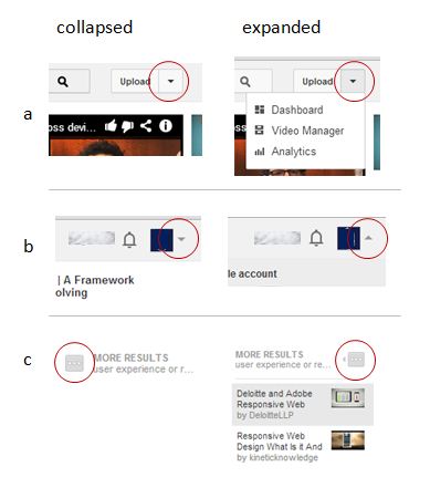
Even I am in favor with the opinion that triangles are not used consistently and hence have ambiguity of usage and its significance. here is the example of different usage and significance of triangle usage in one website (YouTube).

enter image description here

I am not denying the fact that here different widgets are used like drop down box, drop down menus but ultimately it has to convey that its a container and contains more items. Choosing one shape (triangle) and using it differently for expanded and collapsed states may confuse user.

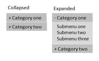
I think + and - states are quite simple to understand in this context, but going further, supporting visual cues can be added, as shown below. Here, in support with + and - icons, different color is used for sub menu background, suggesting this is a sub-section and falls under upper menu category.

enter image description here

3

First of all, I would have removed the hover-state (on mouse over) to display the sub-options, A hover-action is often very sudden and surprising for the user (for smart-phones, there are no real hover - people see and tap) (1)

And secondly, Do they need to know what will happen after they click the category? Visual clues are fine, but simplicity is key. As long as the sub-menu is visually different see @spicerjet, the interaction-pattern will most probably be learned after the first interaction.

I see the use case as: -Someone- wants -something- that is enlisted under -some category-

If the user has to go through a -category- to find -something-, they will interact with the category, regardless of what visual clue lies in front of them. The more you clutter the menu with details, the harder it is to choose from the list of items. (2)

Disclaimer: When working on UX, there is always important to try out ideas on the users of the webpage, see how they act, and learn from it. There is never an easy way out.

1: http://tech.vg.no/2013/04/10/hover-state-on-touch-devices/

2: http://www.infragistics.com/community/blogs/indigo-studio/archive/2013/01/18/interaction-design-with-clutter-free-ui.aspx
2

I wouldn't really worry about the menu itself as much as about the whole concept. I think there is a better way to think about the problem you're trying to solve.

What you are trying to achieve is basically to give users more specific categories as they narrow down their navigation. This is a very common pattern in UX. It's called Faceted Navigation (or Faceted Search), and it's something that Amazon for example does pretty well.

Below are some good articles on the subject, but if you just google it you'll find plenty of others. http://quince.infragistics.com/Patterns/Faceted%20Navigation.aspx

http://alistapart.com/article/design-patterns-faceted-navigation

1

All but 4 will should have high success.

4 (the hamburger icon), is typically used to denote there's a submenu. I have only seen a version of this icon as the sole visual within a button. So adding text next to it would be cumbersome.

1 and 2 can also be interpreted as submenu indicators.

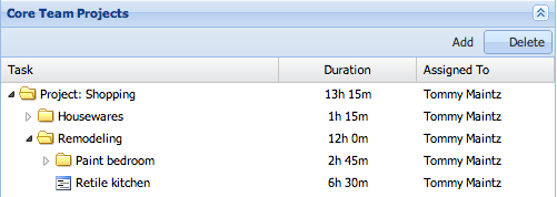
3, however is a fairly standard collapse icon. I would however, change the icon to a full triangle, rather then the bigger than sign.

A tree view with triangle denoting collapse status

1

Really, this seems more like a user testing question than a design question. I would just simply user test them with you clients. We could speculate forever on the best visual approach for making them discoverable, but chances are most of us aren't your users.

Gather up a few of you actual customers or find individuals that you feel fit the profile of your customers and quickly run them through a couple simple tasks involving those menus, without leading them, and then observe and see where they succeed and where they stumble.

The most credible source - you're users.

check out Rocket Surgery Made Easy By Steve Krug - a ton of good user testing advise and tips.

1

(1) Is a dropdown more than a collapse list.

(2) Conventional and standard way to represent a collapse list. We can see everywhere, in desktop software, apps and web.

(3) It can be confused as a type of bullet point of a list, not clear if it's collapsable or not.

(4) The "burger" can represent a collapse icon since the three lines represent actually a list. But is most common for main menus.

I think the best option for your target audience is (2). Is the most conventional and standard way to represent that function. A part of that and looking the layout, it won't look weird of busy in case you want to add more collapsable elements (image 3 or 4 "burgers together in a column" for example).

A part of that I would recommend you to try to make a proper triangle to differentiate the 2 states clearly. And remove the "open when rollover", maybe the user doesn't want to open it when the cursor is hover that area.

Your Answer

By clicking “Post Your Answer”, you agree to our terms of service and acknowledge you have read our privacy policy.

Not the answer you're looking for? Browse other questions tagged or ask your own question.