1

In computer terms, sometimes there is a need to distinguish between items in a list that are checked (e.g. lists that have a checkbox next to them) and items that are selected (e.g. user clicks on one or more rows in a table) because sometimes items can be checked and selected at the same time. What are some other words that can be used to describe them so that it is clear and unambiguous for other languages as well, because apparently checked and ticked are confusing between English and American speakers.

I am looking for terms like 'marked', 'flagged', keeping in mind that they would ideally also serve as a noun and verb.

An example of where both checked and selected states might apply at the same time are for example when you mark emails as read or unread (so they have some marked or flagged status) and then you want to select and delete all read emails. There are also category labels in Outlook and other similar functions in different mail clients. However, because I am asking the question for a generic application, I am not sure if these are appropriate to use without confusing the user.
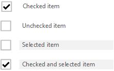
enter image description here

2
  • Hi Michael, I do not think I have seen such an implementation where items could be checked and selected together on one interface. There could be a need to implement them together but this approach inevitably would be confusing. A better alternate would be to split them in two separate screens and select and mark them separately, one at a time. Commented Jul 29, 2013 at 22:56
  • Any UI design that has rows of items that contains a checkbox will have 'selected' and 'checked' items. In desktop applications, you can often find tree controls that have checkboxes in them. In this scenario, an item may be selected, checked, or both.
    – 17 of 26
    Commented Jul 30, 2013 at 15:50

1 Answer 1

2

Updated Answer

(In response to your illustration).

In short: It's ambiguous, counter-intuitive, and will fail usability testing.

Your proposal is extremely likely fail usability testing - users will not get the different function of the checkbox and selection.

Incidentally, I had a similar concept prototyped (partly implemented, in fact) a month ago. In a calendar system, checkbox column was use to show/hide a calendar (filtering), and a selection was used for default calendar in new events. You put users in front of it, and they don't get it. The intuition was that select is show/hide (like in Google Calendar).

What's more, a peer review has revealed that this solution is not extendable, say if new constraints will be applied on the selection/checking mechanism.

Original Answer

Simply don't consider checked to be different from selected.

Consider Gmail:

Gmail Selection and Star/Important columns

A checked and selected item is the same thing. Visually distinguished is items that are Starred (marked as starred) and Important (marked as important).

So Marked as is probably the verb you are after. Or better, use verbs specific to the function of the flags.

6
  • 1
    Maybe, but regardless of checked state GMail also has the "current" (or "selected") row which may or may not be one of the checked ones. Commented Jul 30, 2013 at 11:34
  • The blue bar signifies keyboard focus. It is not exactly "current" or "selected" in the sense that user actions will affect it specifically (with the exception of keyboard actions). This concept is highly counter-intuitive and would fail user testing unless part of accidental discovery / bonus features (which you can argue keyboard shortcuts are).
    – Izhaki
    Commented Jul 30, 2013 at 18:11
  • Personally I think checkboxes are misused in the example you give. It was unintuitive when I first saw it, and there is no good reason for all other user interfaces to fall in line with it.
    – A.M.
    Commented Jul 31, 2013 at 0:33
  • Also, for possibly more confusion as you point out, there is actually a blue bar for keyboard focus and a set of grey dots for mouse focus.
    – A.M.
    Commented Jul 31, 2013 at 0:34
  • As for the checkboxes, a click on a row would open the email; so a selection dedicated area had to be provided, and checkboxes somewhat afford selection.
    – Izhaki
    Commented Jul 31, 2013 at 1:06

Your Answer

By clicking “Post Your Answer”, you agree to our terms of service and acknowledge you have read our privacy policy.

Not the answer you're looking for? Browse other questions tagged or ask your own question.