2

I am designing a map using Google Maps API that allows a potential company to check off boxes based on skill set (currently active), interest areas, and languages.

Each column will have around 15-30 checkboxes. Before programming further, I wanted to get some opinions on an elegant way to handle multiple columns of checkboxes.

Take a look at the current implementation here: http://dreaminginswahili.com/admin/mapv4.html Or this picture:
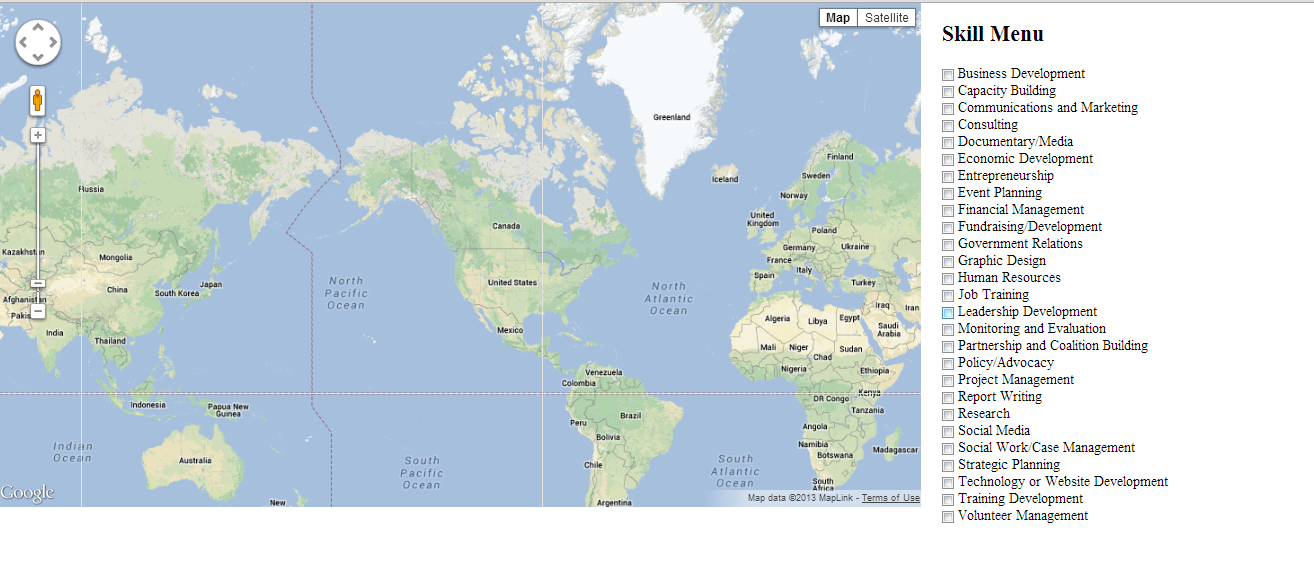
enter image description here

Remember, after the skill menu, I'm going to have another column that has checkboxes of interest areas, and another that has checkboxes of languages. I can't conceive of a way to beautifully render these data choices though. Maybe a scrolling window on the right pane?

Second problem: There are simply too many languages to enumerate all of them. What's a better way to conveniently select languages of interest?

Any ideas?

3
  • 2
    You really should ask only one question per post. Though the question of how to select a language is probably already well-covered on UX.SE.
    – Brian
    Commented Jul 16, 2013 at 21:30
  • 1
    Welcome to the site Parseltongue. With regard to your second question about language selection, see this question for somewhere to start: ux.stackexchange.com/questions/37017/… Commented Jul 16, 2013 at 22:27
  • In this case, I would suggest that there are too many items and perhaps you should try to organize or group them so the user only has to focus on the areas/sections that are relevant to them (in the skill menu and interest menu).
    – Michael Lai
    Commented Jul 16, 2013 at 22:45

1 Answer 1

4

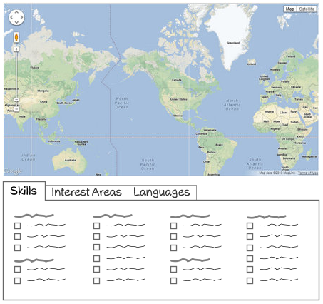
You could give a user more space, not shrinking the area of selection. A lot of items placed into small space make the view cluttered and choice become less comfortable.
enter image description here

Items grouping makes the choice much easy, as a user scans headers first, not the whole items. Even if there are not obvious categories, just the set of several small colunms breaks all the items on chunks, which are perceived better than one long colunm.

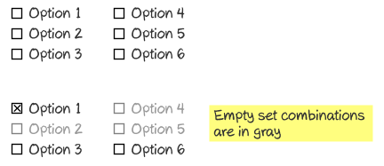
In your demo I saw some empty combinations, i.e. Business Development and Graphic Design have no elements. So having choosen some option, there is no sense to let choose empty sets. So it could be disabled, or at least, make it clear for user which sets are empty.
enter image description here

For local business it could be better to set Interest Areas first, then Skills.

5
  • This is gorgeous and brilliant. Two random questions: 1) What program did you design the graphic preview? 2) Do you know of a good place to start programatically to produce those tabs? Commented Jul 17, 2013 at 13:47
  • 1
    1) I use Xara Photo & Graphic Designer for the sketches; 2) I think Twitter Bootstrap tabs is a good start. Commented Jul 17, 2013 at 13:55
  • Thanks, Alexey. I don't have a lot of web programming experience (taught myself by scratch that whole interface in two days), but I'll try Bootstrap Commented Jul 17, 2013 at 13:59
  • Looks like Bootstrap requires Jquery, but Google API doesn't support JQuery. Any ideas? Commented Jul 17, 2013 at 14:02
  • JQuery in Bootstrap is used for user interface elements, so it shouldn't conflict with Google API. Also you can implement tabs with clear javascript, it is not difficult. Commented Jul 17, 2013 at 14:56

Your Answer

By clicking “Post Your Answer”, you agree to our terms of service and acknowledge you have read our privacy policy.

Not the answer you're looking for? Browse other questions tagged or ask your own question.