1

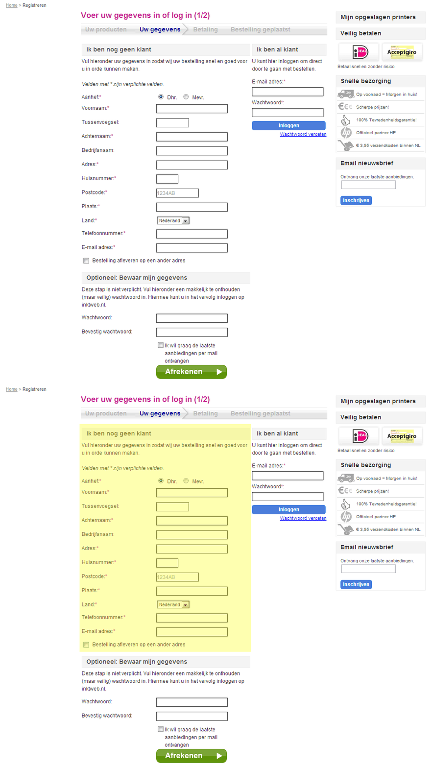
I've recently learned that our checkout page can be a little confusing for some, older, people. It's split up in a "new customer" and a "registered customer" section. In the left part of the screen you can enter your delivery address. Or, if you're already registered with us you can skip this step by logging in on the right-side of the screen.

This is a screenshot of the checkout page. The required section for new customers is highlighted in yellow.

enter image description here

My question; How could I clarify that only the left part of the page is required for new customers? Without completely changing the design of course.

3 Answers 3

2

Having so many forms in such close proximity from one another is never a good idea. As Matt mentioned, the new user column is much more prominent than the registered customer login. It also reads left to right, which only adds to the hierarchy of the new user column.

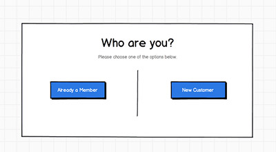
Is there a reason both forms has to be present at the same time? If you created a separate intro page that had two gateways (new customer & registered customer), it should cut down on the confusion.

enter image description here

2
  • 2
    You might actually want the buttons the other way round, too. Commented Jul 17, 2013 at 7:01
  • +1 Good point, I also noticed that amazon assumes that you are a returning member by default even if you're at the checkout.
    – Chris N.
    Commented Jul 17, 2013 at 18:19
3

The non-member route is currently far more prominent than the member route. It's much larger and presented first on the page, so I'm not surprised people are following that route first. There is also very little distinction between the two routes - it's not clear that there is a choice to make in the first place.

The first and easiest solution that jumps out at me is to swap the columns. Prompt members to log in first (on the left) and then include the alternative longer route for non-members on the right. I would also increase the spacing between these two routes to make it clear that they are separate things.

That said, this page is very complex with a lot of form fields and surrounding information. If you were able to make more significant changes, it would be a good idea to tackle that.

1

There are a number of problems with this page, all of which add to friction and confusion.

I think the best solution would be to encourage registration to your site in other ways, then once someone has registered make sure their signed in state persists (use cookies and sessions etc. - look at how Code Igniter does it). Then when the user lands on this page you can pre-populate the form and remove all the other stuff that is unnecessary to a signed in user.

You can also give the user the option to register during checkout, either by adding a checkbox to the form or by asking them on the confirm page. Then generate a random password and use the email from checkout to create an account.

Something else you need to do id remove the unnecessary fields. For example, the 'salutation' field (Mr or Mrs) is unecessary in order to do anything and adding it in merely clutters things. You can use just the following:

Name; Address 1; Address 2 (optional); Town; Postcode; Country; Email; Phone;

Then, remove the unnecessary forms.

Let someone checkout anonymously with their email address but always store the transactions with that email address. This way anonymous checkouts will find their transactions when they next sign in OR when they actually decide to sign up in the future. Always explain to the user what you are doing and give the choice if you are going to store data.

Also, get rid of the newsletter form in the side bar, this should also be an option given on the order confirmation page, or as part of the main form.

You can also consider a service like paypal, that allows for transactions to be processed without even providing an address, which makes for a very smooth user experience.
Your Answer

By clicking “Post Your Answer”, you agree to our terms of service and acknowledge you have read our privacy policy.

Not the answer you're looking for? Browse other questions tagged or ask your own question.