2

We're developing a new mobile app for premium users. It is basically a content reading app. The content will be updated periodically; we have 3 fixed "topics". These topics are going to be updated weekly. Adding to those 3, we'll have a small number of topics that vary from week to week.

These topics are articles about some products and services. The most important part of the app, in the vision of the business area, is a functionality "Contact me." When it's tapped, one specialized employee (specialized depending on the topic in which the button was clicked) will call the user to explain/try to sell the product.

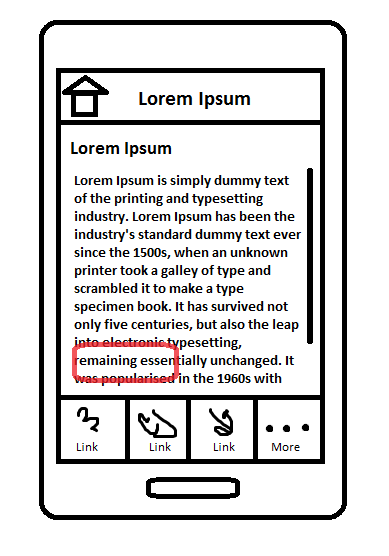
This "Contact me" button has to be available from all app screen/topics. The current idea is to place a floating button, but I'm not so sure about it; I think it may make the content less readable.

The image below is what we have today, the red placeholder is where the floating button would be:
enter image description here

Is it a good idea to place a floating button on an mobile app? What techniques there are so we place a button on all the pages of an app?

Some alternatives to the main idea of a floating button we considered are:

  1. a button on the top bar. <-- But the top bar has no text, or it would be very small and could go unnoticed.
  2. a button on the bottom bar. <-- I like this one, but the button could be confused with content.

2 Answers 2

3

I will acknowledge that you really are designing an app to make the world better by giving really relevant information from the right people to the right people.

You do not want to pollute your content with a floating button. Your readers are probably going to read the whole text before wanting more information, so a button at the end of the article does not seem a foolish idea. If you want to be more aggressive add a call to action button within the text.

Empathize with your reader: why would he want to be contacted ? Is a floating button going to be of any help here ? The user has to feel in control or she is going to flee.

For instance instead of a Contact-me button (who is going to call me ? How this people have my phone number ? When are they going to call me back ? I am on my toilets for god sake !) prefer an add-to-my-favorites one, with a summary of what she enjoyed at the end of some period.

Then eventually, if the journey was nice and the moment adequate she is going to accept your calls and maybe actually buy some stuff.

You have to create value before you can capture it and make sure you are not destroying it in the process with such an aggressive trick.

1

Firstly, the floating button is a bad idea. That is the equivalent of Sony putting a "buy more Sony products" button over some of the film that you are watching. It's poor UX and will annoy users. For the record, if any app did that to me, it would be about 10 seconds before I deleted the app.

If you want people to contact you, first, make an app worth using - so no floating button for a start. Then all you have to do is have the option available when users need it. That is easily achieved using an action overflow or similar button / icon.

enter image description here

On Android I would expect that to be on the top left, but in your current design (which look more iOS like) you could reveal it when someone selects the 'More' button.

Your Answer

By clicking “Post Your Answer”, you agree to our terms of service and acknowledge you have read our privacy policy.

Not the answer you're looking for? Browse other questions tagged or ask your own question.