There are a number of reasons for why websites go for color coding as given below:
- Color coding helps up speed up the visual search as it enables users to quickly jump to a specific section with the knowledge of the the color associated with it. To quote this article :
Color coding is a way to convey information quickly, which facilitates
visual search. In this Washington D.C. metro map, as with most
schematic subway maps, color coded lines represent the different rail
lines. Visual searching occurs when we actively scan the environment
to locate a specific feature among many distractors. In this case,
color makes it easier to visually follow the path of a rail line,
speeding up the search process.

- Color is used to create structure : To quote from the same article
Color is often used in technical documentation and textbooks to convey
structure. Each chapter might feature a different colored heading and
a block of the same color may appear on each page, making it easy to
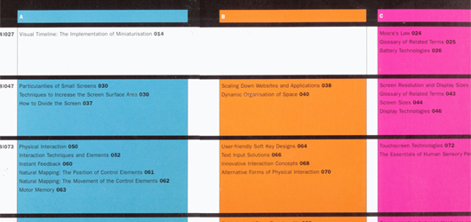
distinguish between chapters. Another approach to color structure can
be found in the book, Designing for Small Screens. Each chapter is
organized into three sections, denoted by vivid colors. The sections
form three tracks running through the book, which is described
visually in the table of contents shown below.

- Color can be used for associations : As mentioned in your example,the use of color enables users to specify associations and link content together. Colour-coding sections will allow your visitors to subconsciously group content together.
All of this said, the use of color alone to convey information can lead to trouble when dealing with people who suffer from some form of colorblindness. It is strongly recommended that to keep designs inclusive, use redundant attributes, such as icons, labels or patterns to ensure everyone can perceive the information that color conveys. To quote the W3C standards on accessibility .
The objective of this technique is to ensure that when color
differences are used to convey information, such as required form
fields, the information conveyed by the color differences are also
conveyed explicitly in text.


