2

I'm designing a user interface, which will contain fields that the user can edit.

Each field can have 4 states:

  • Unchanged (field has the same value).
  • Added (field has a value, where it didn't before).
  • Deleted (field used to have a value, and now it doesn't).
  • Edited (field has different value to before).

I have decided that each state will affect the colour of the field, for example:

Unchanged

Unchanged

Added

Added

Deleted

Deleted

I can't figure out which colour should be used for the 'edited' fields. I don't think yellow would work, as it is hard to see on a light background, and may convey the wrong message.

I'm a programmer, not a designer. So is there a colour that is normally used for 'changed'? Any suggestions or answers would be much appreciated!

(Regarding people with colour blindness, this is only a slight visual cue, the actual information on what has been changed will also be available in a database, this is just to aid the team currently working on this form to help make their job easier).

1 Answer 1

4

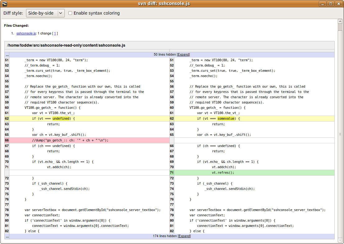
Based on pseudo standart in the diffing world, you could use yellow

enter image description here

But the real question here is why do you need to show that on the field level.

Usually field colors are used for validations purposes and assiociated with a certain meaning.

  • Red = errors -> usually accompanied by a error message.
  • Green = acceptable value
  • ...

Here you are strechting the use of fields colors, so with the little context you gave us, I’d reconsider the design approach towards something like a diffing preview or something (cf the screenshot).

1
  • In this case, validation isn't really necessary, as we just need to capture whatever the user enters, regardless of what that value is. The important thing for the user is knowing what has changed between the data loading on the form, and their current situation. If this was any other scenario, I would use it for validation purposes, however this is what we have been asked to produce. Thanks for the help, I'll use a slightly dark yellow, see how that goes. (Also, how did I not think of looking at a diff view??)
    – Jessica
    Commented Jul 13, 2018 at 13:28

Your Answer

By clicking “Post Your Answer”, you agree to our terms of service and acknowledge you have read our privacy policy.

Not the answer you're looking for? Browse other questions tagged or ask your own question.