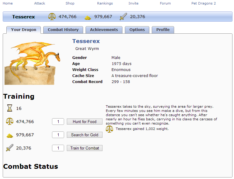
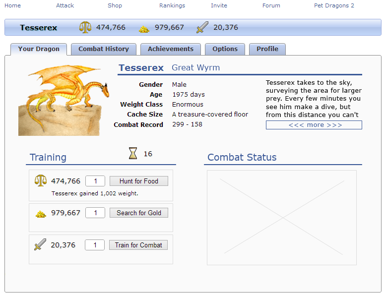
I need some expert advice redesigning the layout of my Facebook game. Below is a screenshot of my home page as it stands now. Styling of margins and some font stuff isn't done which is why some things are touching the left side.
There are a few different pieces of data here and I can't decide where to place them, or if I should omit some completely. There's the picture, basic data to its right, stats and the button to train them, space for training stories, and combat status (when in use takes up the same amount of space as the top section picture and data).
I want to be able to put a display of inventory on here too but then it seems like it's getting crowded and it might fall below the fold. Not terrible I know but maybe information overload.
The UX part of me knows that the long winded stories are wasting space and nobody will ever read them, but if I remove them then the game is just clicking to watch numbers go up. I also can't decide if I should try to fit the stats in the top right corner, maybe by making the basic info smaller or moving / removing it. On the other hand, the stats are central to the game, and I know that UX wise, the left side on the second line is a bit more readily visible than the right edge, as far as how eye flow goes.
If I had to rank things that could be on this page in order of importance, it would be
- Stats / training
- Inventory
- Combat status
- Name and picture (full size picture doesn't appear anywhere else)
- "Basic" information (gender and age aren't really anywhere else though)
So I'm looking for advice on what things I should throw away, resize, shuffle around, etc. I want to avoid nesting another set of tabs in here if at all possible. Expandable / collapsable sections came to mind but seems a bit too "advanced" or click heavy for a casual game crowd. Also note the screenshot is already at the maximum width I can get (760px).


