There are two ways of looking at this problem. One suggests that you create objects without affording interaction. The other suggests that you actively imply to the user that an object is non-interactive.
To satisfy the first, the method is simply stated: avoid techniques that are typically used to afford interaction with an element. What you're doing here is not adding in the various design cues like shading, onHover states, contrasting colours, and so forth.
The one element which almost everyone can agree is usually non-interactive is uncoloured plain text. The simple (or lack of) styling on elements like this means that they don't stand out. Users also have a mental model of the internet (built from general web practices) which suggests that plain text doesn't usually do anything. If you have status messages, for example, you could render them in plain text and not give them any major styling or animation. By presenting them in this way you are not affording any action with them.
Various other attributes of affordances can be avoided - funky colours, shadows, animations, onHover effects, borders which look like buttons, mouse cursor changes. Keeping an element plain means that users will have less reason to believe that it affords an action.
One other technique is to present something which is more obviously an interactive component. If you're showing a status message, then perhaps you could add a control which hides the message or performs some other action - because the affordance will be much more obvious, it is more likely that the user will act on it by preference. This is the same principle which suggests giving more visual weight to the action you want a user to perform when they're presented with multiple choices.
To satisfy the second is more difficult, but there are examples. There are a number of cues that actively suggest that a component is inactive. By doing this, you are relying on the user's memories of having encountered similar items in an inactive state.
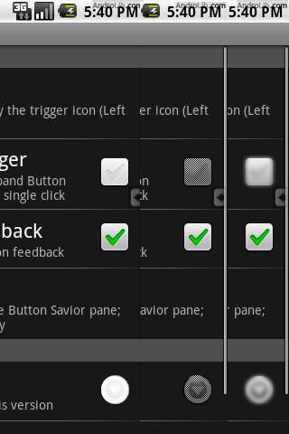
Inactive items will seem to recede from the design or blend in with it. A common example of this is greyed-out icons or text (or more generally, elements with a lower contrast than active items). They will also lack the various other affordances that active items have.
In particular icons or badges could blend with the surrounding content in such a way that it does not look like a self-contained object. Buttons are easy to press and afford their pressing largely because they are contained - avoid containment and users will have vastly less opportunity to interact with the icon. For example, try this:

download bmml source – Wireframes created with Balsamiq Mockups
There are a few other methods, but these are by and large the most common of directly indicating that something is inactive.
And finally of course, it's worth investigating other solutions to the deeper problem. As others have suggested, using the affordance to your advantage and adding functionality may be one solution, as might simply removing the icons themselves altogether if their presence causes more problems than it solves.


