2

I am writing a report generating system where result is shown in a tabular data. The Result appear in a table with information like

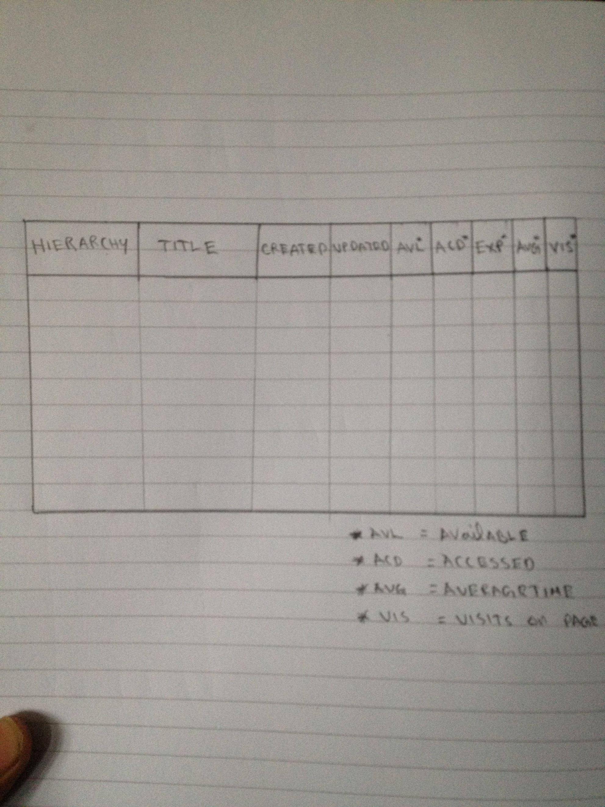
Hierarchy | Title | created | updated | Available |Accessed | Expired | Average Time | Visits on Page

Now I am having problem with few things:

  1. Hierarchy and Title have larger texts so how should I show them?

  2. Available Accessed and Expired just have yes no values but it occupies a lot of space

  3. Visits on page seems like a large title and wraps up and looks ugly.

Can somebody suggest a alternate design which is intuitive and readable.

3
  • 1
    Can you add a screenshot? I'm not sure I understood if you're talking about tabs or columns.
    – Dan Barak
    Commented Apr 9, 2012 at 12:30
  • These are simple columns. Some columns have very large data and some are simple yes no. So the overall look is very unreadbable Commented Apr 9, 2012 at 12:31
  • So your columns are different widths?
    – ChrisF
    Commented Apr 9, 2012 at 12:33

3 Answers 3

1

Its difficult to modify these things to our own style , the best can be done is this using the abbreviations for those small columns ..enter image description here

1

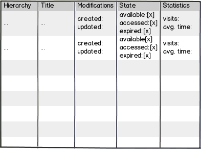
mockup

download bmml source – Wireframes created with Balsamiq Mockups

Instead of using acronyms it would be more effective to revise the whole information presentation. I think that some columns will turn out to be redundant or can be grouped together. I suggest the following steps:

  1. Group columns by their meaning
  2. Assign names to the respective groups --> these are the new column headings
  3. In each group, the former column headings now represent possible states or subordinated information: e.g. if you group "average time" and "visits on page" to "Statistics", then both have to appear together in one cell and in each row. If you replace the names by understandable icons (with the names as tooltips), much less place is needed in comparison to the current layout.

The mockup above still looks confusing as I did not use any icons or acronyms. I only wanted to outline the idea of information grouping. I'm sure, the approach can be further improved. But I'm also convinced that the long chain of table columns must be simplified by any kind of grouping.

2
  • 1
    A useful feature of most tabular data displays, is the option to sort based on a certain column to quicly find the top (or bottom) items by some metric. How would I, in your example, easily find the top 5 most visited or titles? Or the 10 most recently updated ones?
    – André
    Commented Apr 11, 2012 at 10:24
  • I agree, this approach is not quite good with regard to the common filtering and sorting options in tables. It is just an attempt to do some aggregation on the data. Besides, I'm not sure if the table is supposed to be interactive or if it is just to be printed as pdf. I have assumed the latter. If this is not the case, then maybe it should be reconsidered, whether it is indeed necessary to show all the information at a glance, as it is difficult to keep track of all the information, if there are many rows. You could e.g. list the titles and and link to a property page providing the details. Commented Apr 11, 2012 at 10:48
0

For columns that show data of a known, narrow width - such as check boxes, single words or dates then fit the column width to the data. This is "Auto" in WPF/Silverlight (for example).

For columns that can hold any amount of data then use a "fill" width, where the column expands to fill the available space. This is "*" in WPF/Silverlight.

For titles that are much wider than the data then you either have to live with the title wrapping on to two lines or use a shorter title - "Visits" might be OK in your example. If your title is only a single word and longer than the data then it's harder. Abbreviating the title might work - if you can show the full title on hover or a tooltop or something.

2
  • thanks chris Accessed Available and Expired columns take large width because of their title but the content there is just y or n. How can i possible correct it. Like may be showing Accessed Available and Expired in a dropdown? Commented Apr 9, 2012 at 12:46
  • @sushilbharwani - In these cases you might have to live with a wider column than you'd like, unless you can shorten the titles in some way.
    – ChrisF
    Commented Apr 9, 2012 at 12:48

Your Answer

By clicking “Post Your Answer”, you agree to our terms of service and acknowledge you have read our privacy policy.

Not the answer you're looking for? Browse other questions tagged or ask your own question.