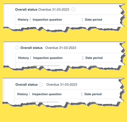
I have a field label with its associated value but am unsure whether the tooltip icon should display before, or after either of these items. (Also, it could potentially appear after the label but before the value).
-
1Hi, Michelle. Can you edit your question to let us know what the tooltip text contains? Is it about the status in general, or the overdue status in particular? Thanks.– IzquierdoCommented Oct 31, 2023 at 14:12
-
This is not directly related to the question, but please ensure the icon has at least 3:1 contrast against its background.– friCommented Nov 4, 2023 at 9:22
1 Answer
I don't think there's a rule for this. However, I think the vast majority of icons are placed right after the element they refer to, which makes a lot of sense. For example, when you read a sentence, you read the element which may or may not need help with. If you need help, then you take a look at the tooltip by using the icon.
This is a classic example of the structure of language as explained by Ferdinand de Saussure, and it's called a signifier.
In semantics and semiotics, a signifier is a linguistic or visual element that represents a concept, object, or meaning. It's often part of a sign, which includes both the signifier and the signified (the concept or meaning it represents).
Here's how your combination of elements relates to the concept of a signifier:
Definition (Linguistic Signifier): The written definition is a linguistic signifier. It's a textual representation of the concept or meaning you want to convey. In this context, it represents the meaning in a written form.
Icon (Visual Signifier): The icon is a visual signifier. Icons are visual symbols that represent concepts or actions. They are used in a graphical or symbolic way to convey meaning. In this case, the icon visually represents the concept or action associated with the definition.
Tooltip (Additional Clarification): The tooltip, when displayed on hover or interaction with the icon, can be considered an additional form of linguistic signifier. It provides further clarification or information about the icon, making the connection between the visual representation (icon) and the meaning (definition) more explicit.
In this way, the combination of these elements is a multi-modal approach to conveying meaning. It uses both linguistic and visual signifiers to enhance communication. The tooltip acts as a bridge between the visual and linguistic signifiers, reinforcing the connection between the icon and its meaning.
About positioning
The long explanation on semantics above is to explain where the icon should be placed.
As mentioned above, the icon and the tooltip are related to the concept they help describe. Therefore, if the tooltip will explain what "Overall Status" means, the correct version would be the third one in your image.
But if you need to explain why it's overdue or what it means, then you should use the first one, since the icon is right after the concept that needs explanation.
As for the second version with the icon before the concept, I find it a bit unusual, but on the other hand, if you don't have a clear separation between the "Overall Status" title and the "Overdue" label, it's worth a try (pending user testing, of course).
-
1Following your explanation (nice to hear about Saussure in this context :-) I think there is a good reason to reject (2): During reading from left to right, if you first come across a help indicator, you don't know whether you need help (or what the help would be about). Only after reading the explained item, the user knows whether he wants more information. And, depending on what is explained in the tooltip, that alternatives (3) or (1). Commented Nov 2, 2023 at 9:05
-
1Hi @Devin. So sorry for the late response, your reply entirely missed me by. Thanks VERY much for writing such a detailed reply. I found it very useful.– MichelleCommented Aug 5 at 7:53

