I came across a website called color hunt and wondered how each color palette must be used (usage percentage and such). For example, I liked this color palette but I am not sure what color must be used the most and which color must be used for each specific action on the website, e.g. links, buttons, navbar, etc.
1 Answer
It's not a simple question nor does it have an immediate answer. There are thousands of pages that talk about the use of color in relation to percentages, but nothing makes the use of color better understood than practicing with them. I summarize in the answer a minimum of Color Theory and a simple practice.
Starting from the base that we already know the colors and the name of each one of them, or approximately, at first instance it's necessary to know and understand what is the position of each one of them in a graphic piece.
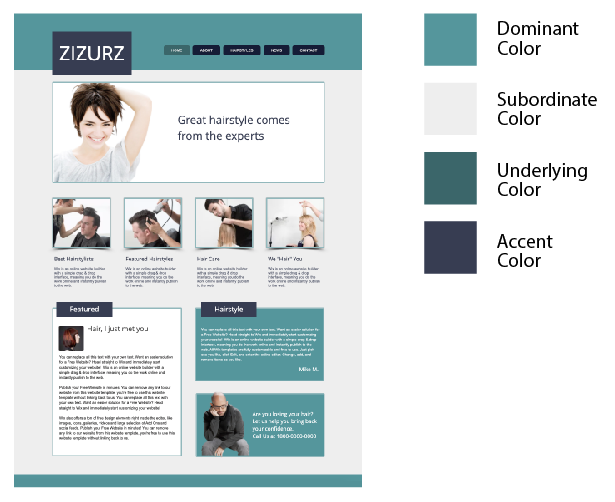
Dominant Color: is the color with the highest predominance in perception, without the need to occupy a larger space. It's the color with which we remember the object after seeing it.
Subordinate Color: is the secondary color in quantity. It may occupy a larger space than the dominant color but perceptually it's not so relevant.
Accent: it's the color touch, the point that draws attention. Perceptively the second in importance after the dominant color.
Underlying Colors: the colors behind the dominant and the subordinate, the third order colors, those that fill the work without highlighting the others. Difficult to remember by their name, from the perceptive point of view remain in a very distant plane.
Color Details: colors of reduced proportions, without becoming accents, complete a detailed chromatic components description of the object. Unlike the underlying colors, and despite appearing in small proportions, they are usually easy to remember by the color name.
Using a basic example home template from freewebsitetemplates.com:
The exercise consists of breaking down its main elements by color, replacing each color in the corresponding position with those of the chosen palette and exchanging them on the scale in subsequent copies to see all their possibilities:
Some tips:
Look for a template that is as close as possible to the idea or ready-made design of the web
If it's possible in the program you use for the exercise, place each group of elements by color in a different layer, this helps to understand the relevance and position of each color and if they are in the correct place or should change.
Name each color: names always help to better understand any kind of work
Name each color combination mode: names always help to better understand any kind of work
Note:
The use of color is not something absolute, in perception and in taste and use, it's subordinated to several factors: concept, product type, branding, personal test, geography, symbology, etc. Even the color itself has its own identity as an independent element. Factors such as saturation, luminosity and hue, the color variables can cause elements chosen as a base in a palette to change their position. It's nearly impossible to perceive an oversaturated fuchsia as a subordinate color, no matter how low its occupancy percentage is in a graphic object.


